


JAGA Studio is a home design studio led by architect and designer Julia Ann Gallagher, headquartered in Los Angeles County and working throughout California, New York, and abroad.
Founded in 2016, the studio evolved from a transformative Brooklyn residential renovation into a full-service practice dedicated to thoughtful, site-driven homes. Today, JAGA Studio designs interiors, additions, and ground-up residences that respond to landscape, light, and the lives of the people who inhabit them.
From hillside and beachside properties to urban and countryside retreats, the studio approaches each project holistically—working from the inside out to shape architecture and interiors as one cohesive vision. Services include architectural design, interior design, zoning and planning approvals, consultant coordination, and construction management.
With over 25 years of combined experience, JAGA Studio assembles expert teams tailored to each project, guiding clients seamlessly from concept through completion. The studio’s work balances rigorous permitting strategy, technical execution, and refined interior environments to create homes that are both deeply personal and architecturally enduring.
Headquartered in Los Angeles County, JAGA Studio accepts residential commissions across California, New York, and internationally.
When a developer and property management client approached us about an existing hillside home in Pacific Palisades, the opportunity was clear: reimagine the structure to fully embrace its elevation and unlock panoramic horizon views. The original one-family house wasn’t taking advantage of its steep site. Our proposal? Go vertical — and design a three-story home that opens completely to the landscape.
On a hillside, every move matters. The design maximizes section as much as plan, stacking living spaces strategically so that when you enter and move through the home, the eye is pulled outward — toward sky, ocean, and the distant horizon. Large openings and carefully positioned glazing dissolve the boundary between interior and exterior, allowing the view to become the home’s central artwork.
The material palette stays minimal and restrained, letting the topography and light do the heavy lifting. Clean lines, quiet surfaces, and thoughtful transitions keep the architecture feeling calm despite the dramatic setting. It’s modern, but warm — sculptural without being severe.
The outdoor spaces were treated as an extension of the interior, especially the pool terrace carved into the hillside. Rather than competing with the view, the pool design mirrors it — sleek, minimal, and visually expansive. It feels suspended between land and sky.
This hillside renovation transforms a conventional structure into a layered, view-driven experience. It’s not just about adding floors — it’s about amplifying perspective and creating a home that truly lives in its landscape.
When their Brentwood home began to feel oversized for two, these empty nesters didn’t downsize—they redefined. Partnering with JAGA to rethink their long-term retreat, they developed a clear set of guiding principles: preserve the trees and landscape, maximize the existing footprint without expanding it, and shape a home that feels open, connected, and distinctly theirs.
One of the most transformative moves was relocating the kitchen from the center of the house to the backyard edge. By shifting the heart of the home outward, the design now promotes seamless indoor-outdoor living, with doors that dissolve the boundary between kitchen, living space, and garden. From the moment the front door opens, sightlines extend straight through to the backyard—an intentional gesture that makes the home feel expansive and welcoming.
Ceilings were lifted and the roofline raised to align with neighboring homes, yet articulated in a way that gives this house its own architectural identity. Inside, exposed wood structure accentuates the new ceiling heights, celebrating volume and craftsmanship while adding warmth and character.
The primary suite was moved to the rear for privacy and sweeping backyard views, while the lower level was opened for relaxed, modern living. An ADU doubles as a flexible guest house and support kitchen for the suite. A gym, home office space, two-car garage, and low-maintenance landscape complete the vision—an elevated, light-filled home designed beautifully for the next chapter.
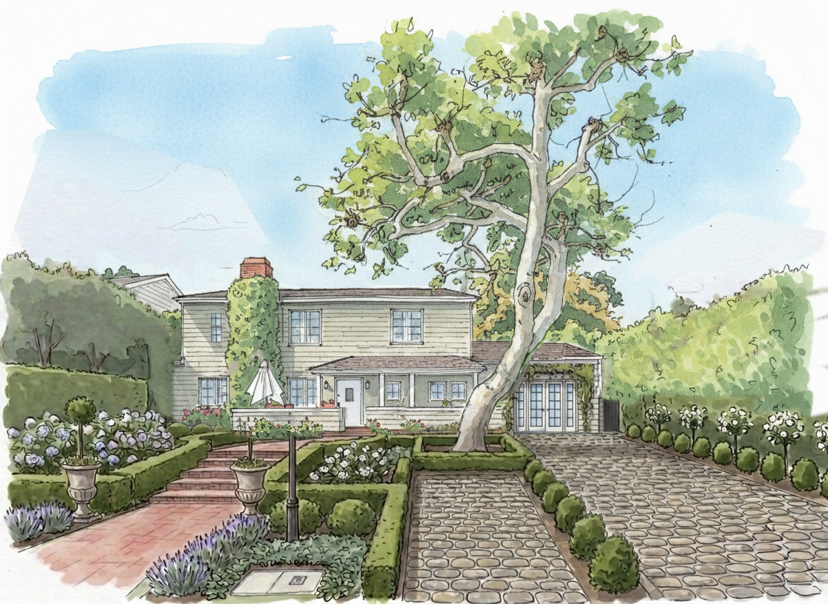
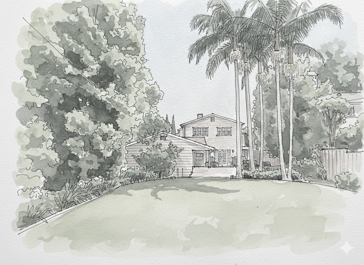
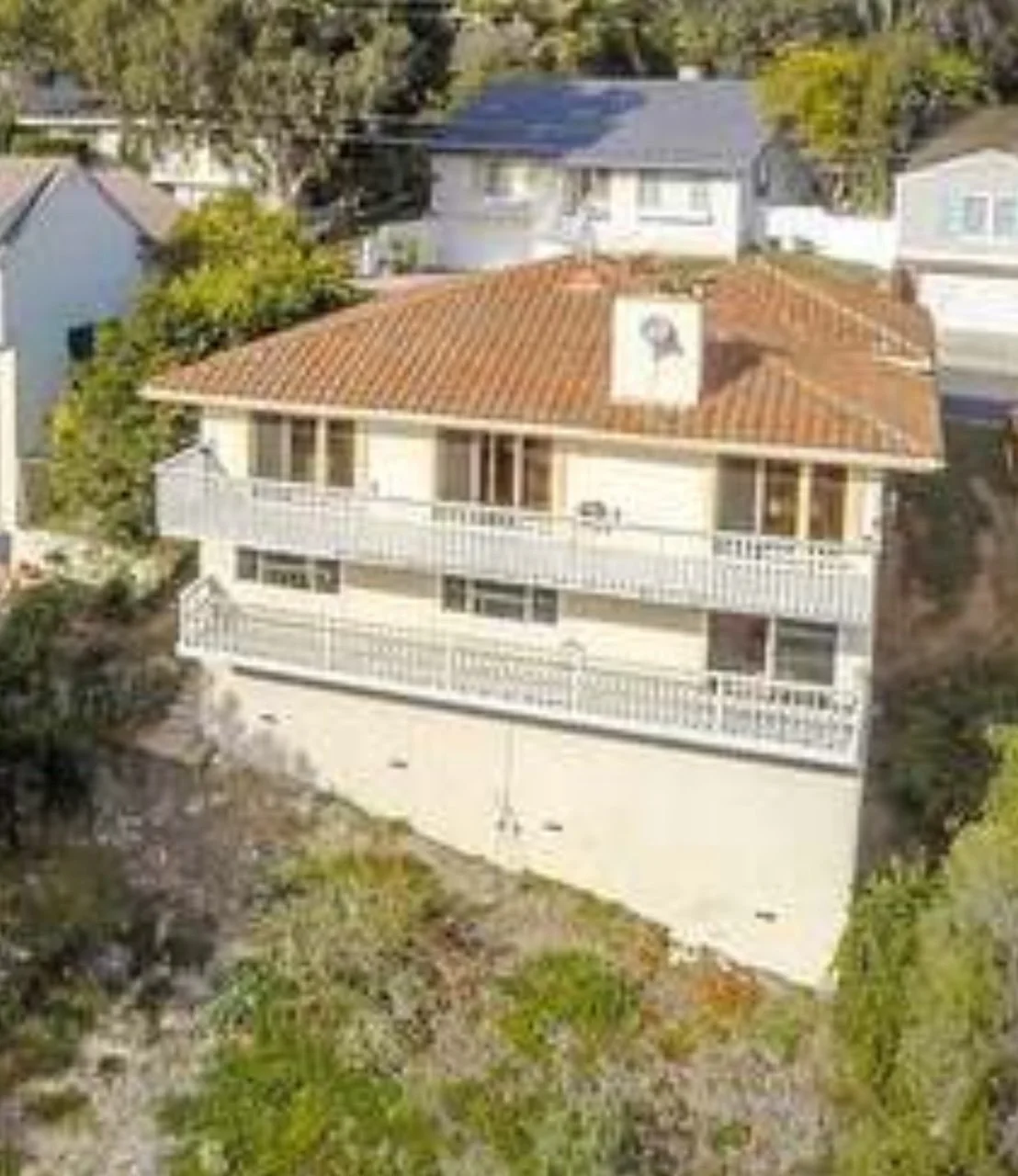
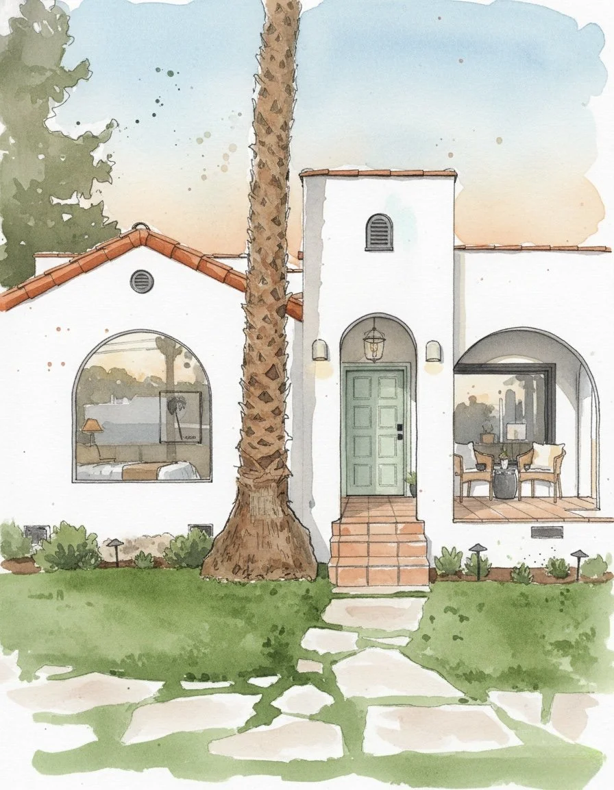
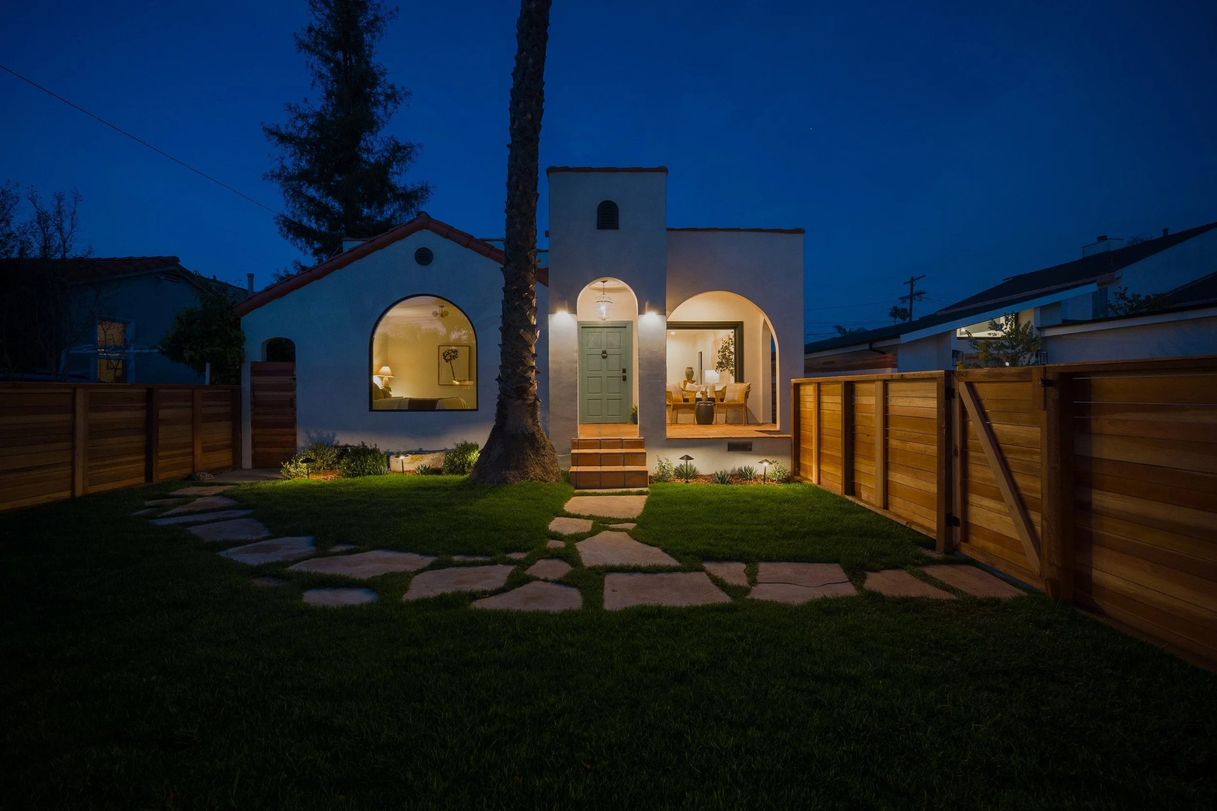
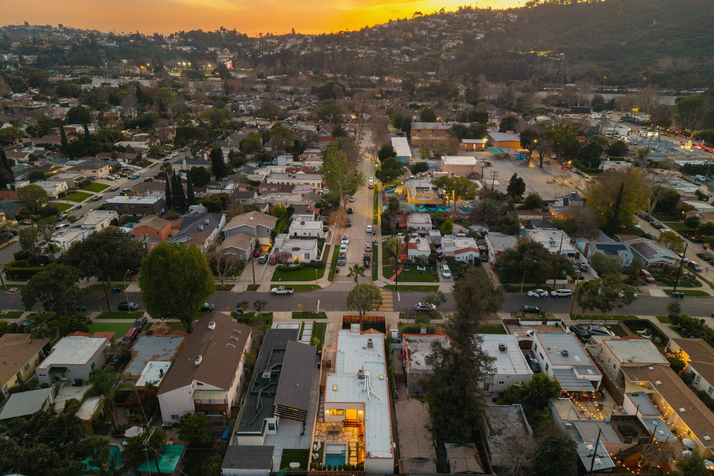
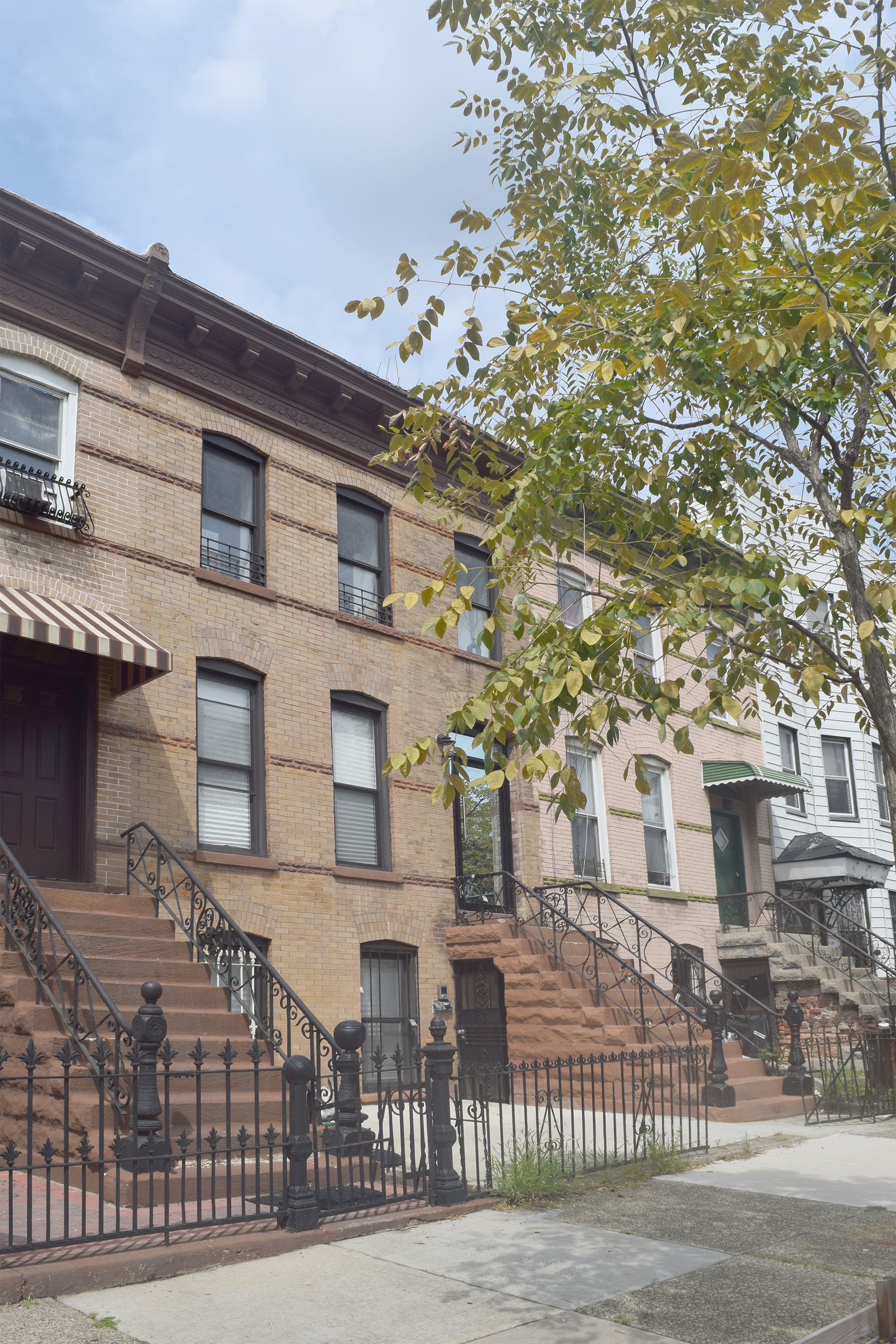
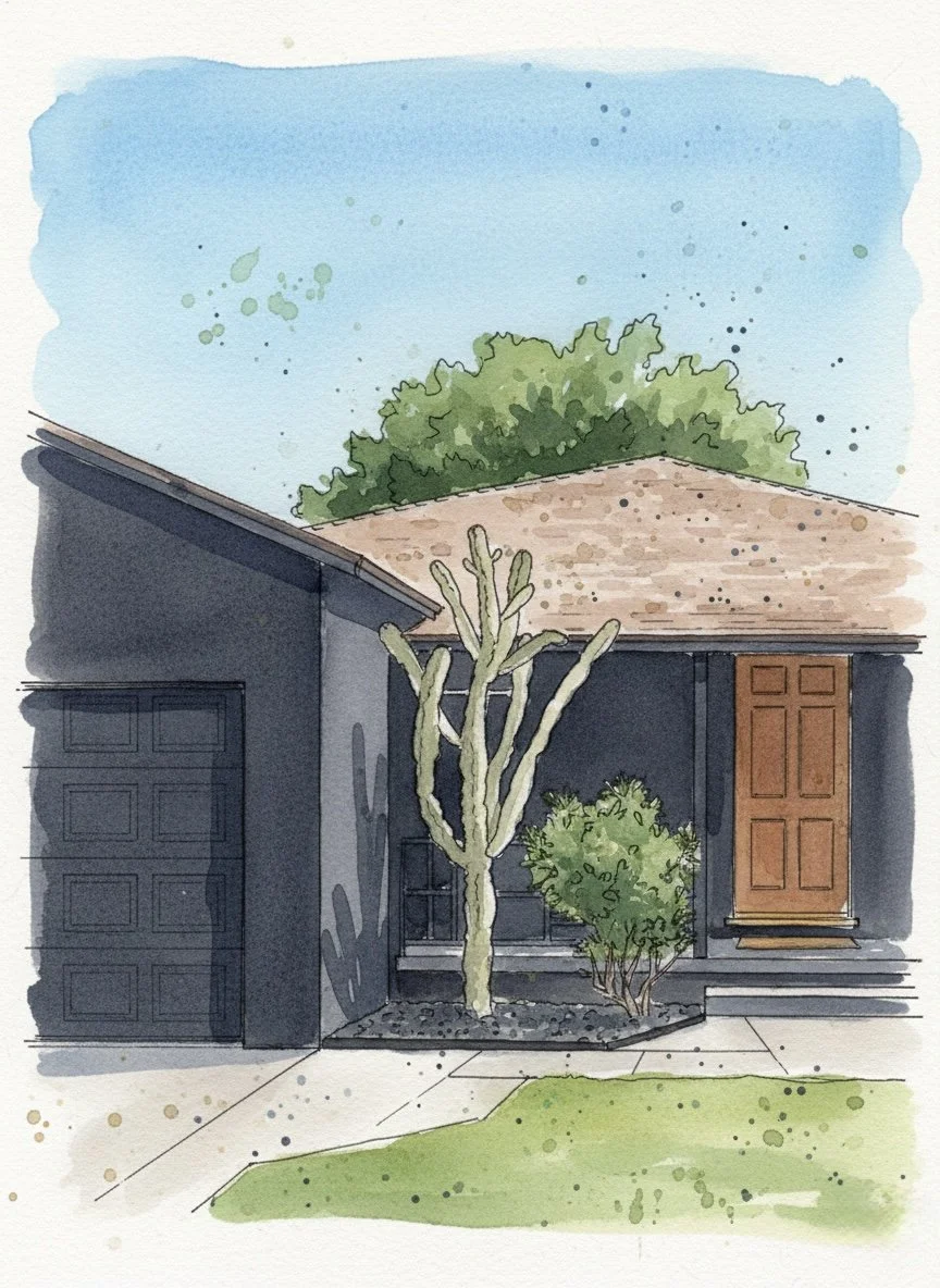
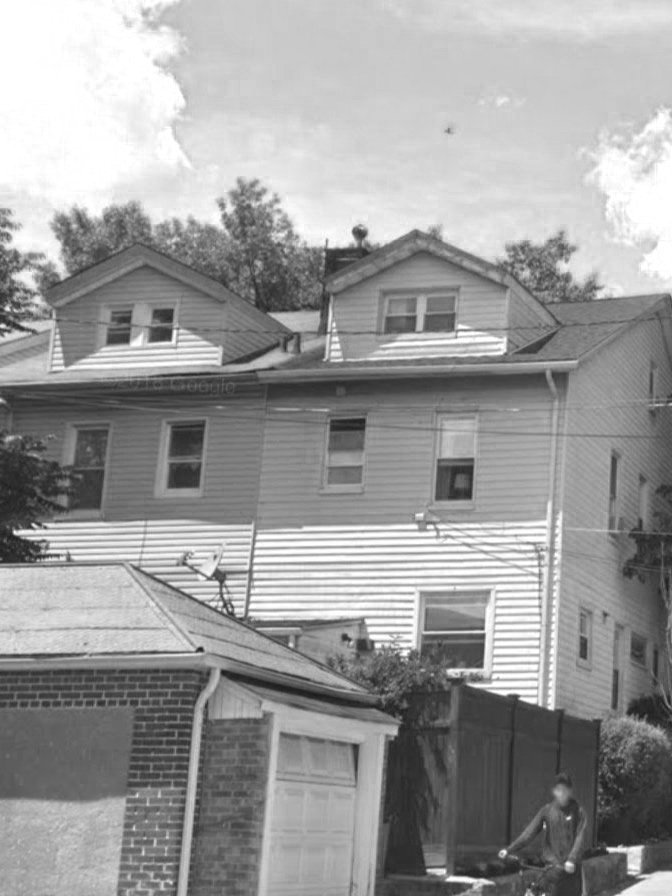
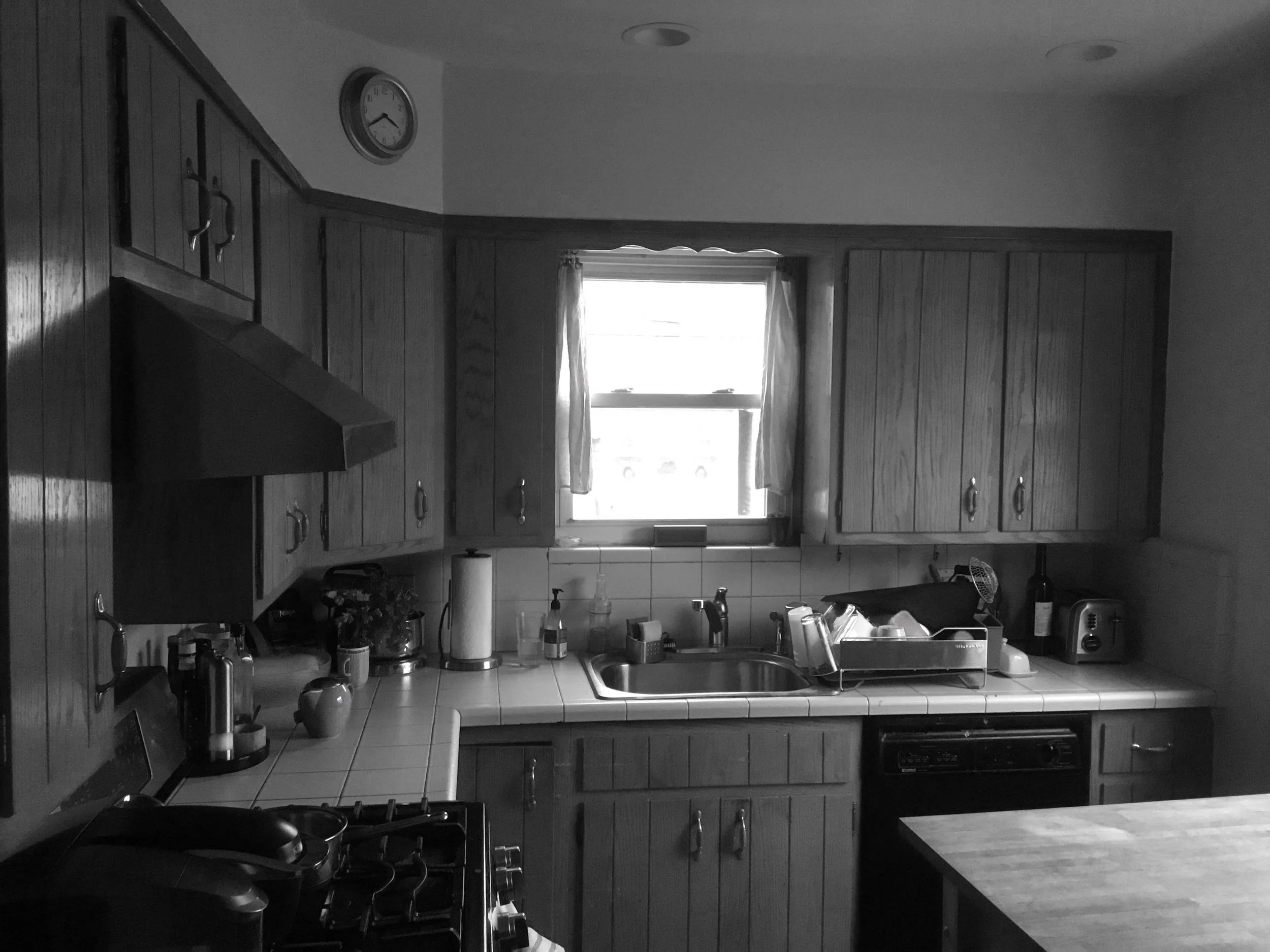
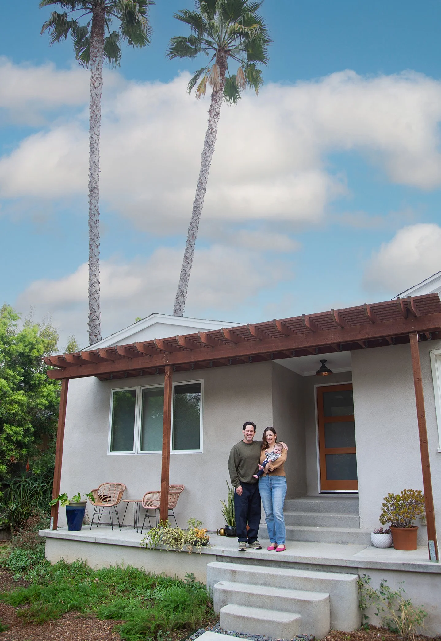
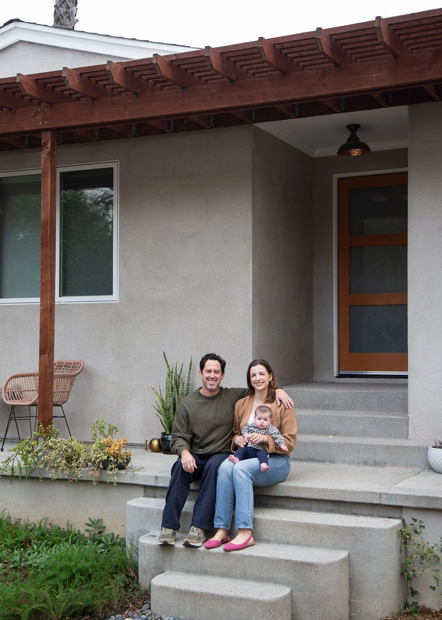
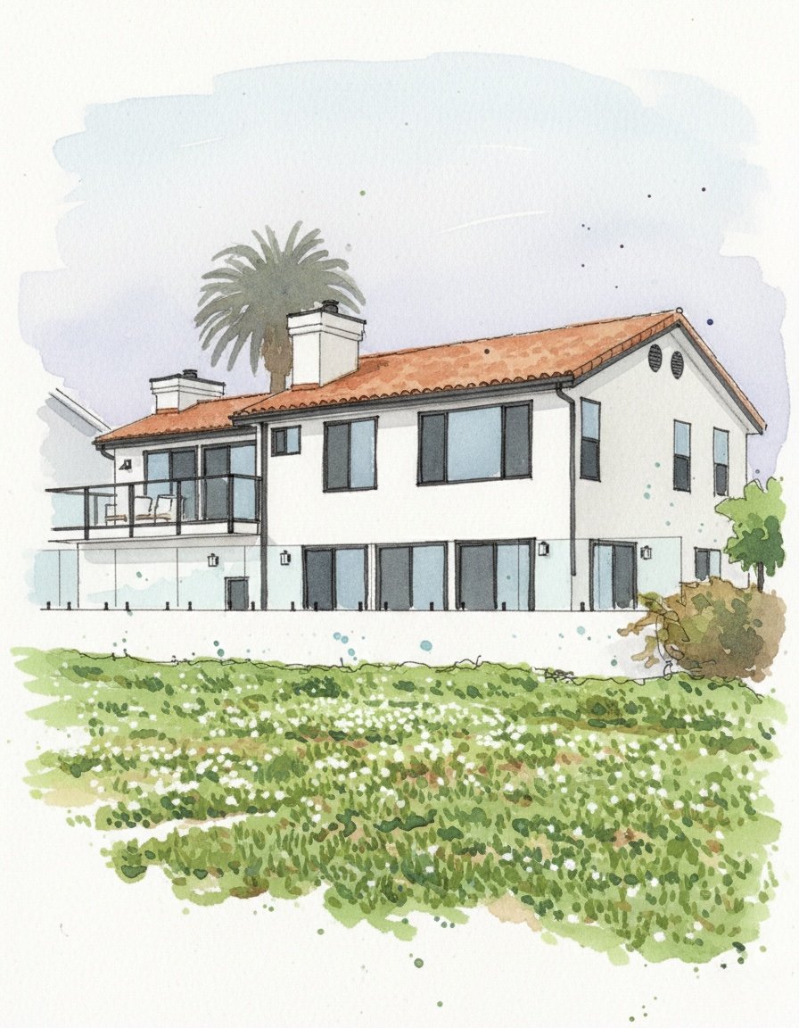
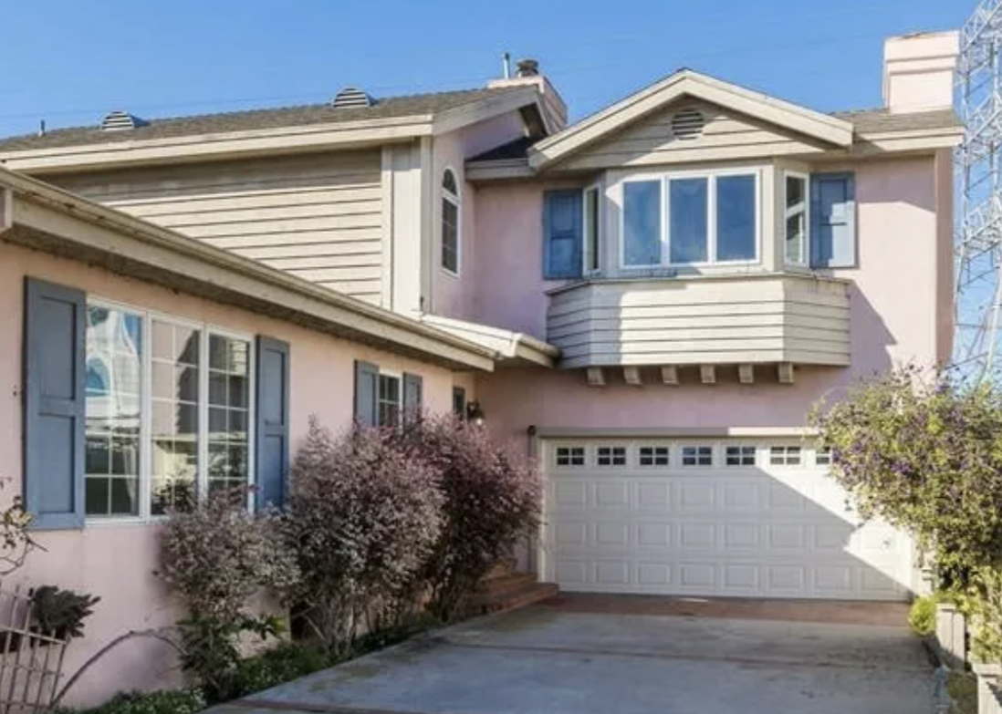
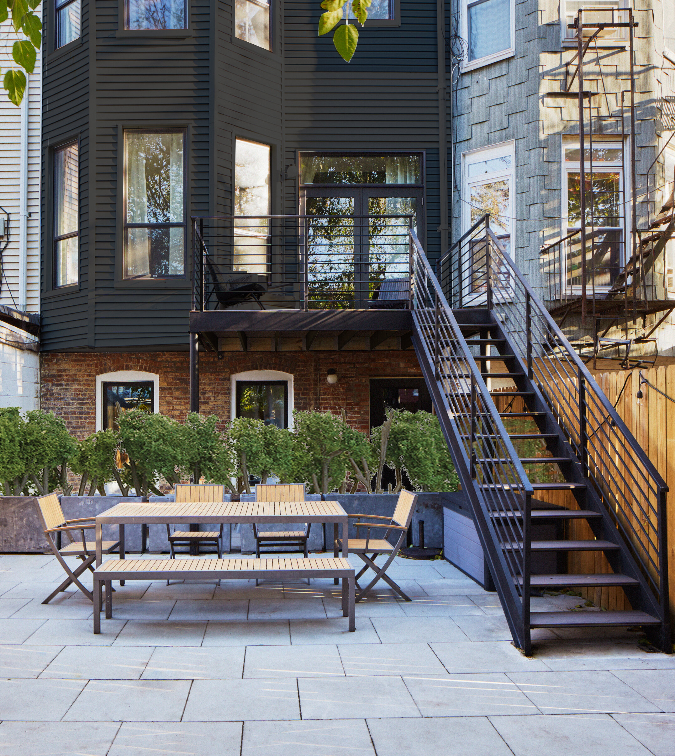
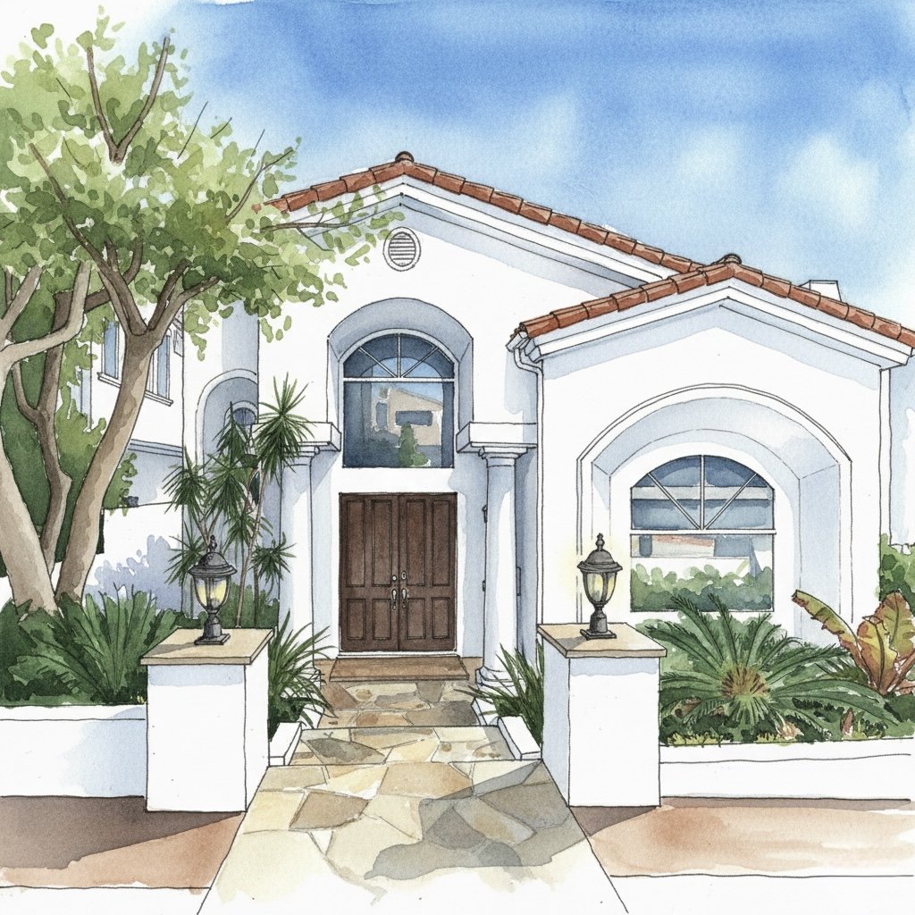
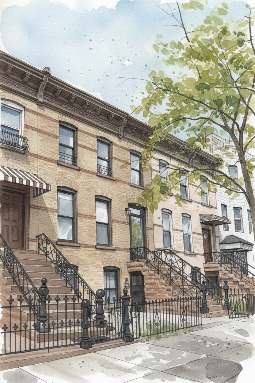
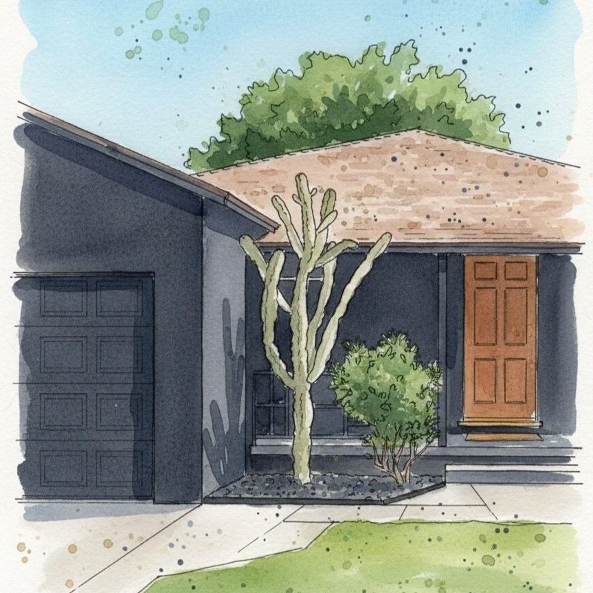
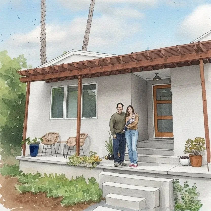
When a developer-interior designer building group reached out mid-property hunt, they weren’t just looking for a flip — they were looking for potential. The house they found? An 853-square-foot Spanish charmer with two bedrooms, one bath, a petite living room, and an even cozier kitchen. It had personality, yes — but it also had serious room to grow.
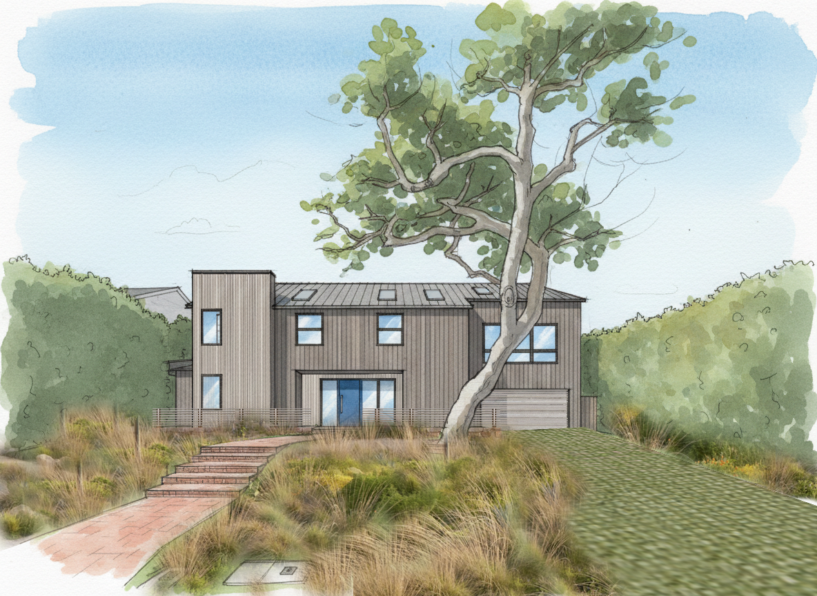
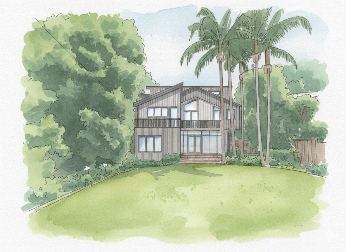
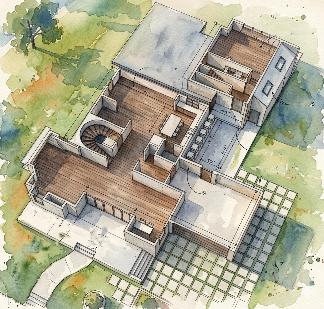
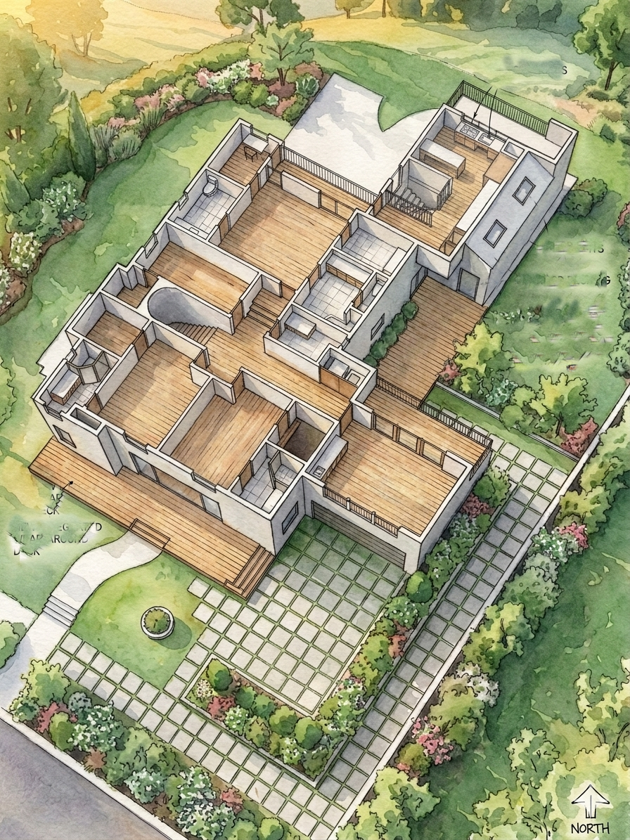
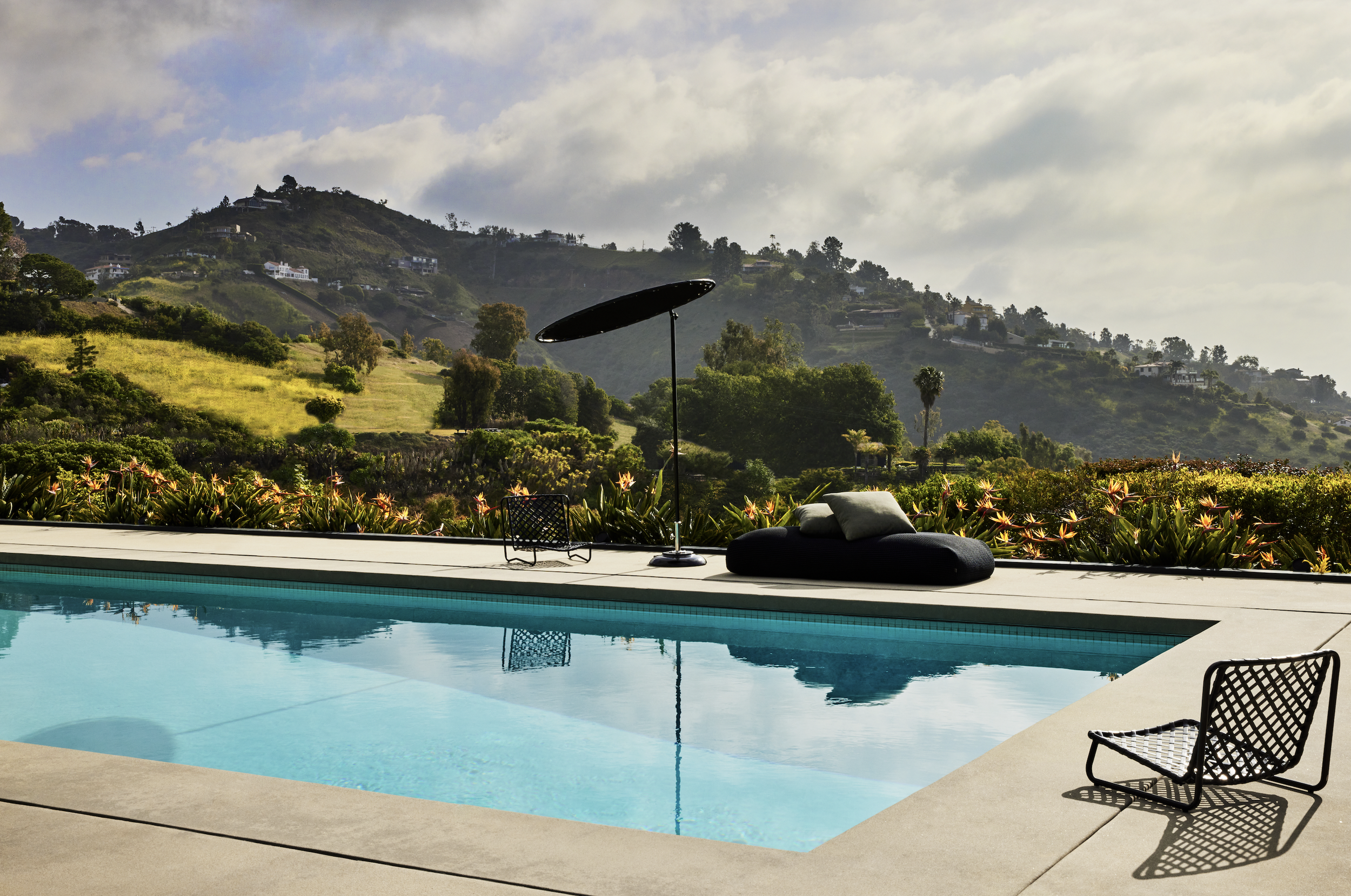
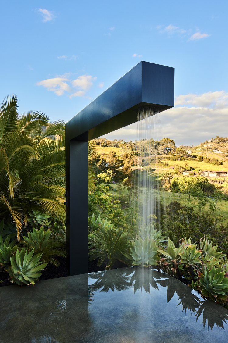
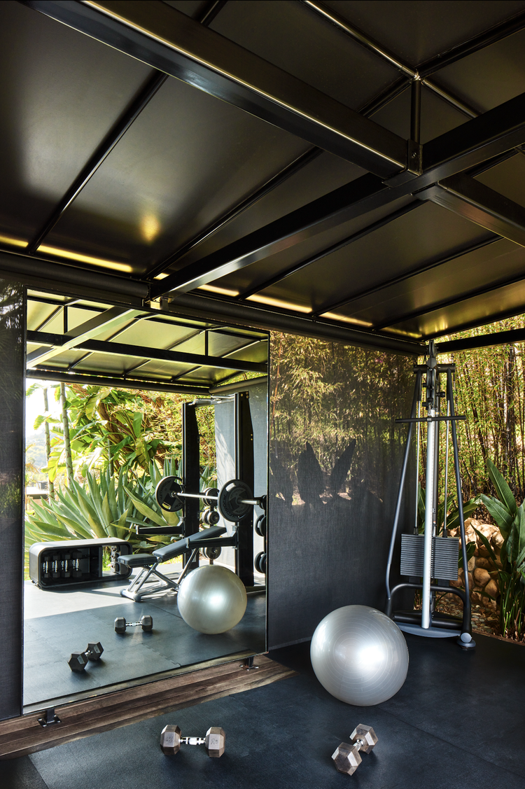
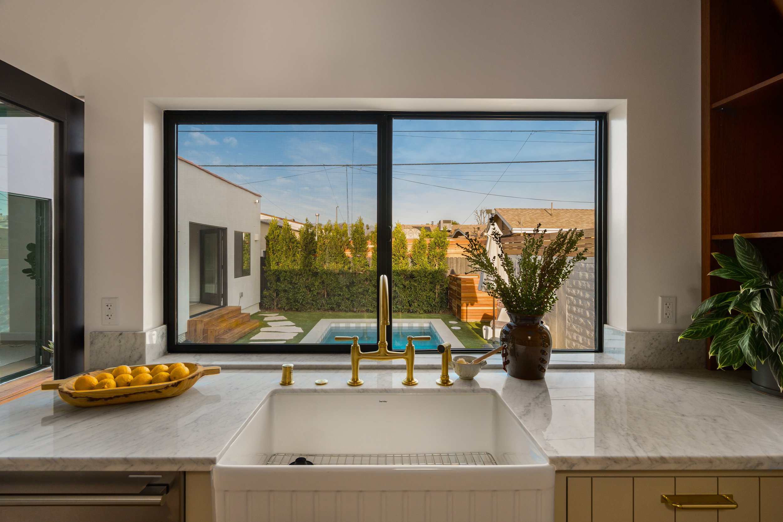
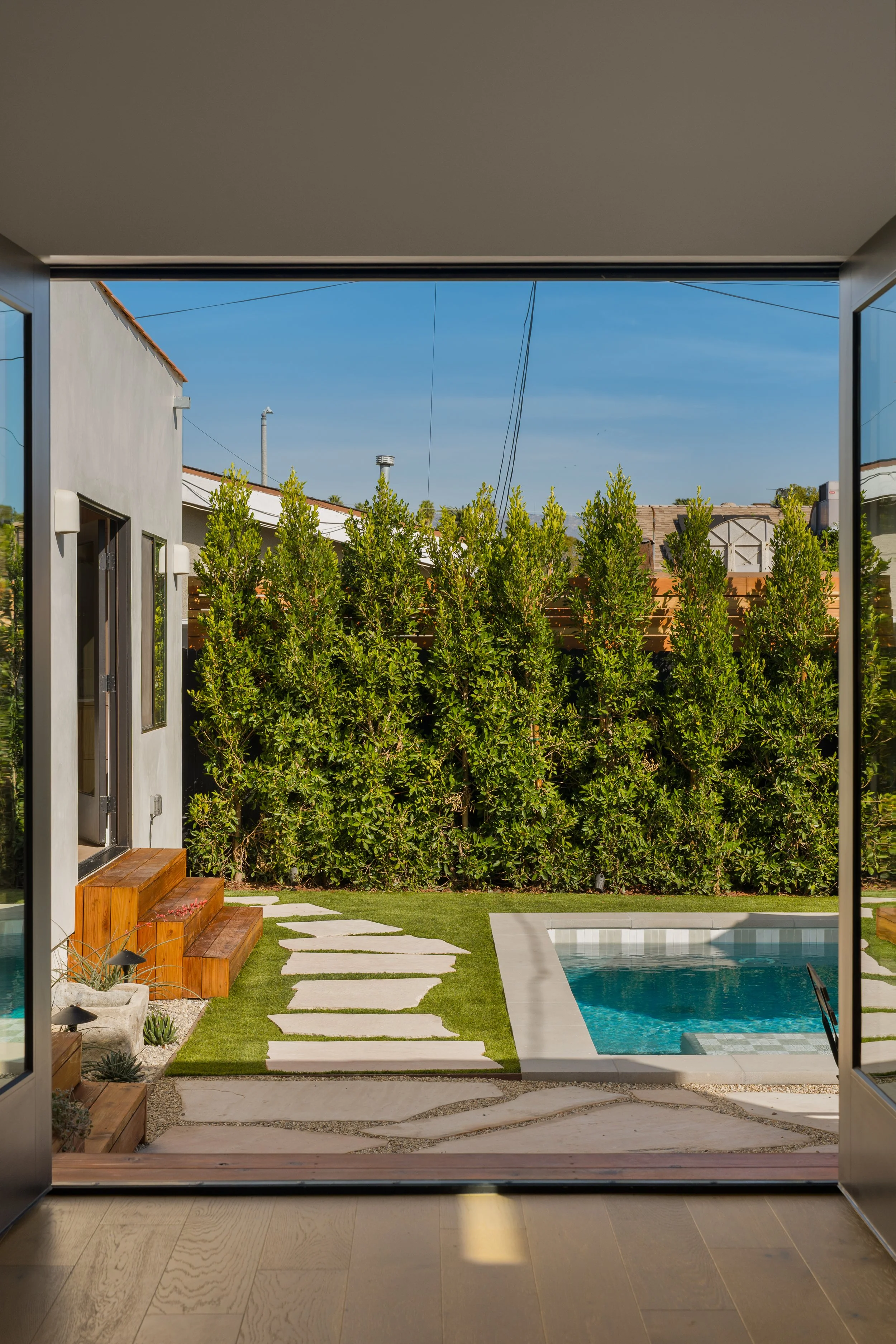
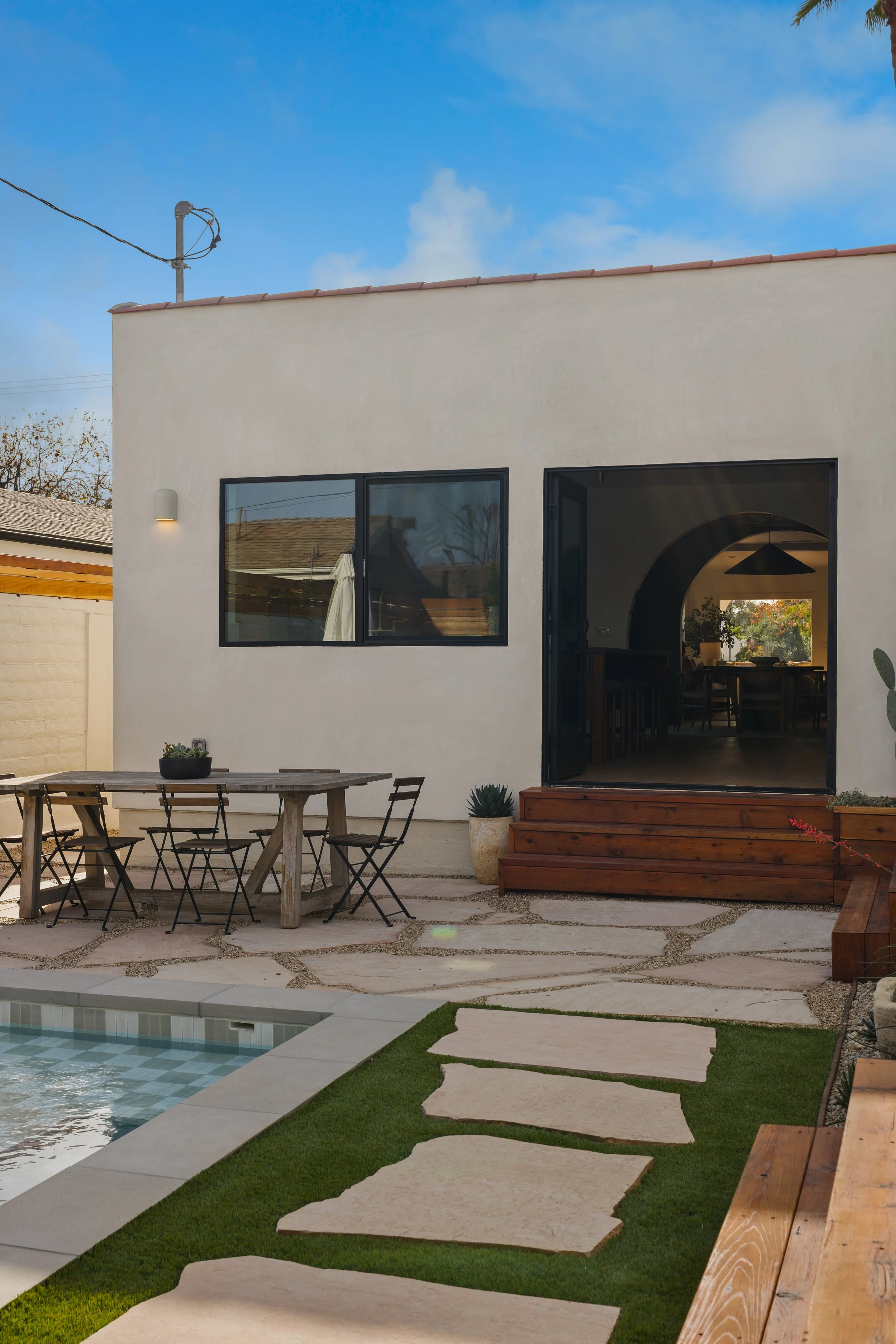
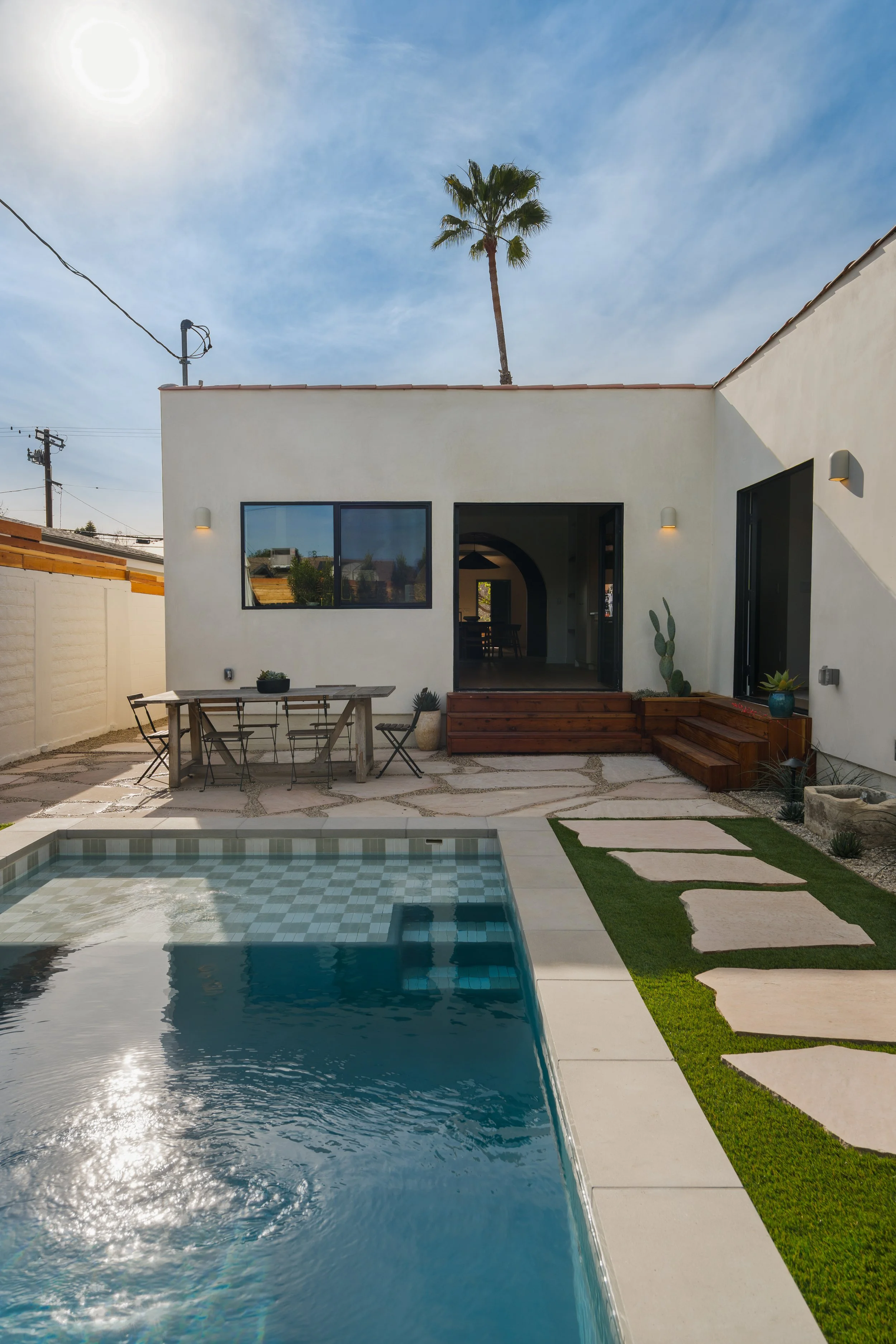
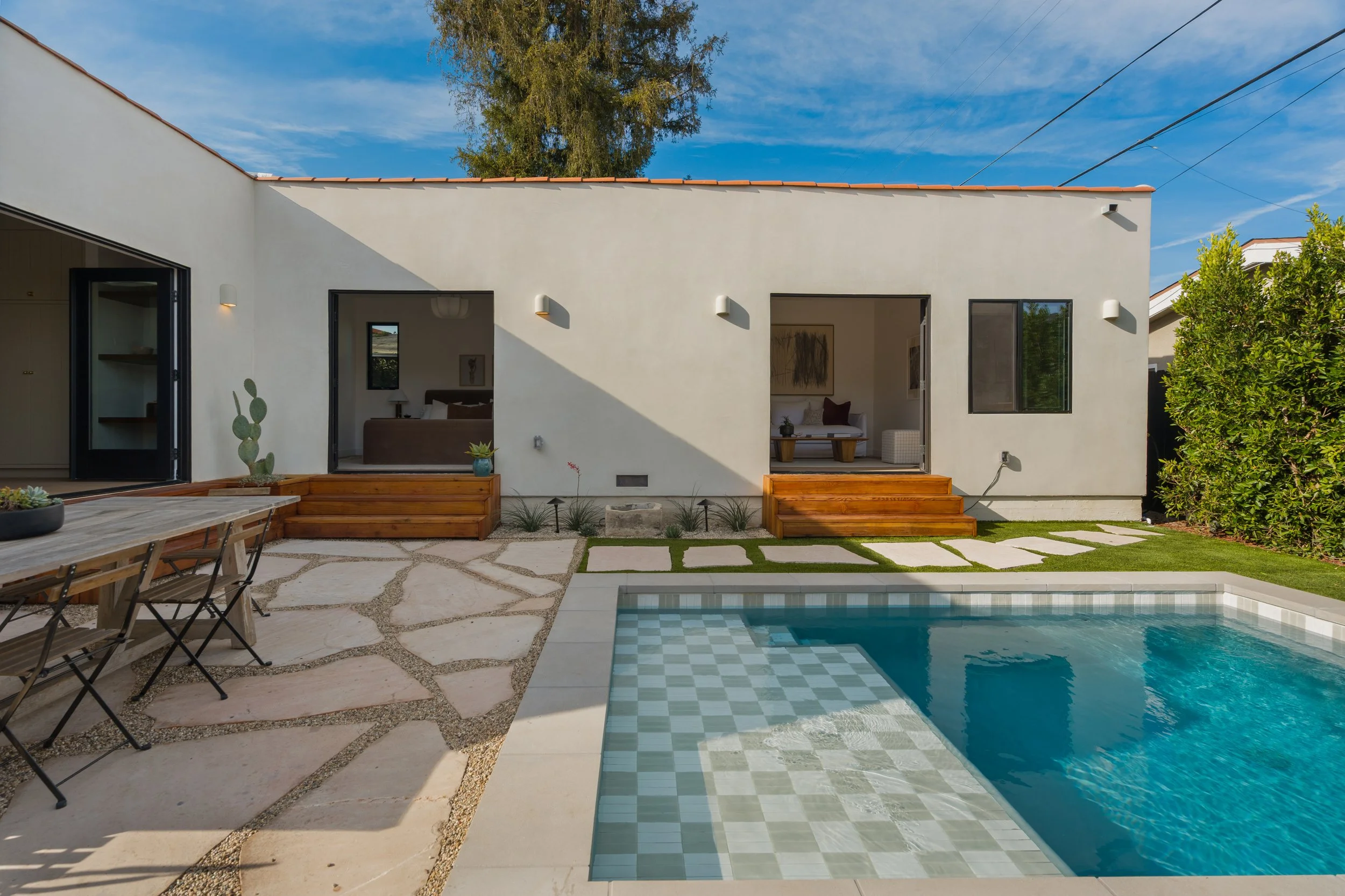
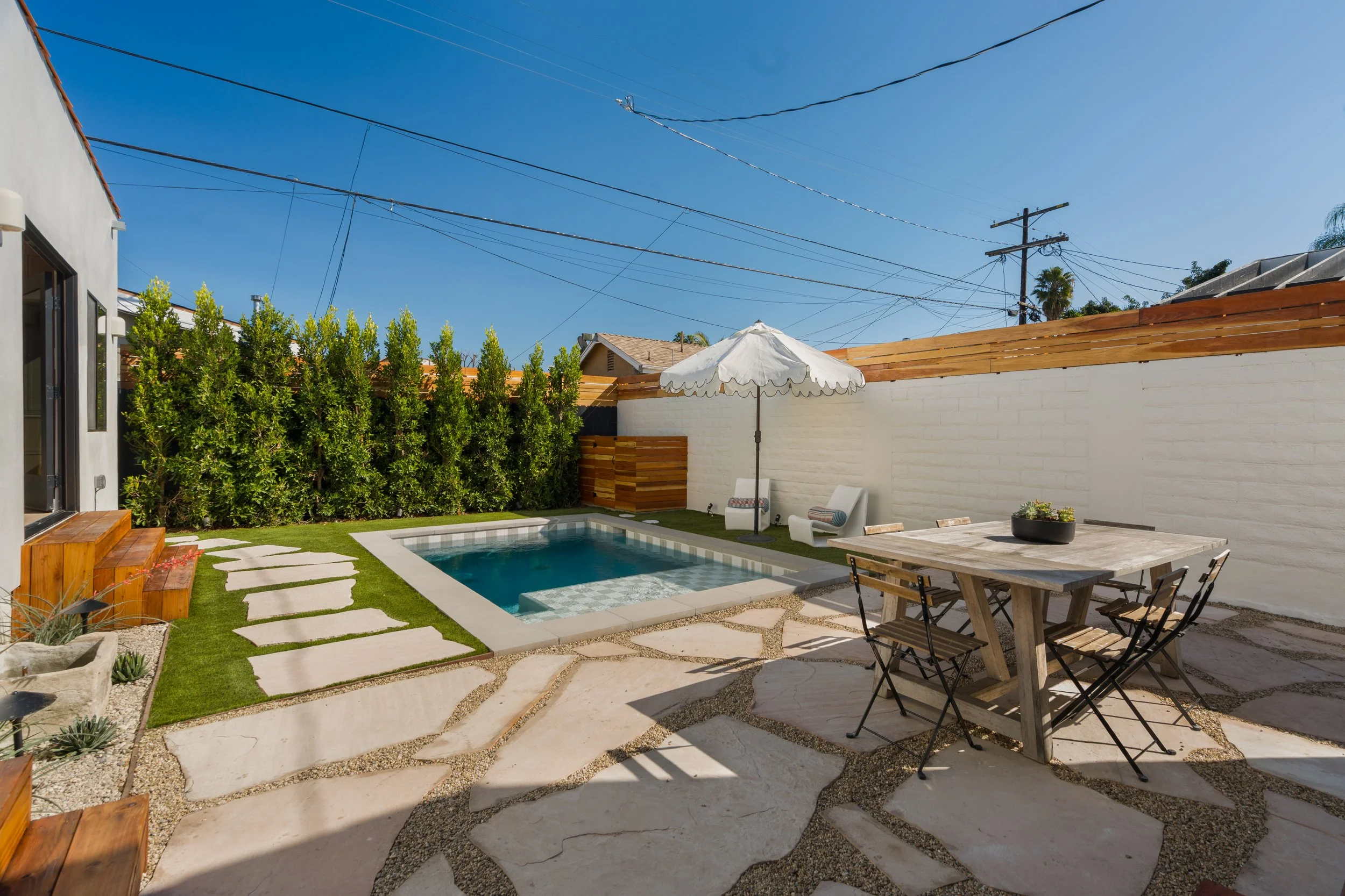
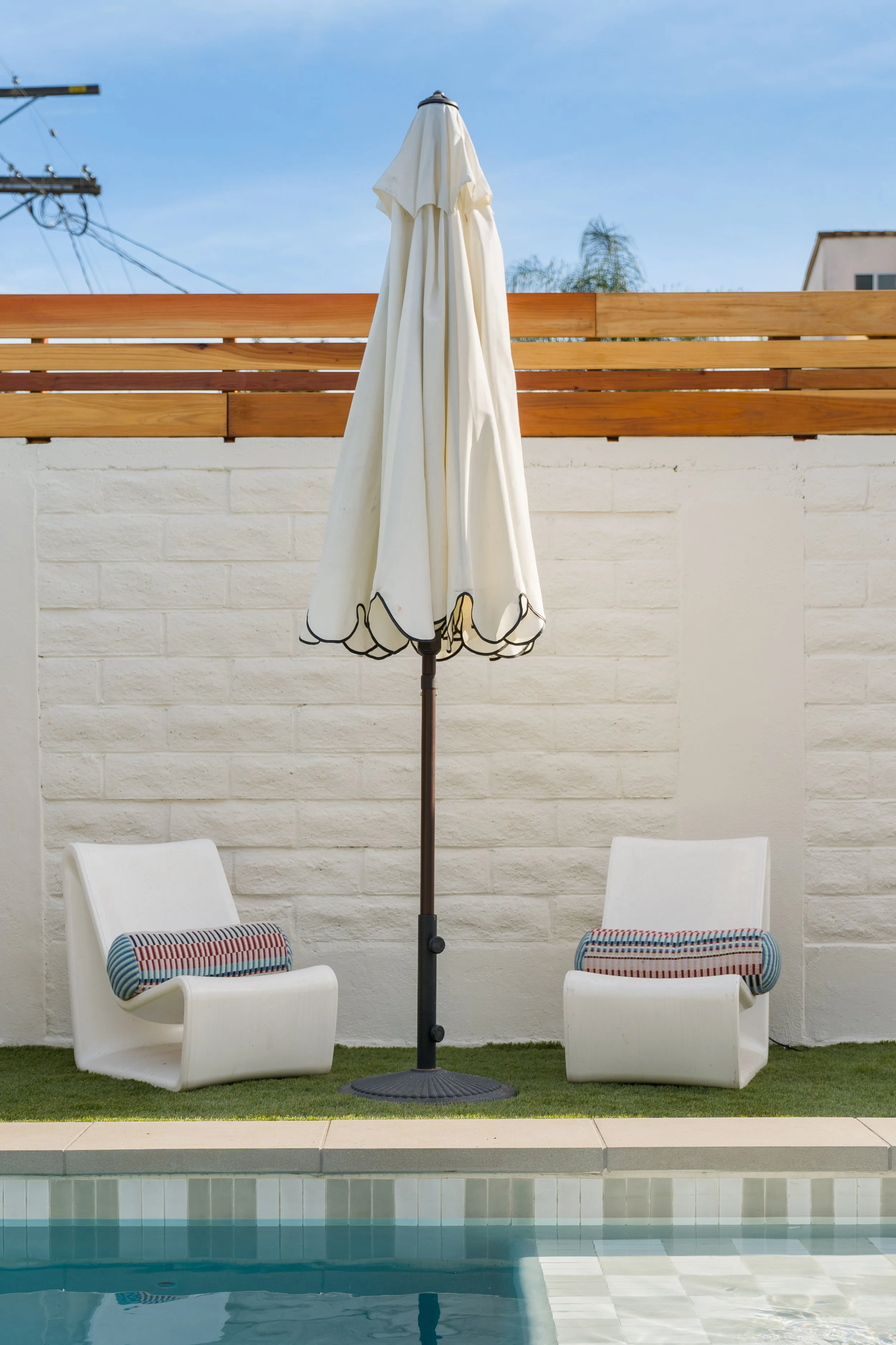
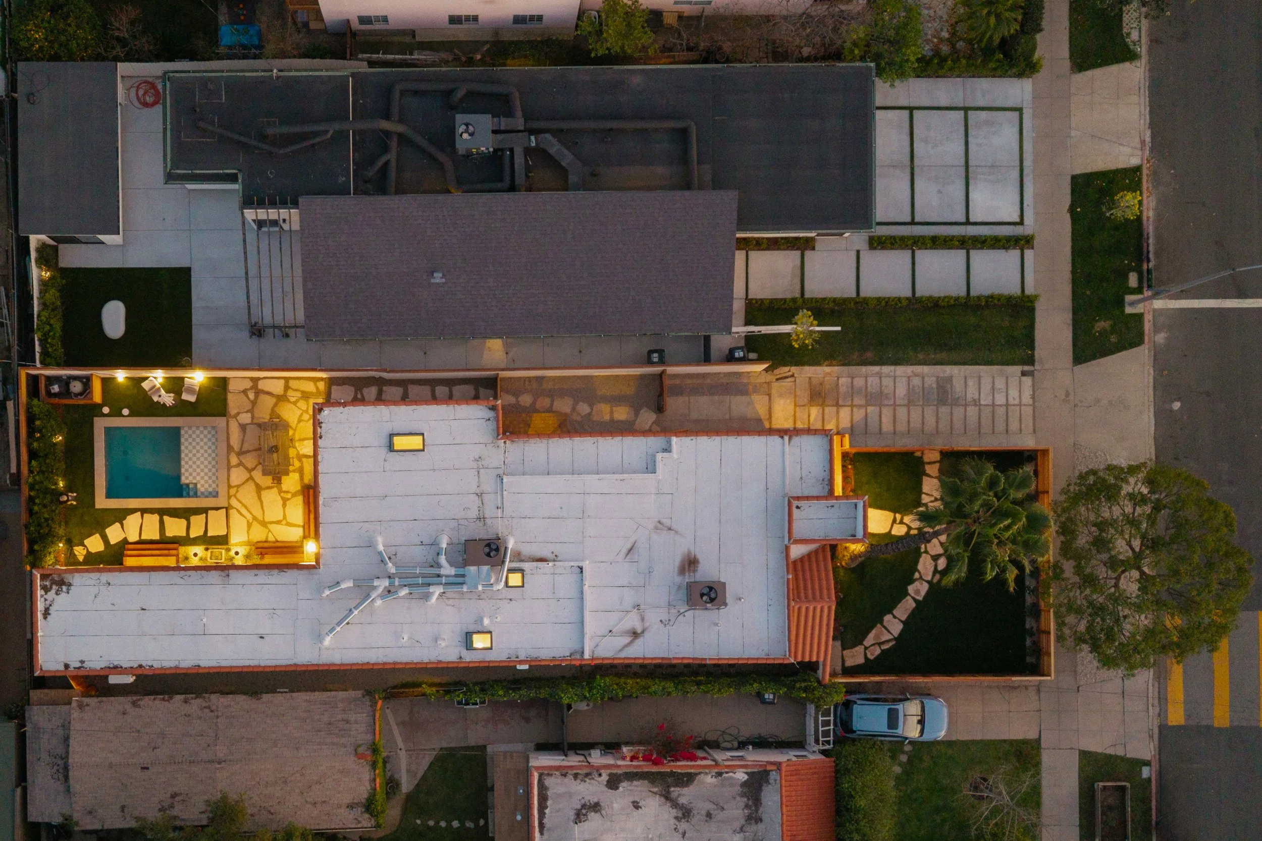
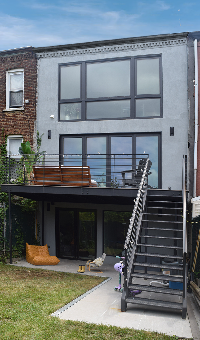
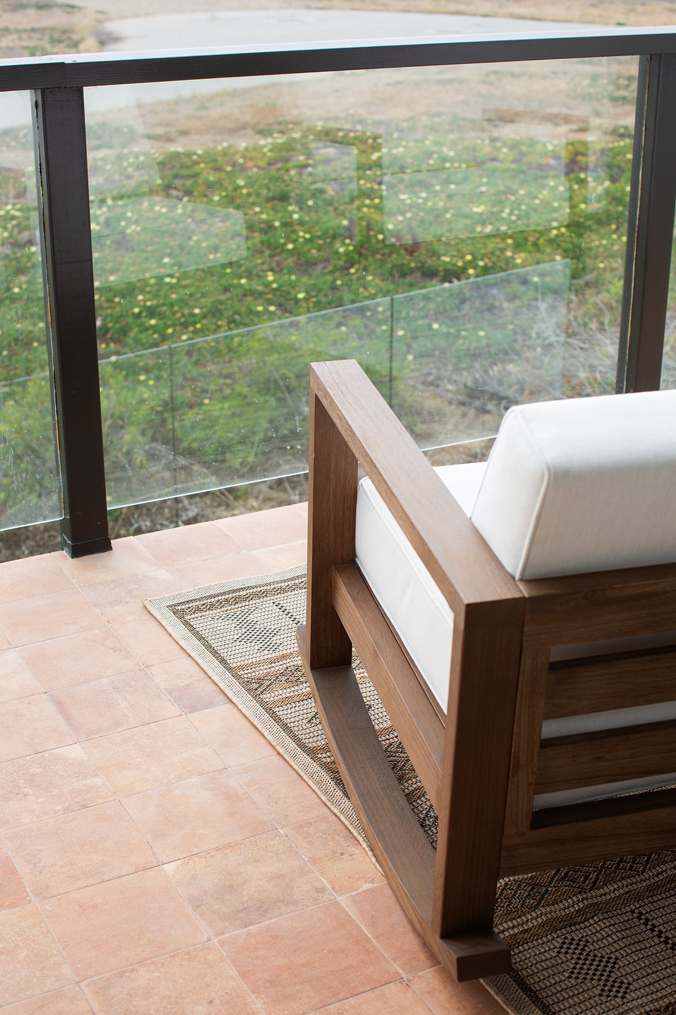
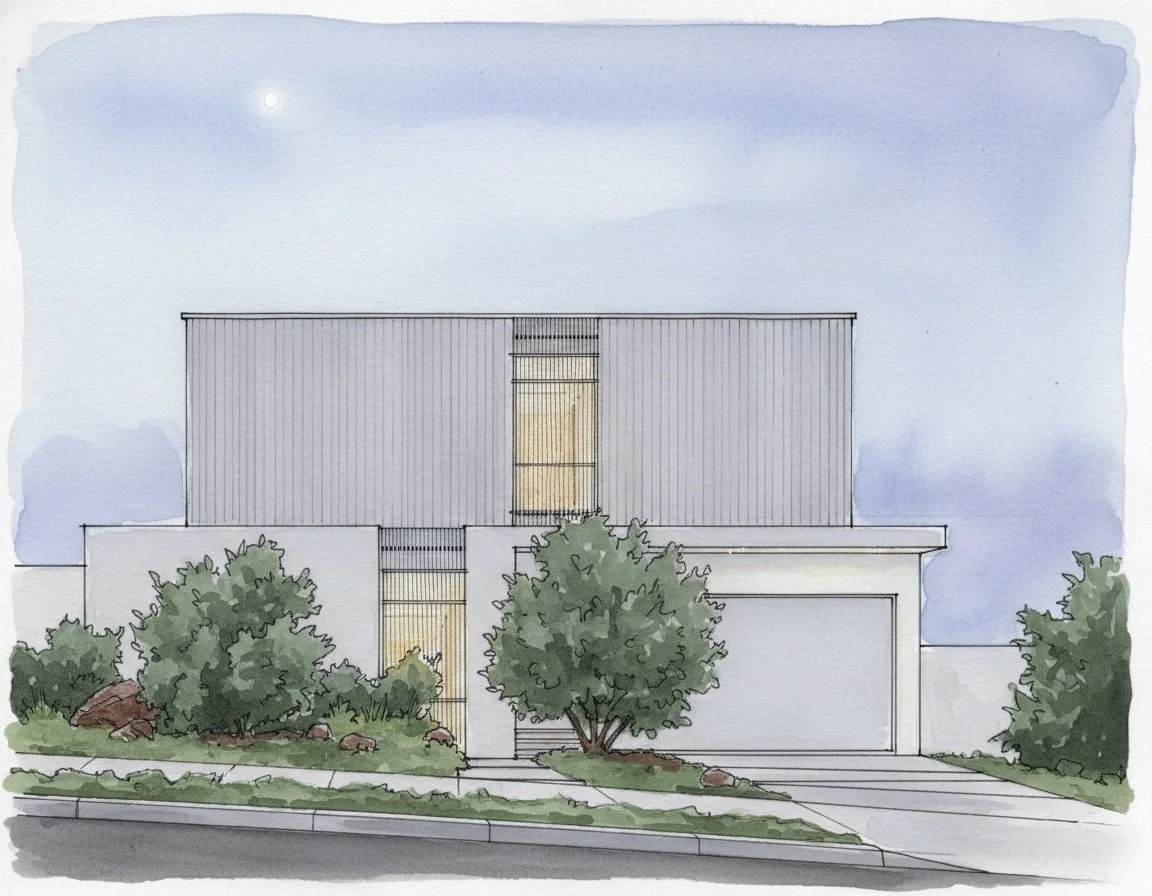
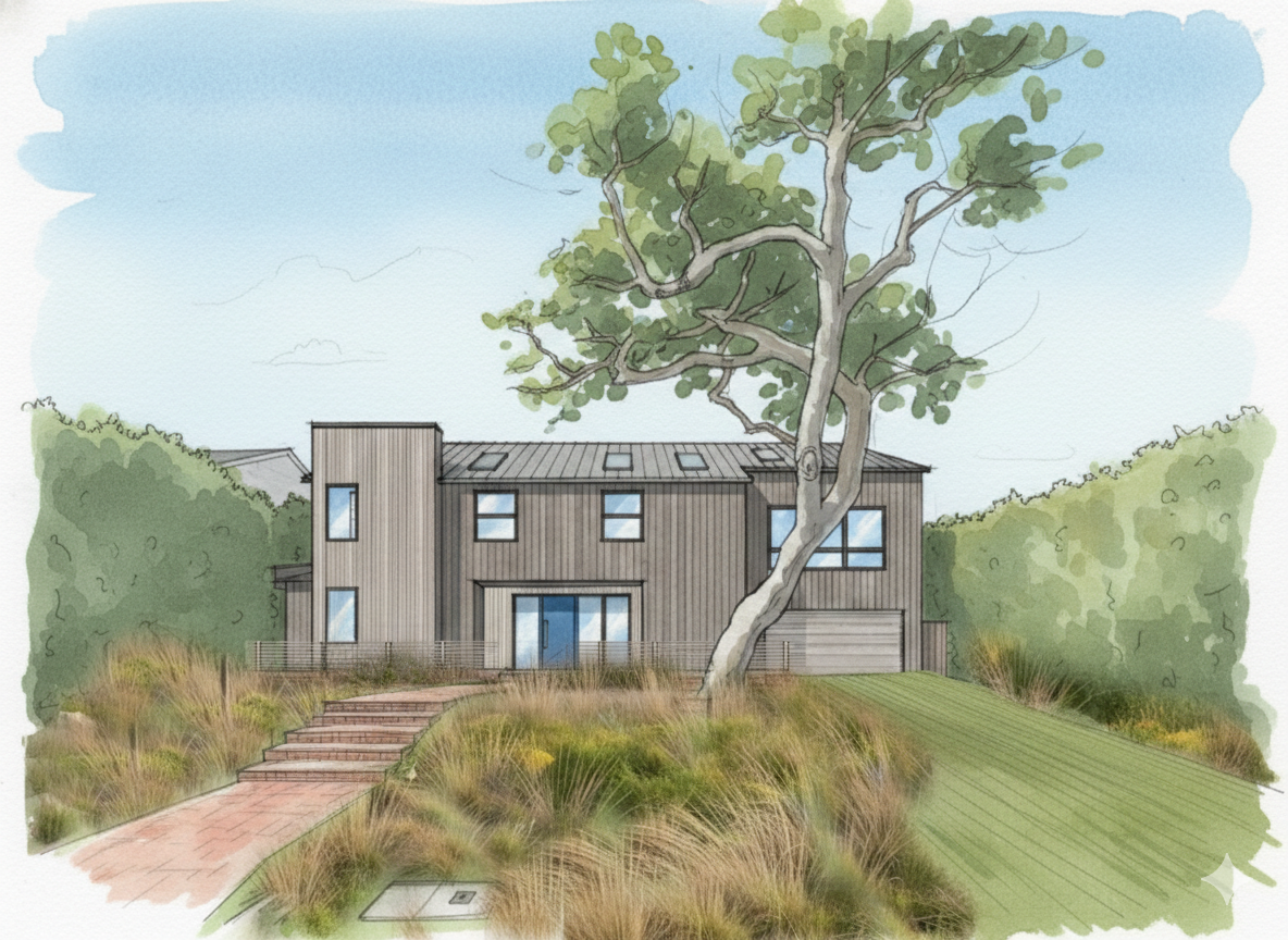
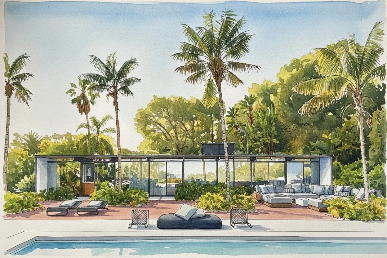
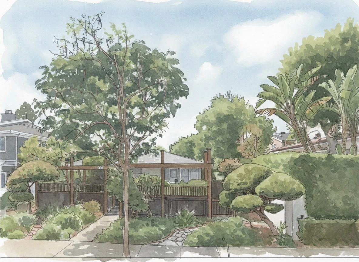
Before sketching a single wall, we dug into lot coverage and zoning allowances to understand exactly what the site could handle. Once the numbers made sense, the vision came quickly: expand the footprint by 1,200 square feet, introduce a 300-square-foot ADU, and anchor the backyard with a pool that would transform the property into a true lifestyle home.
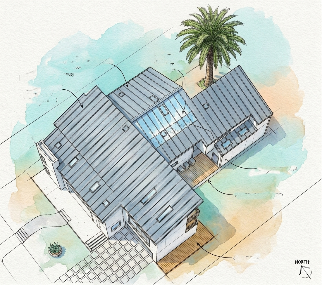
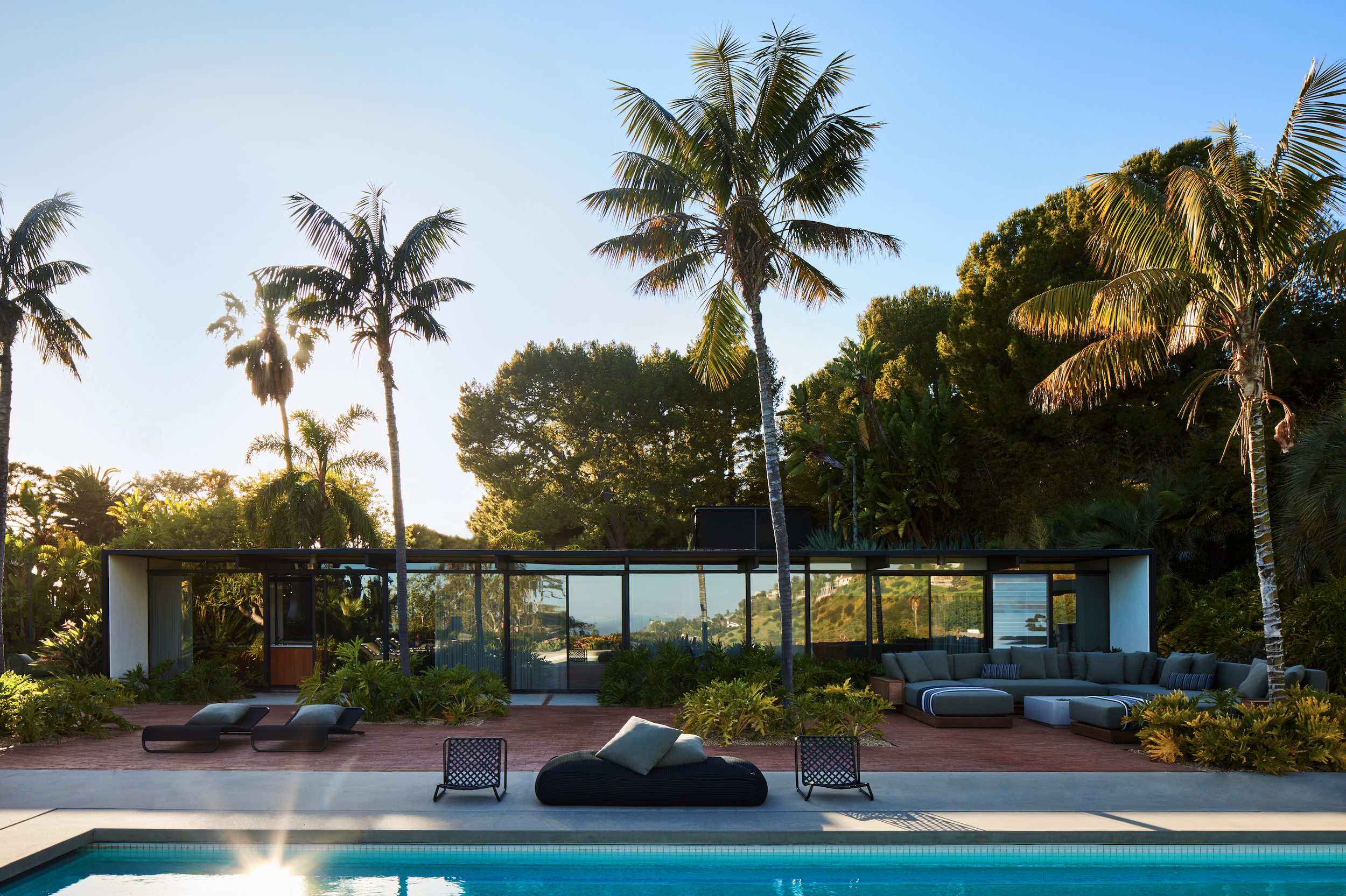
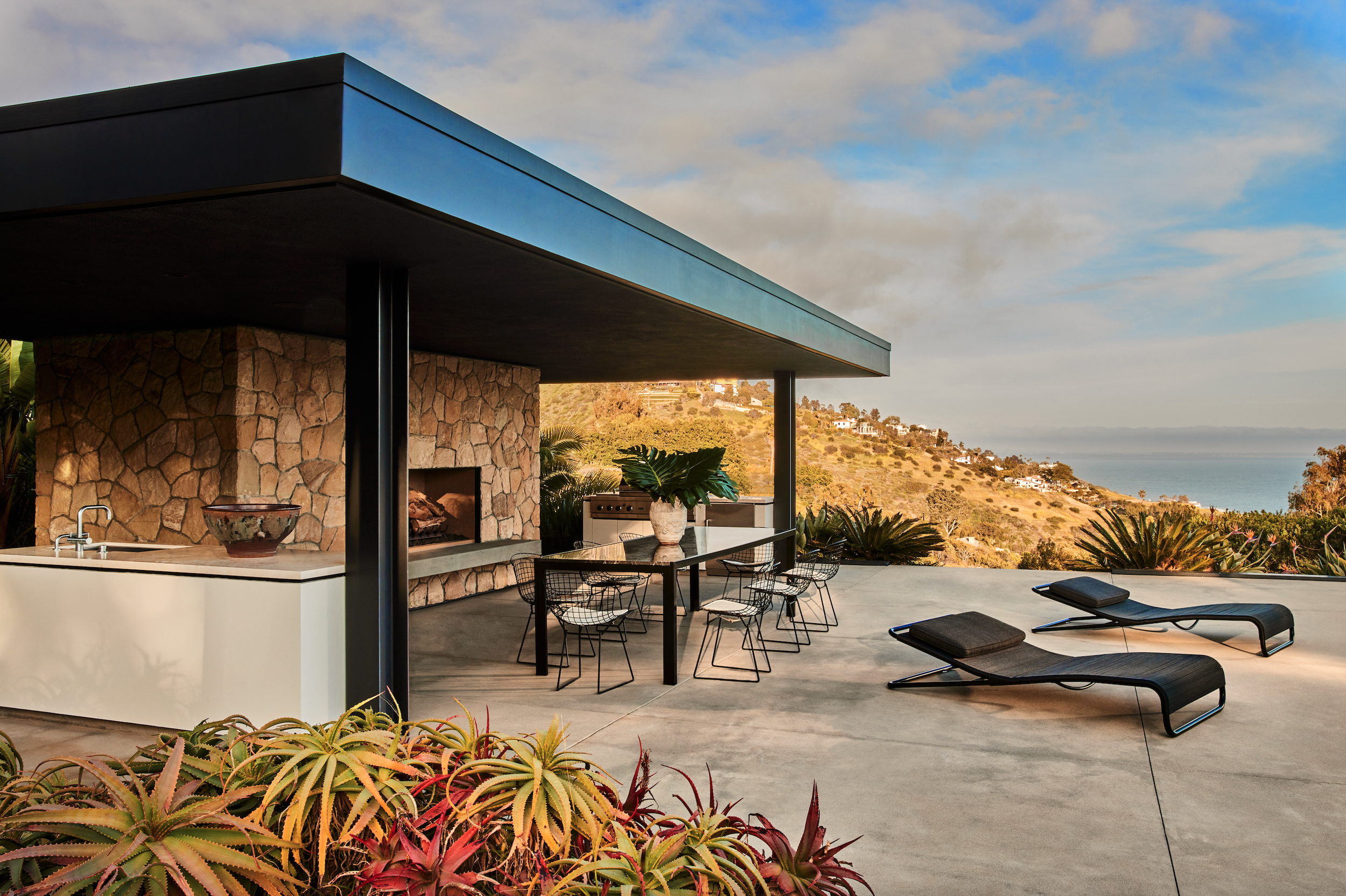
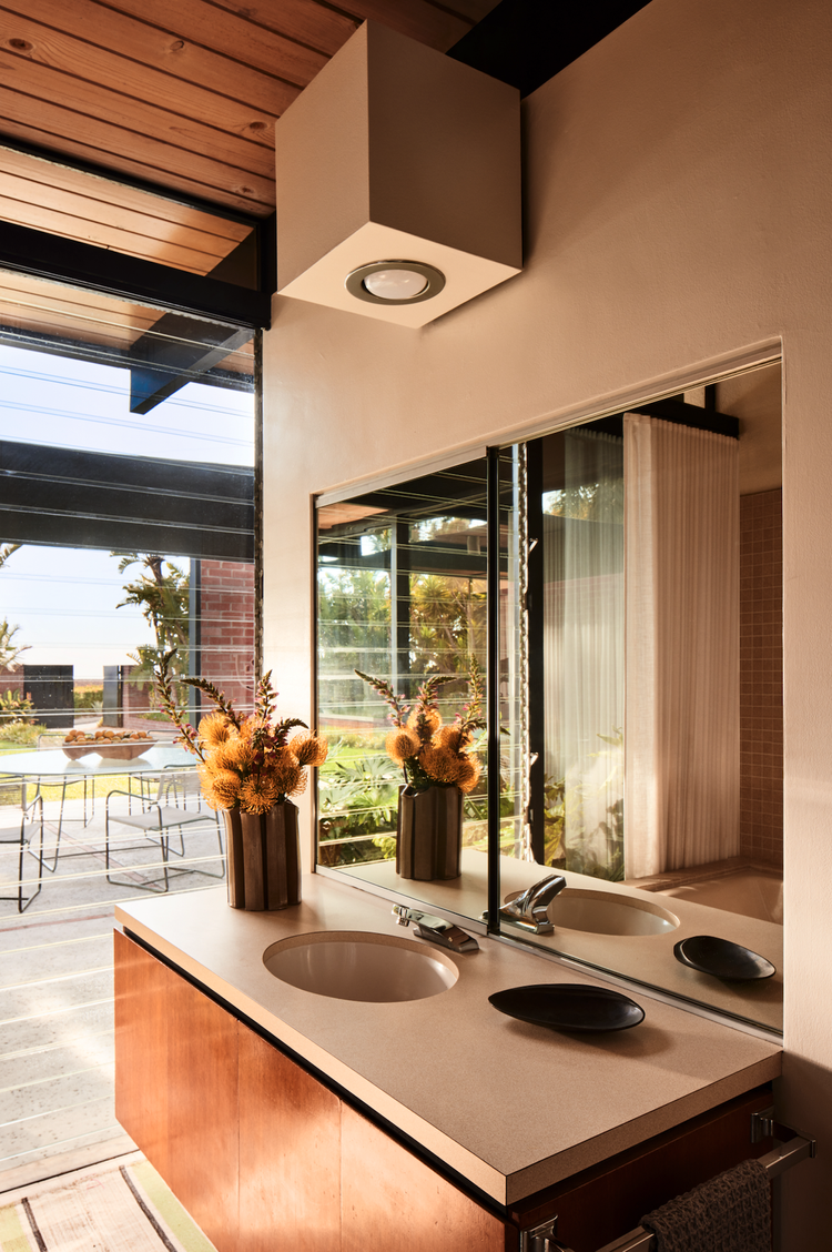
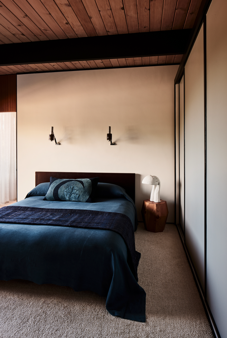
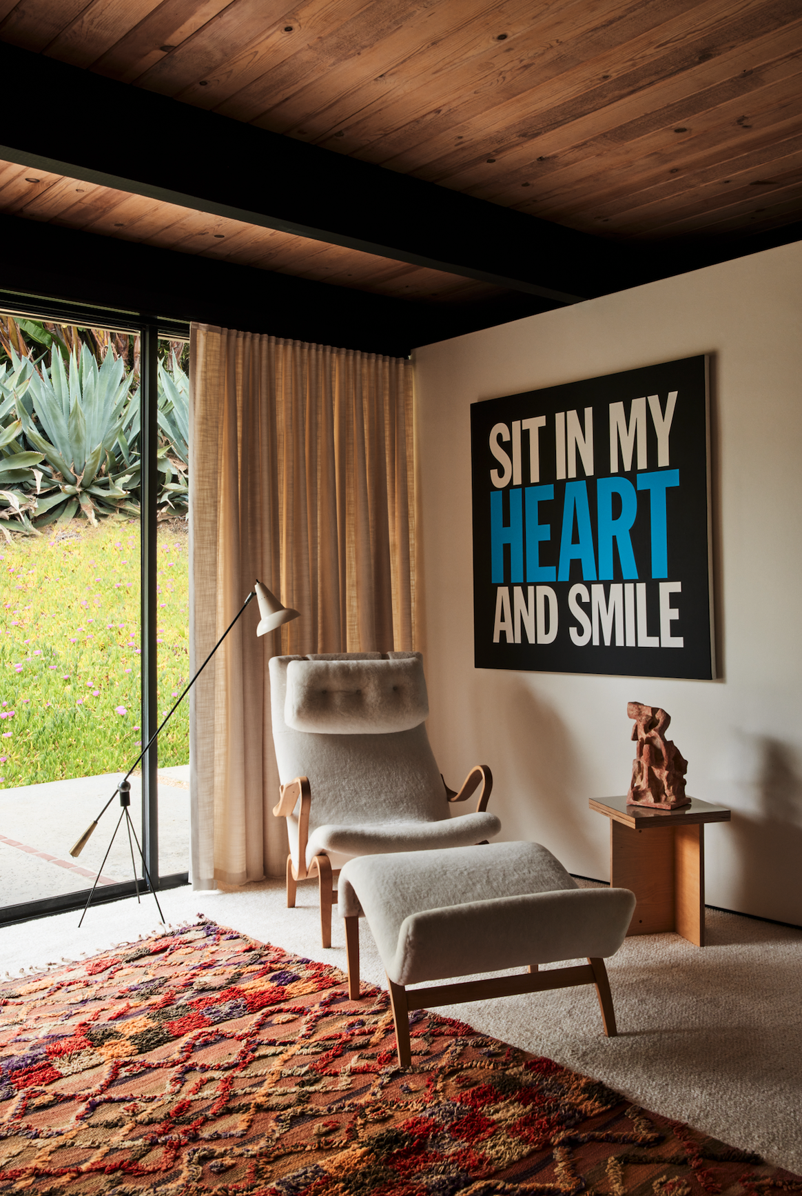
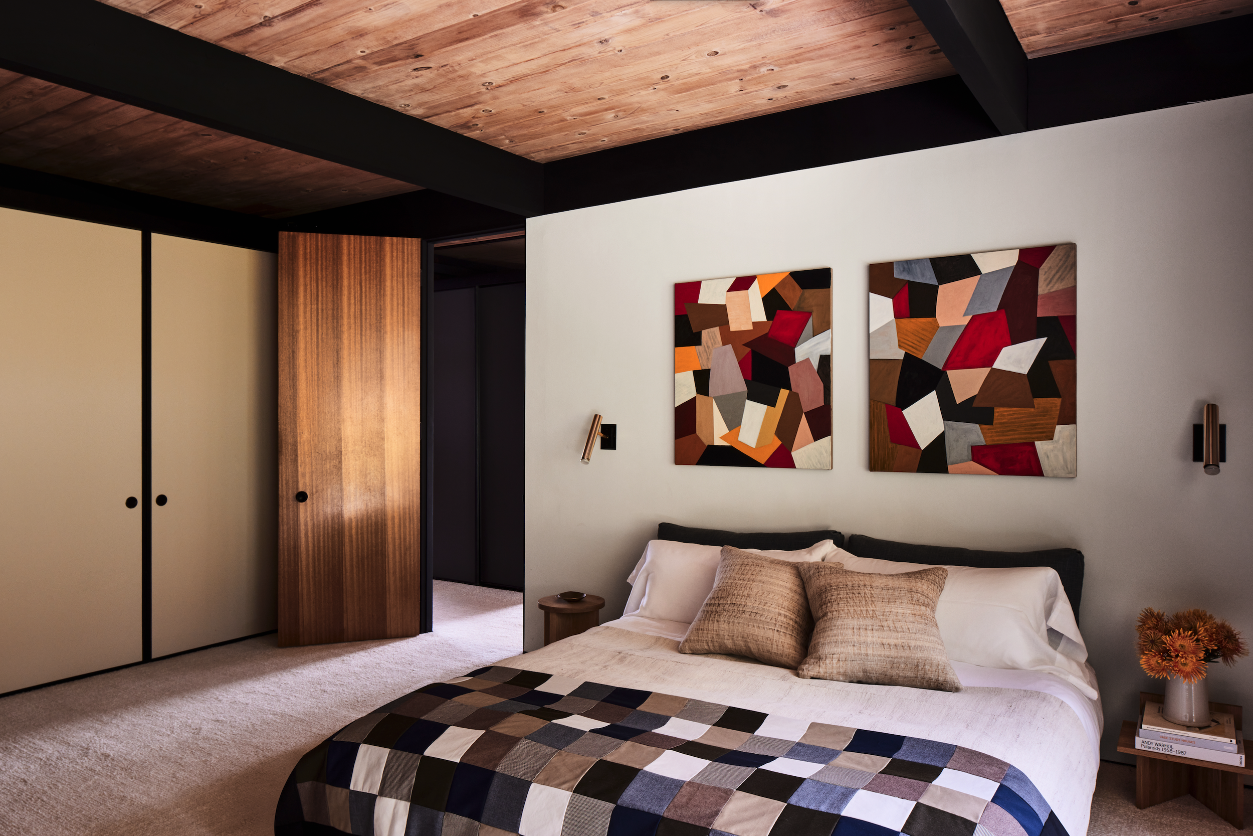
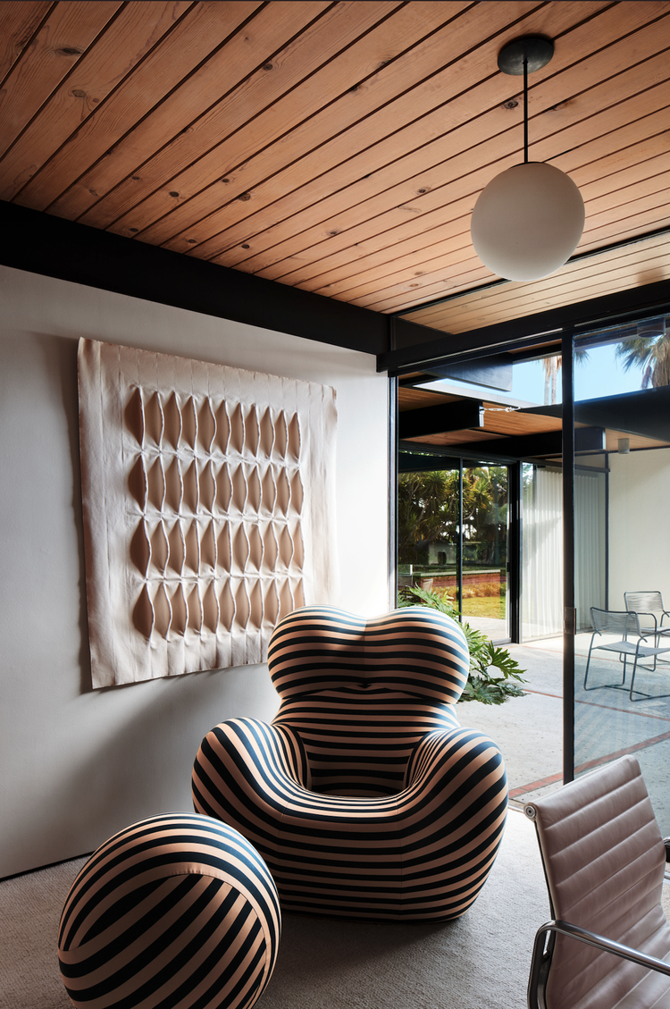
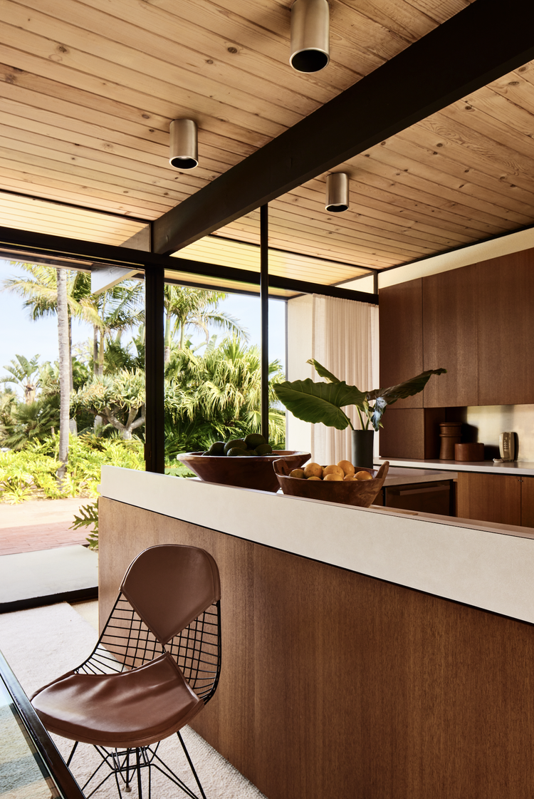
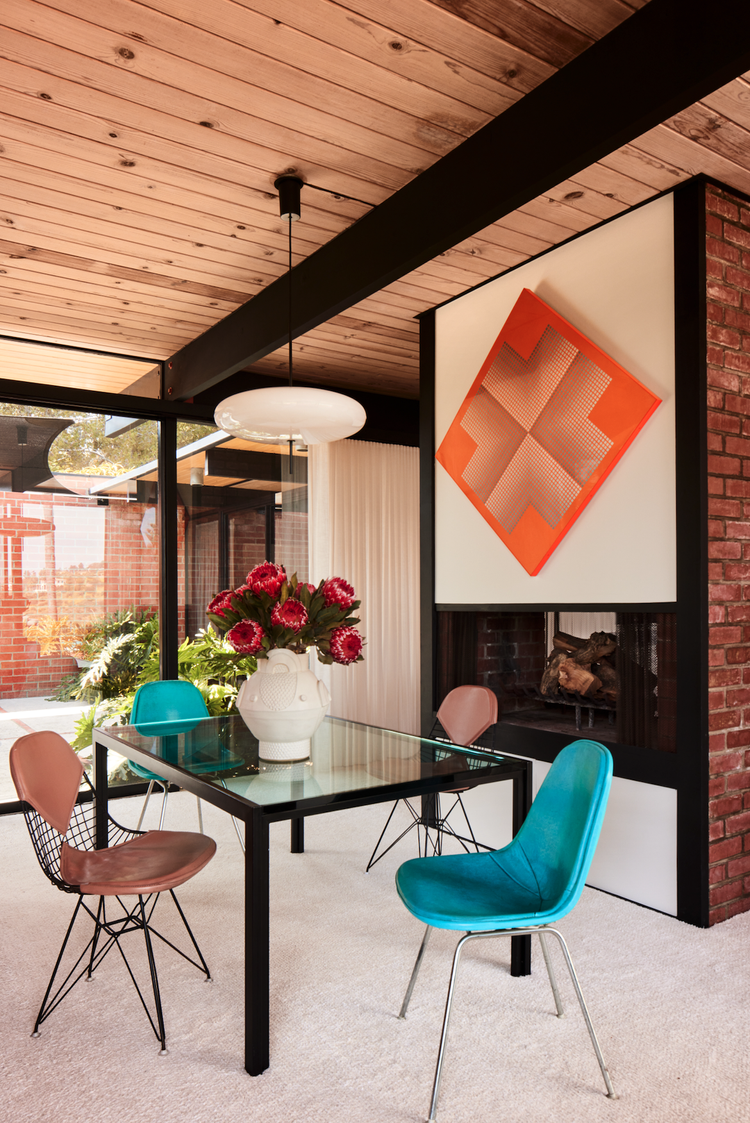
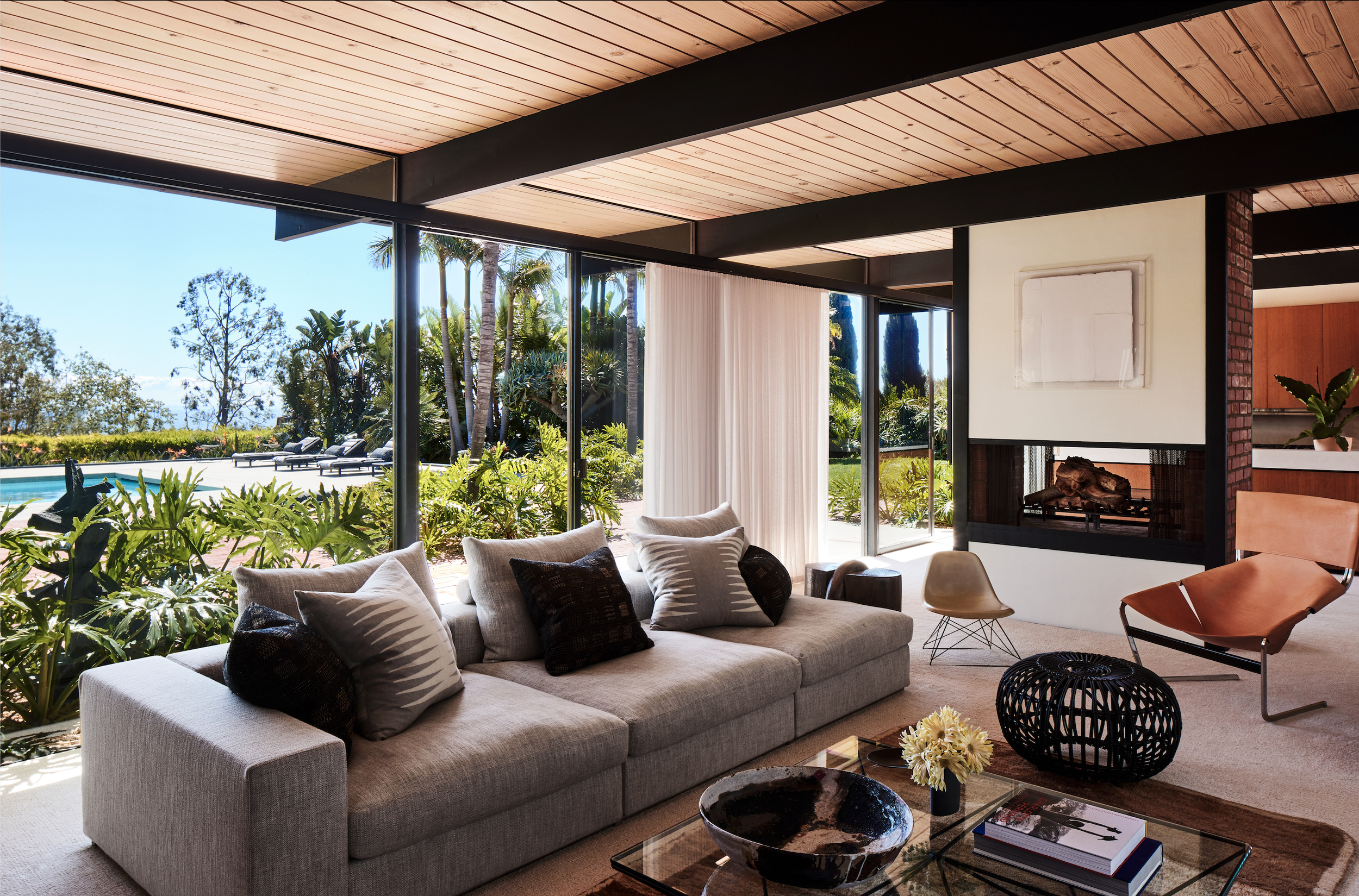
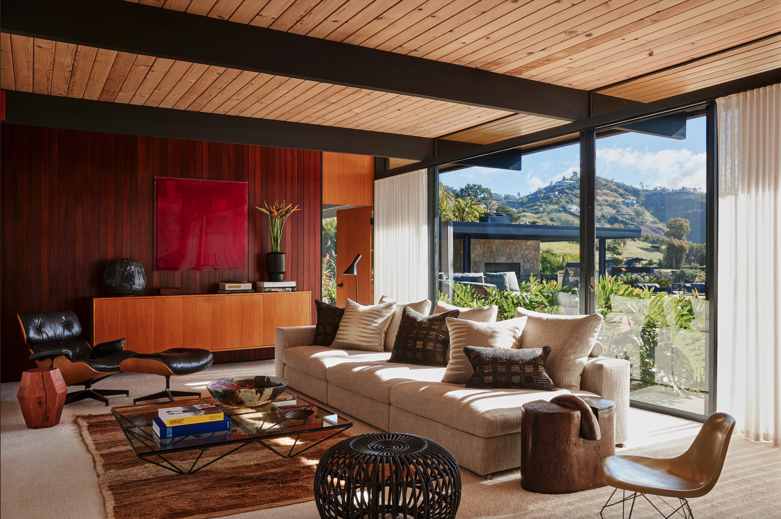
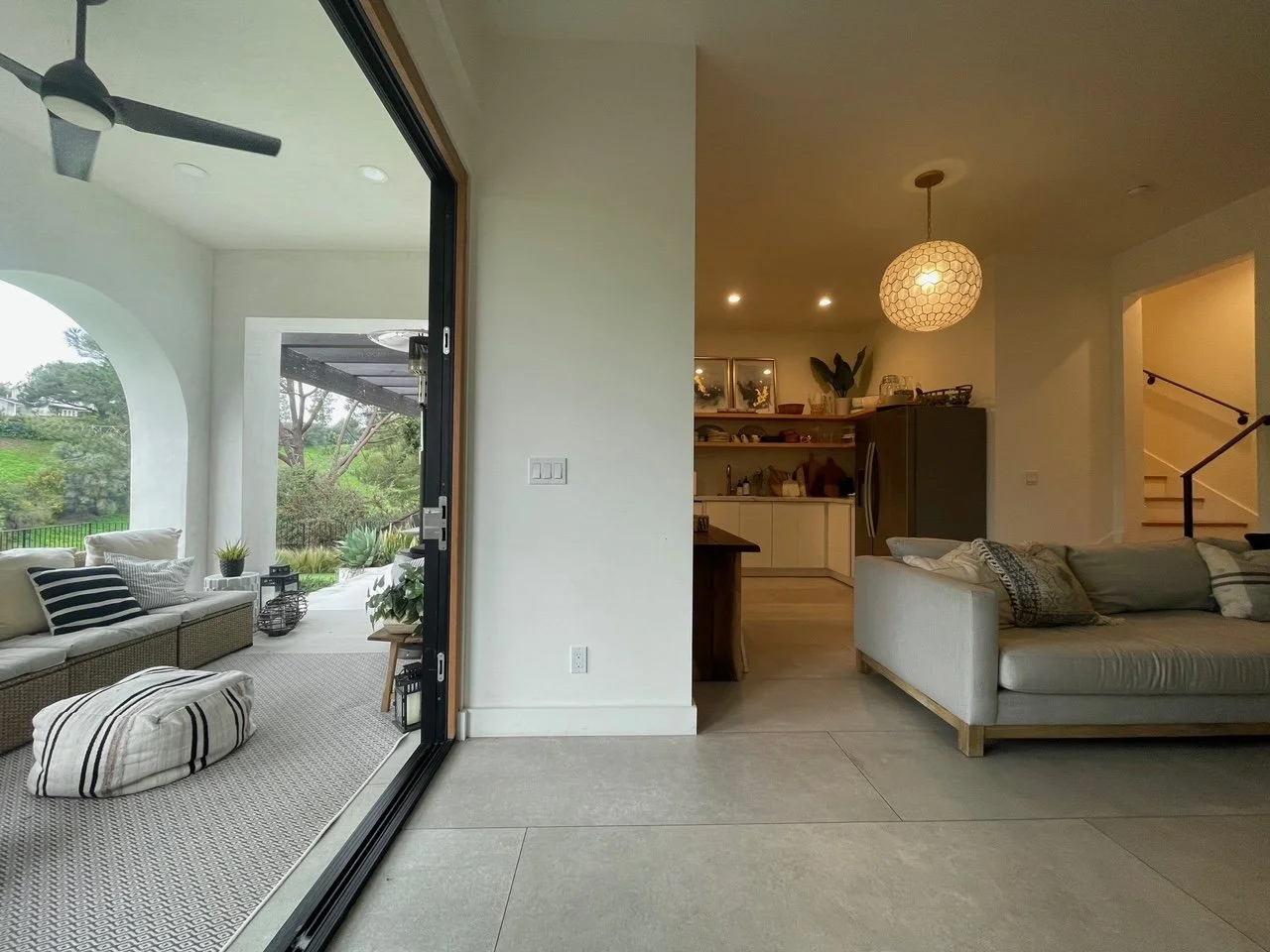
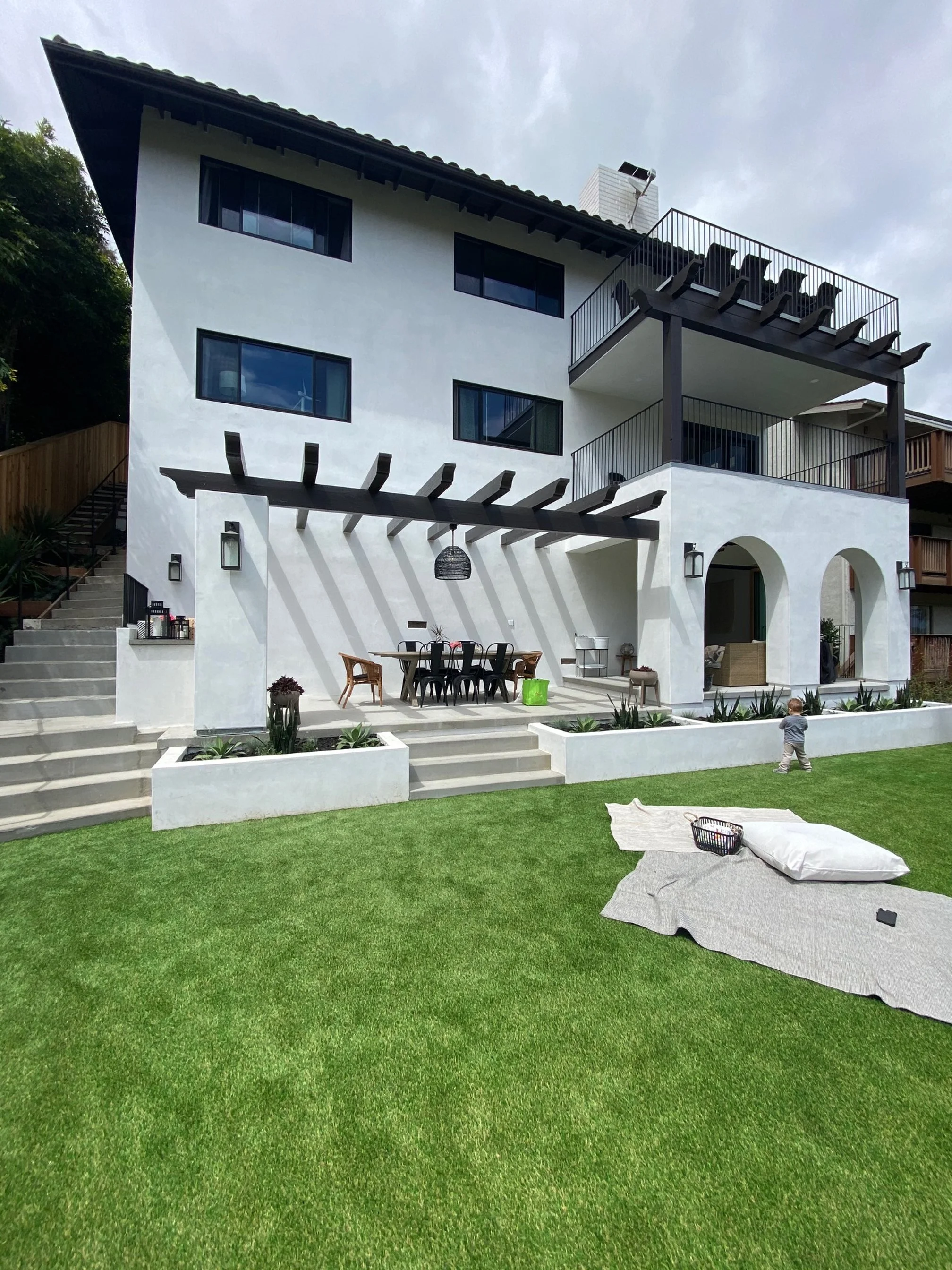
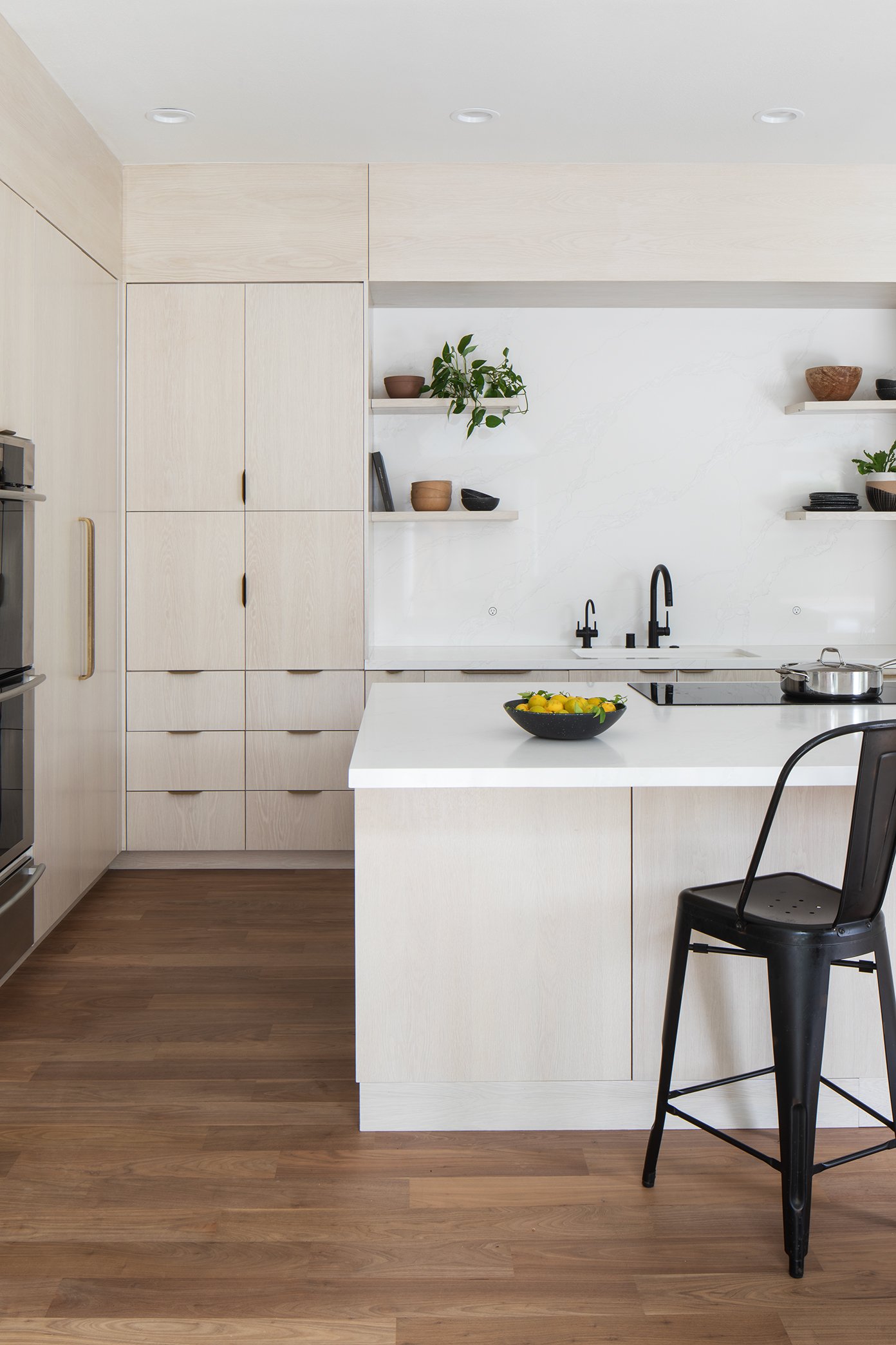
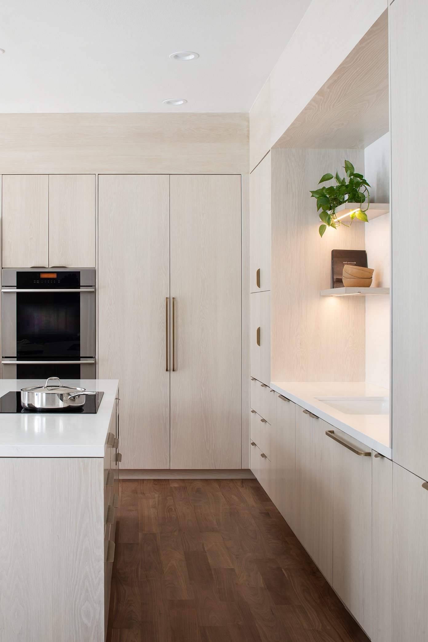
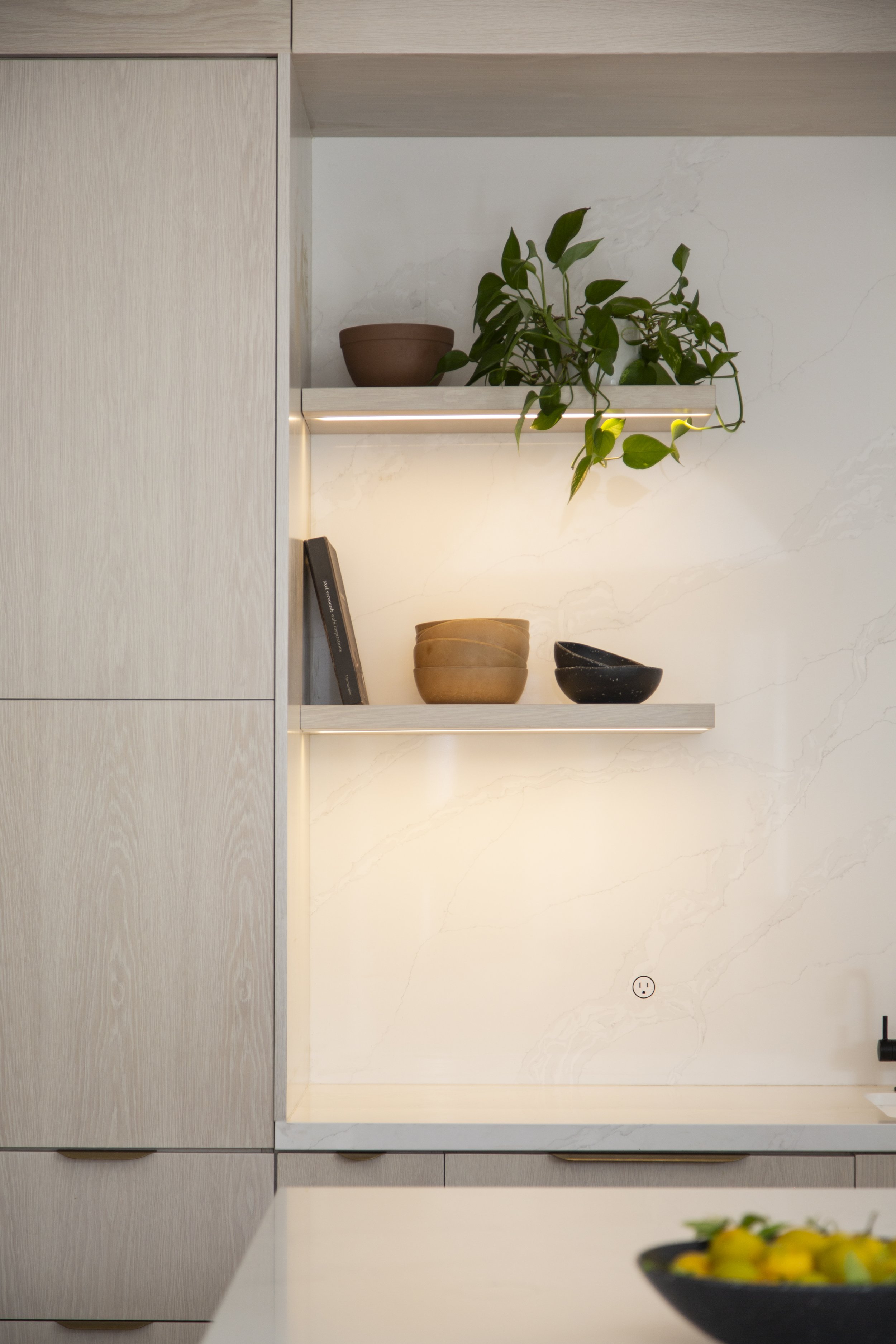
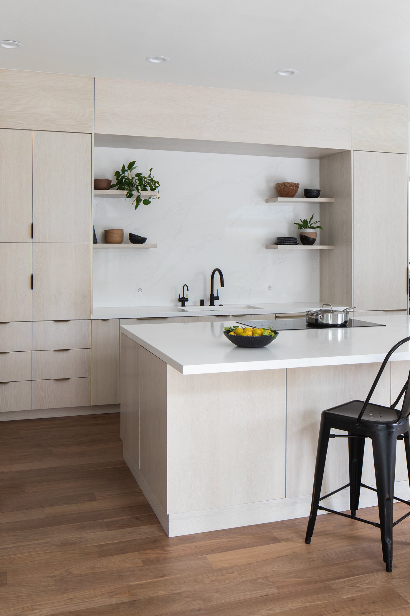
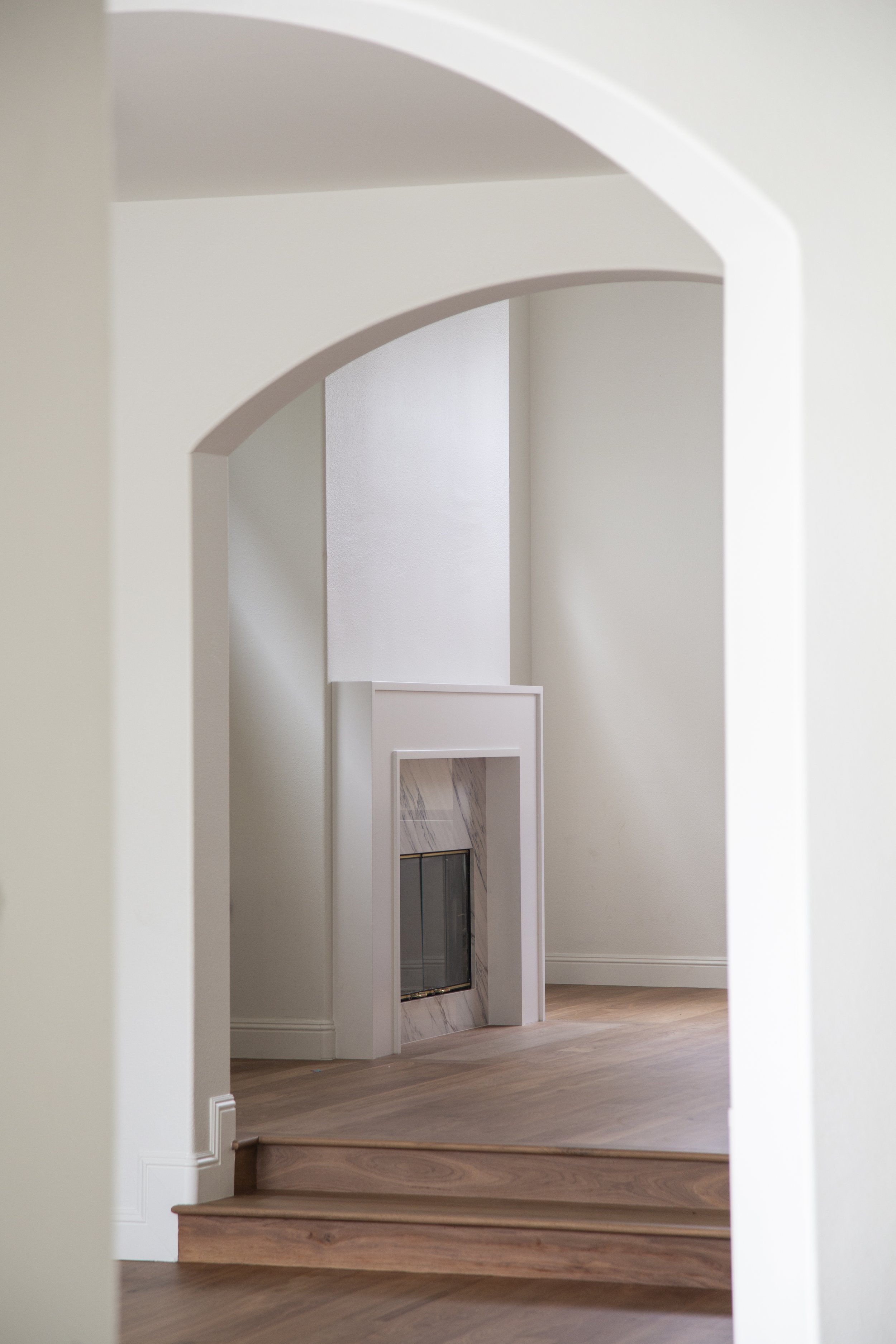
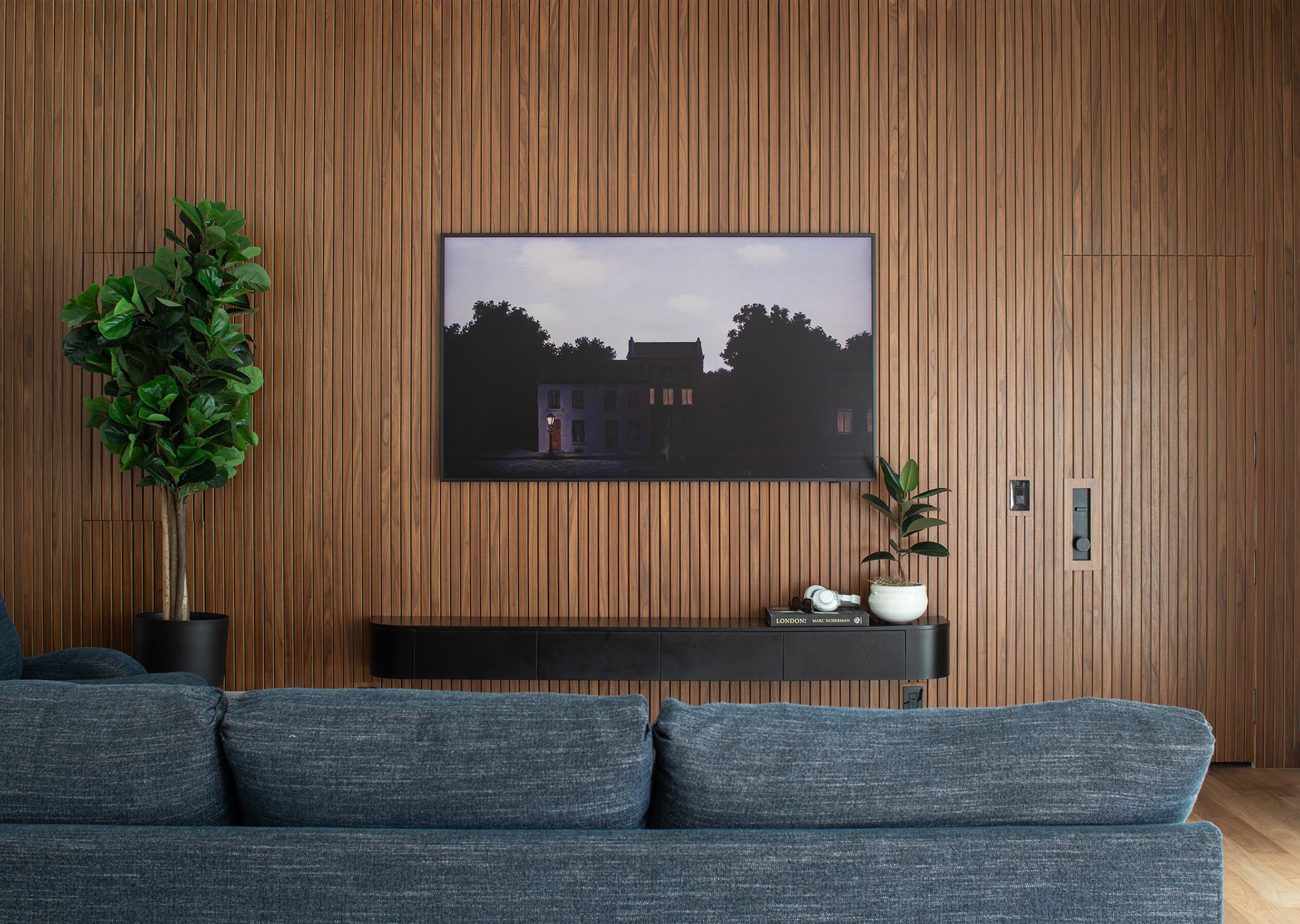
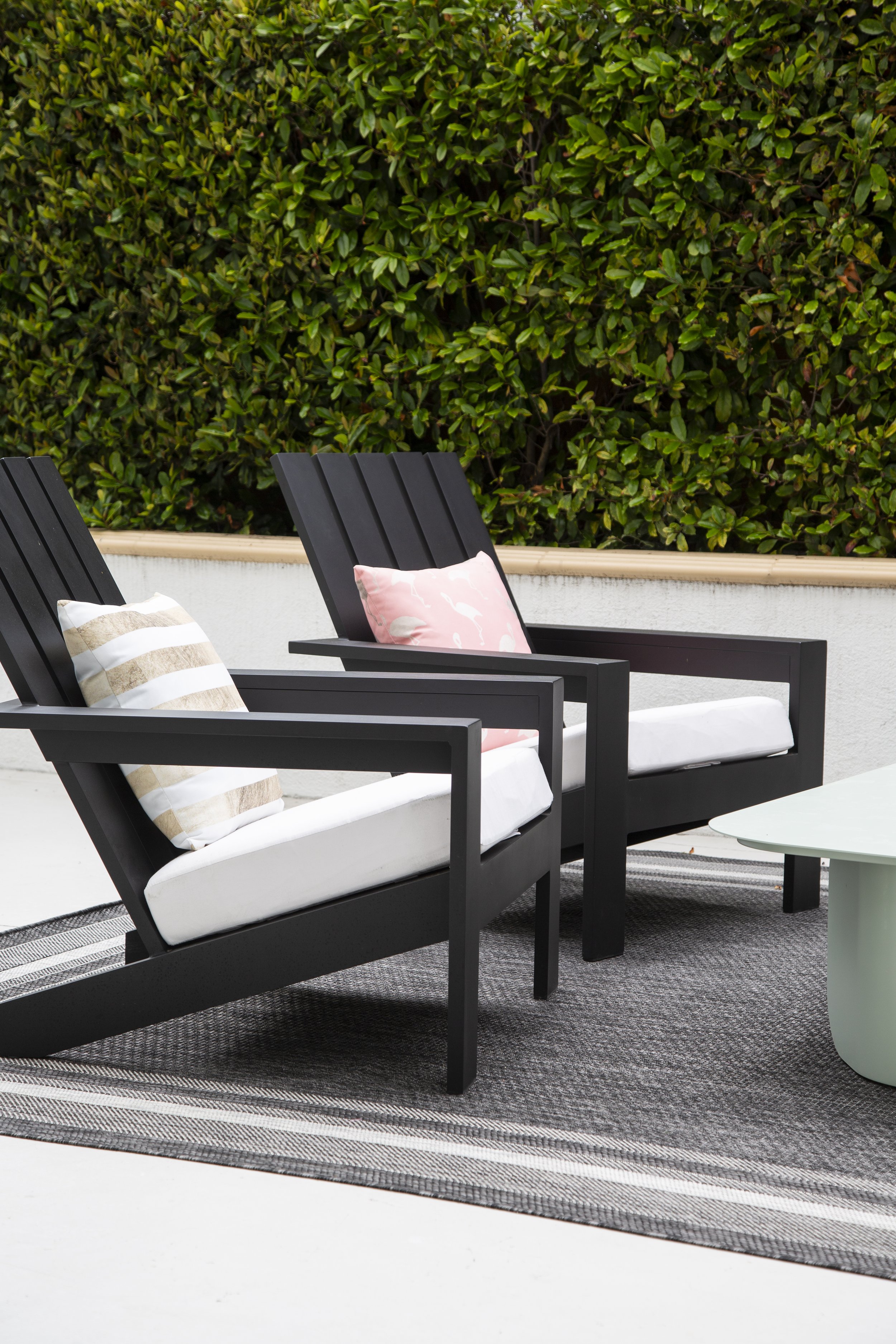
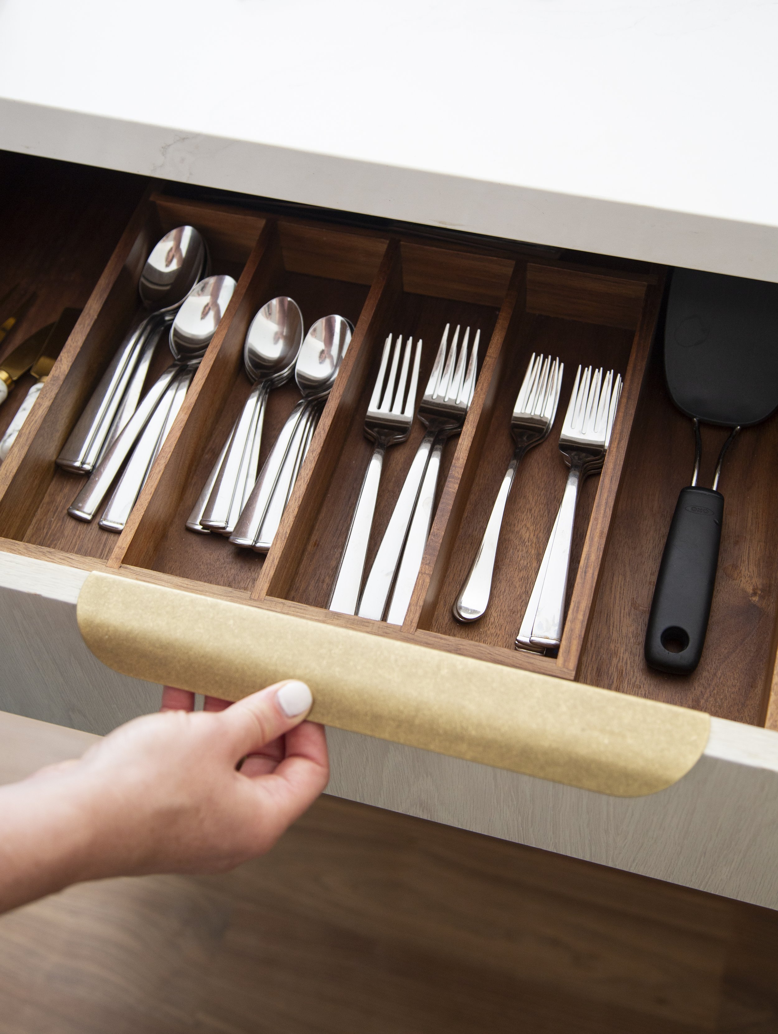
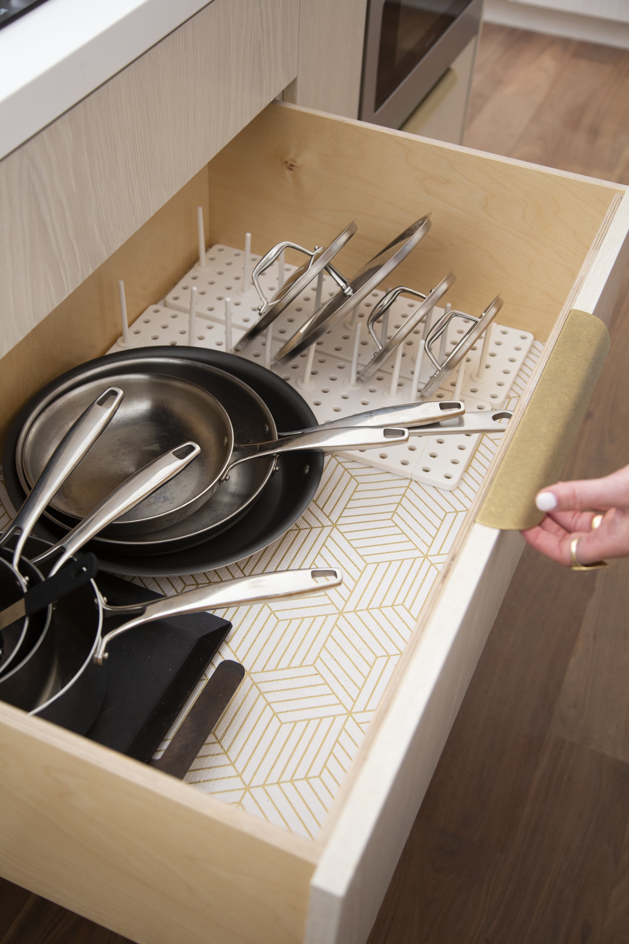
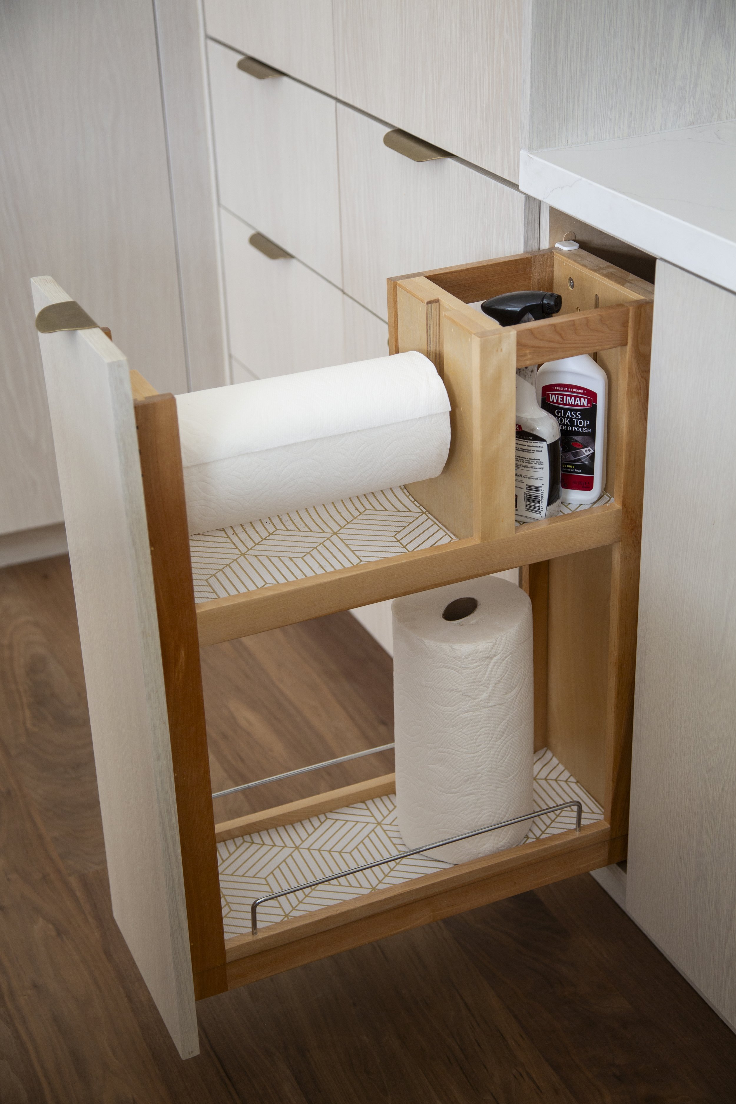
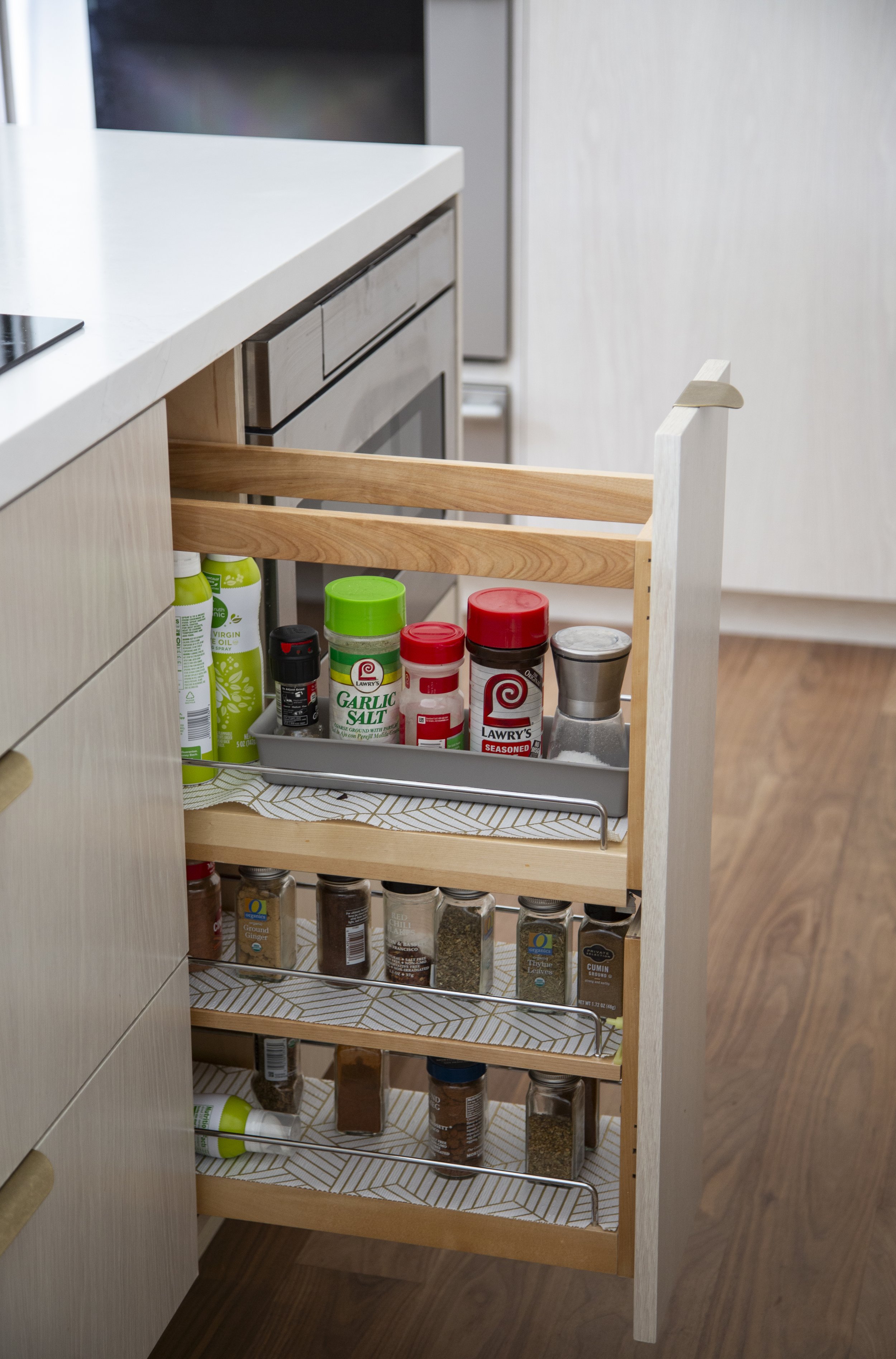
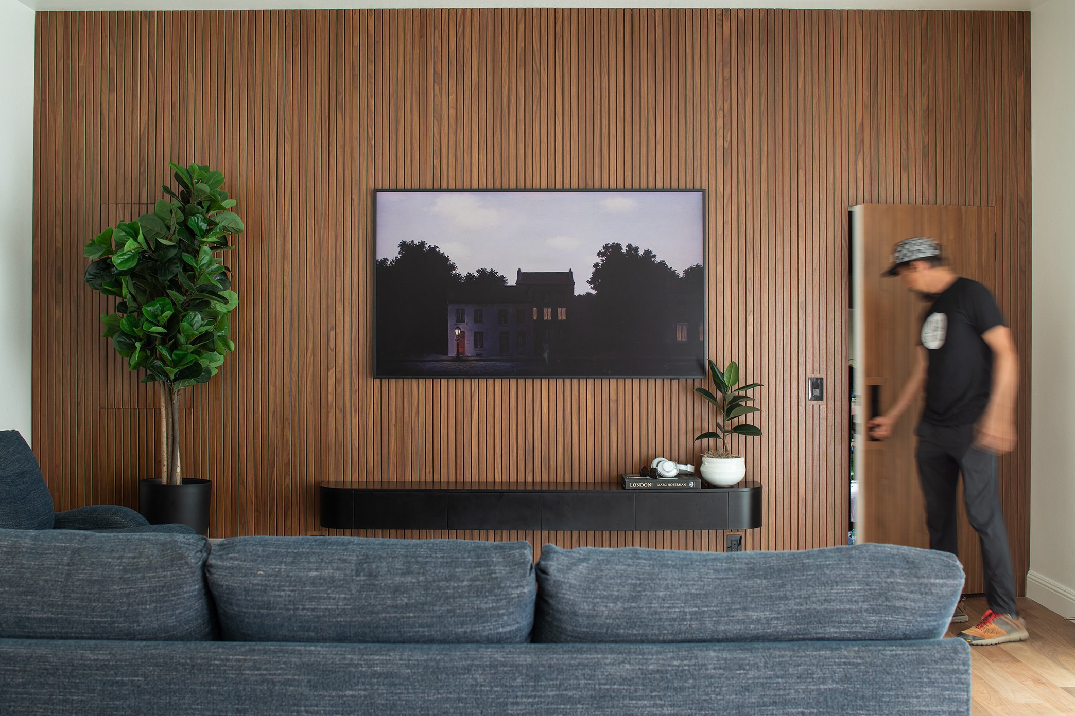
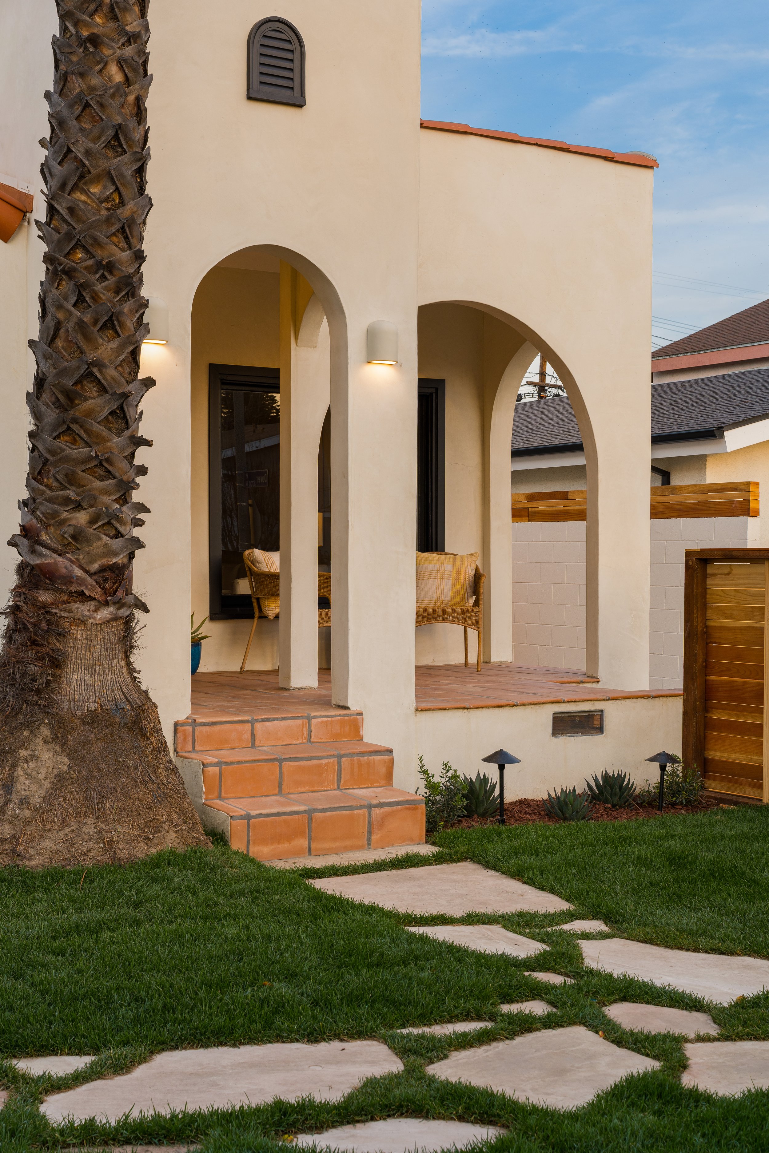
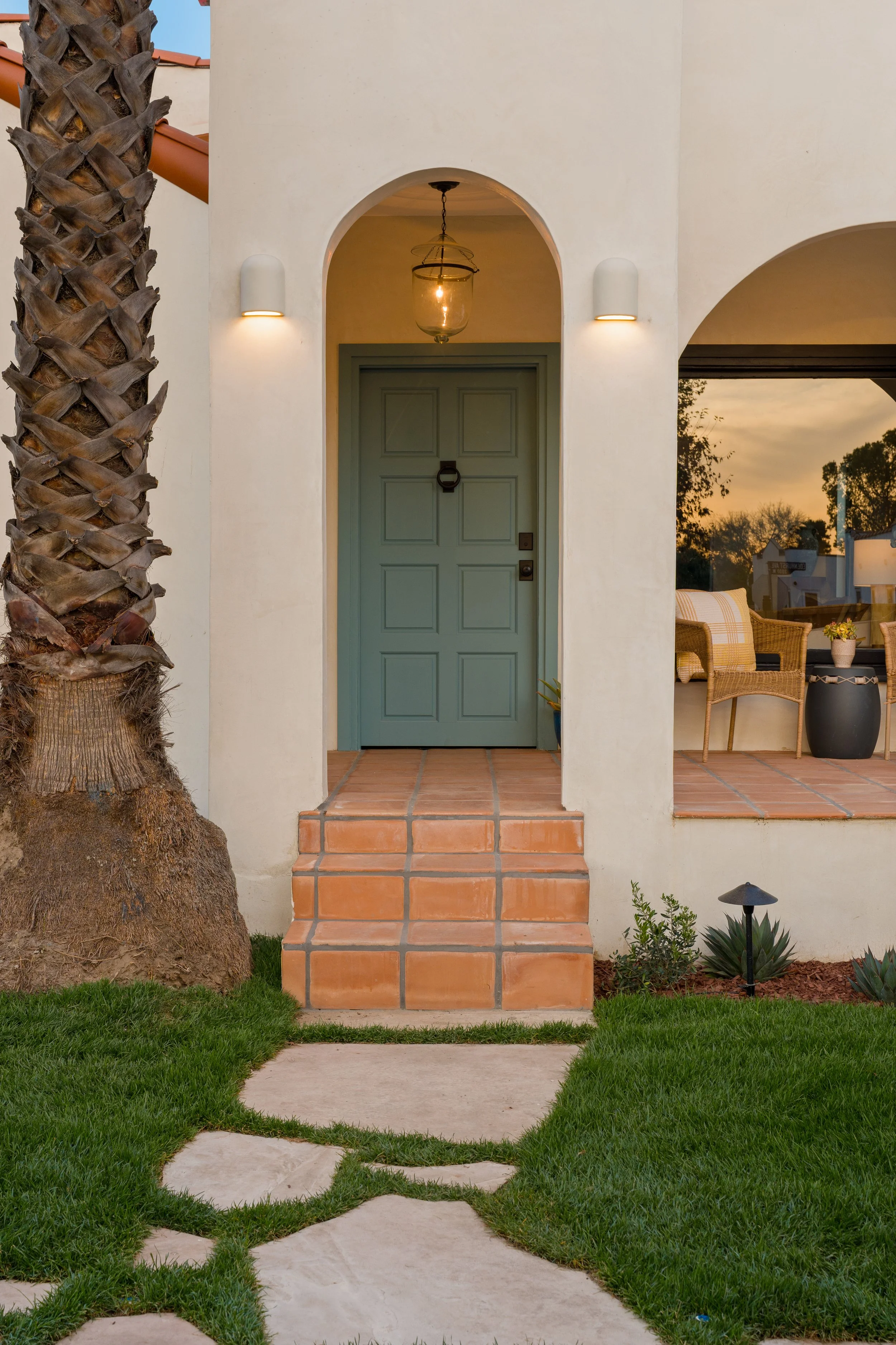
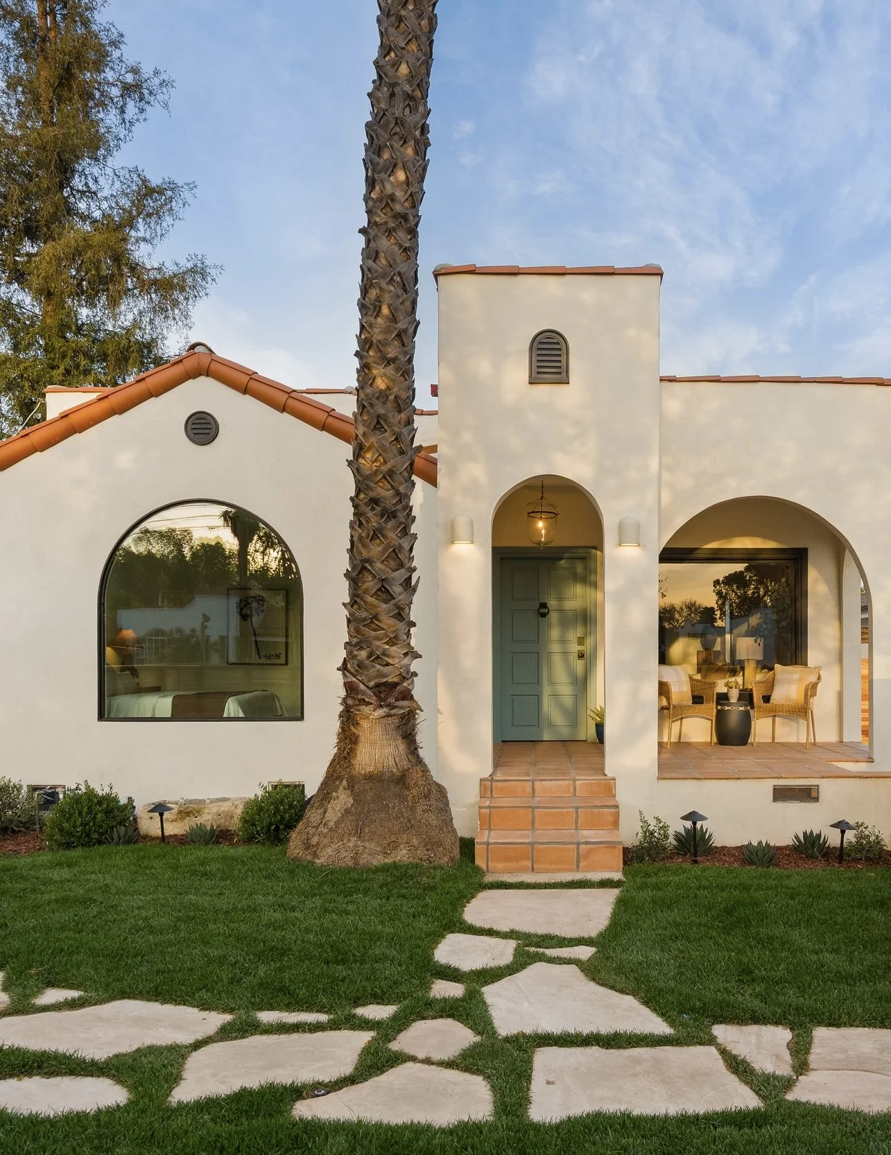
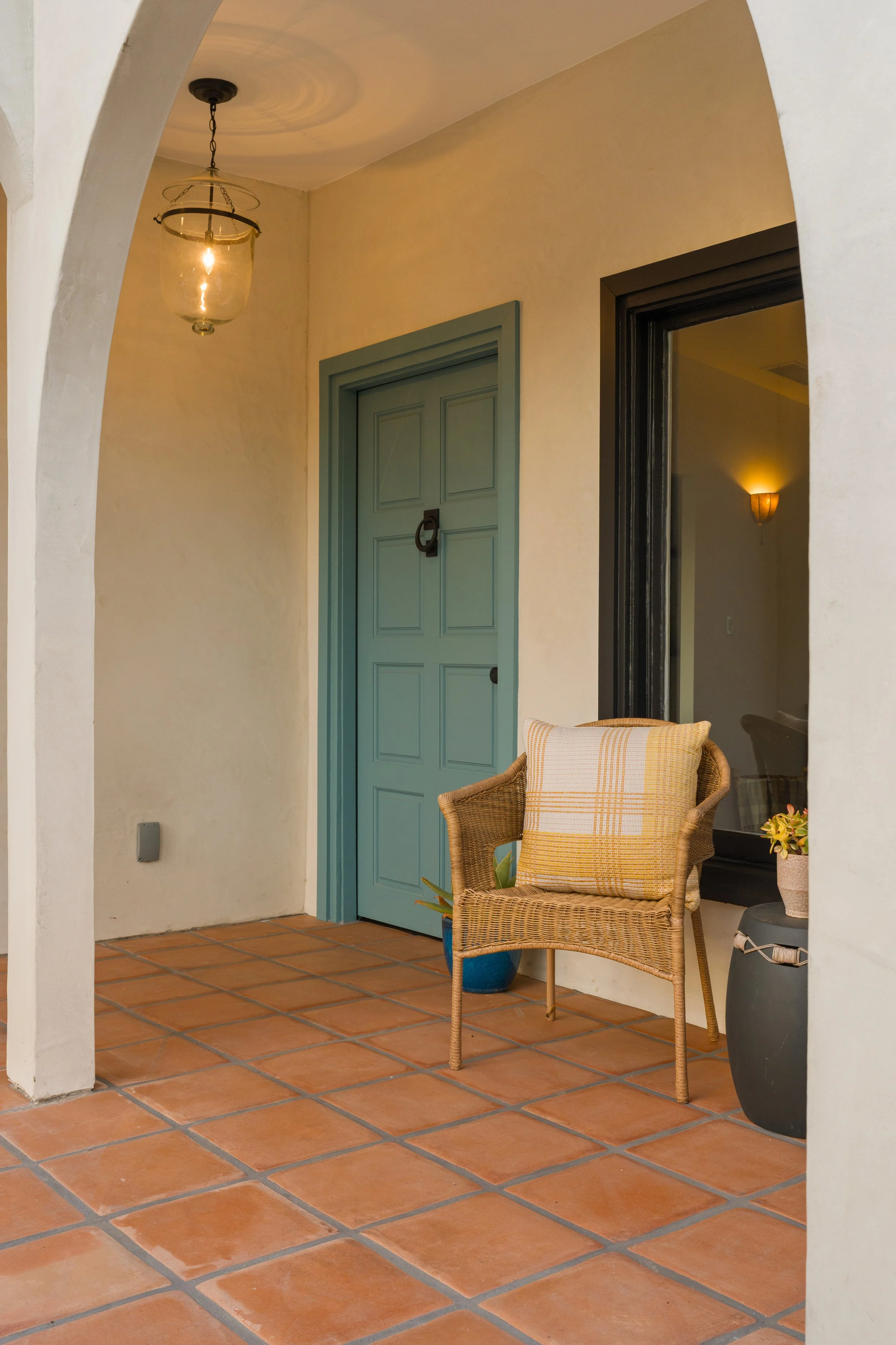
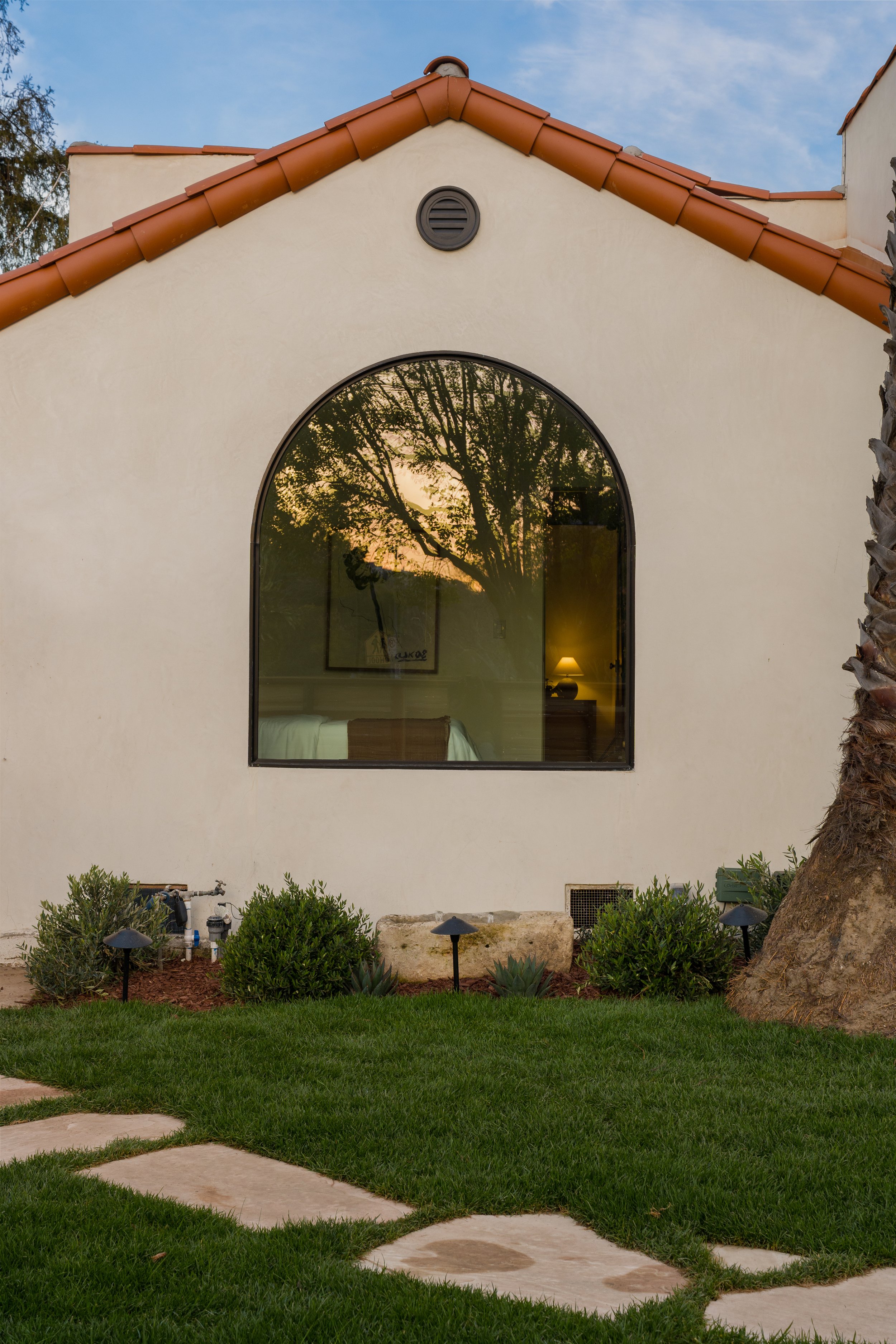
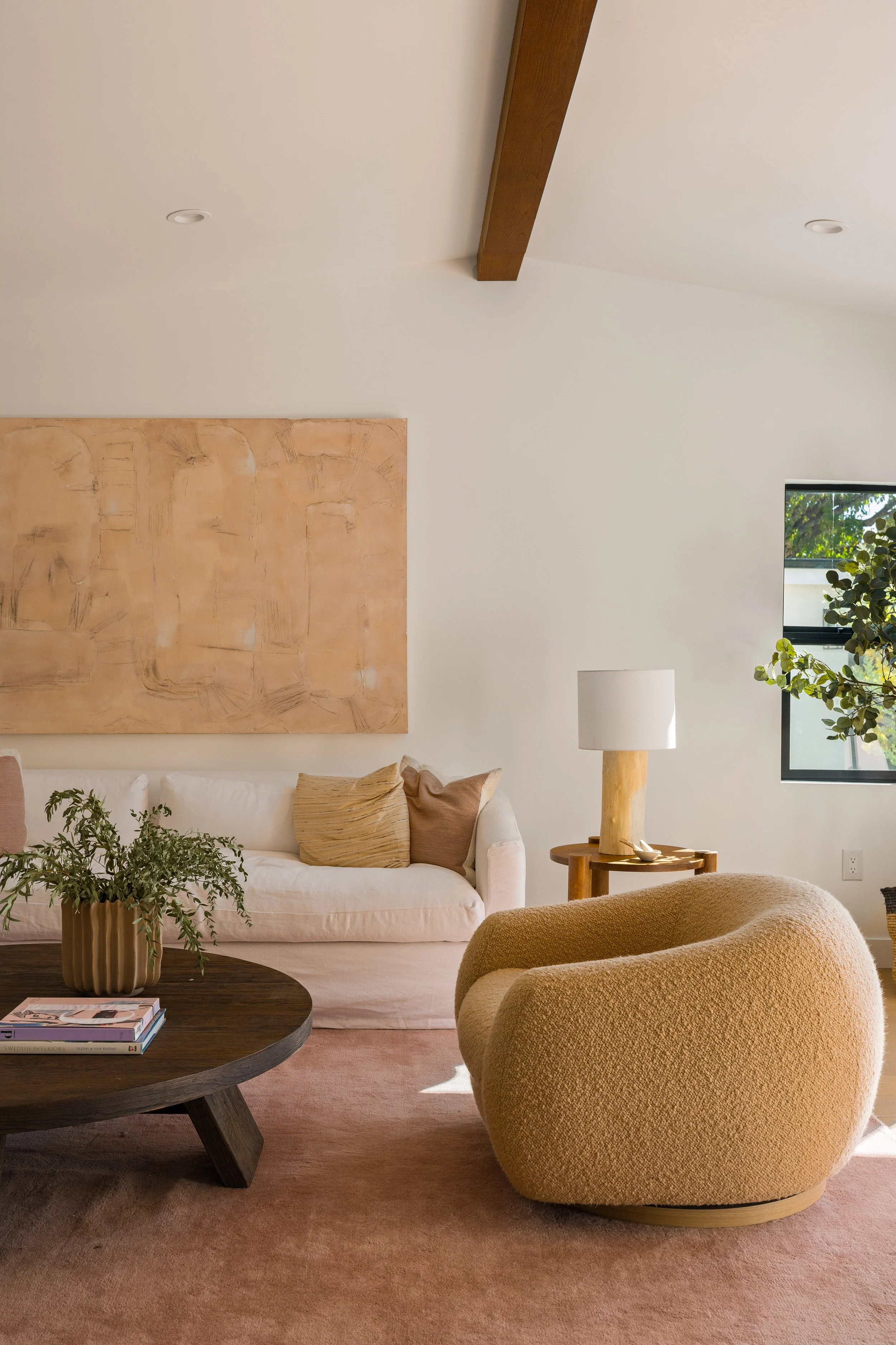
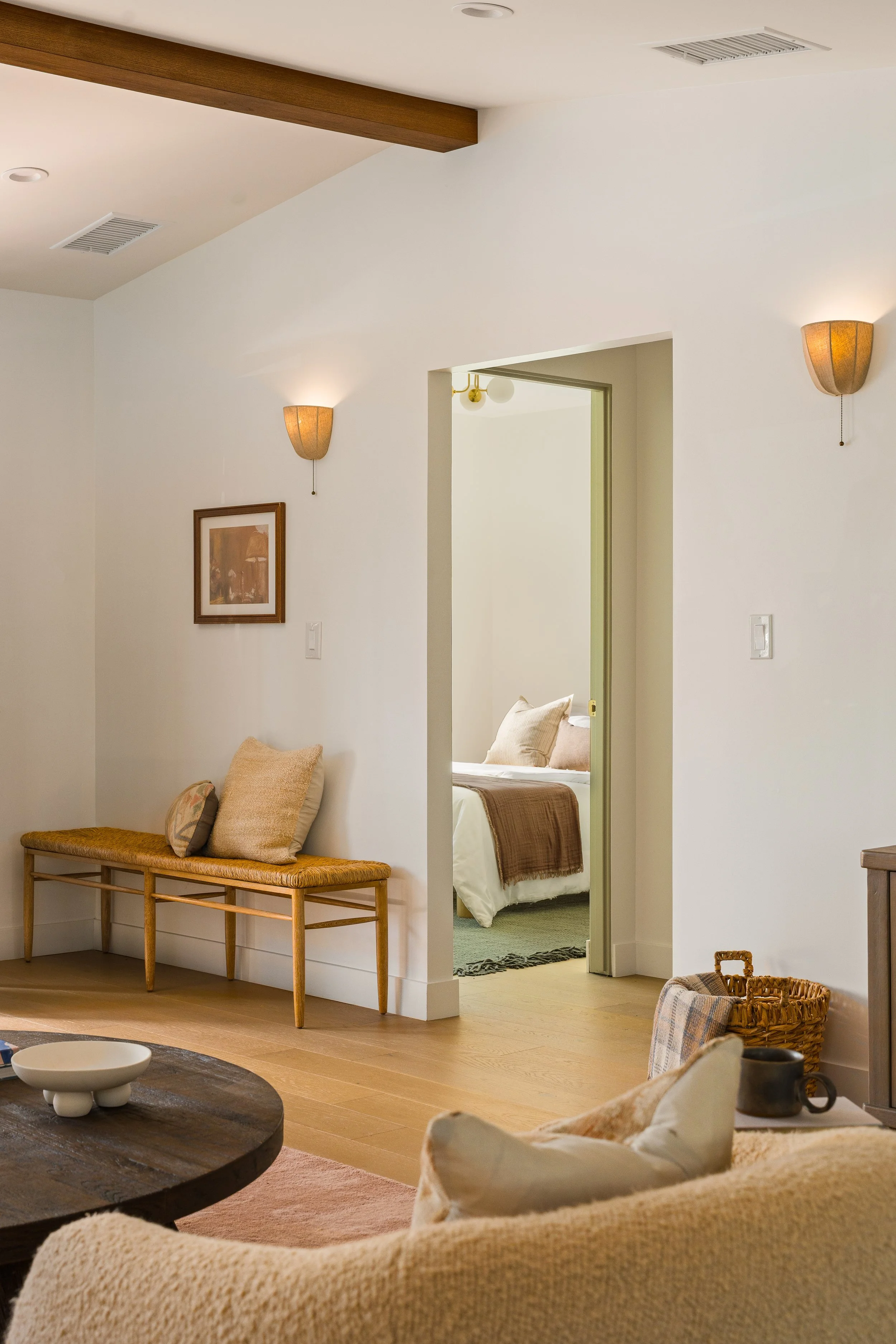
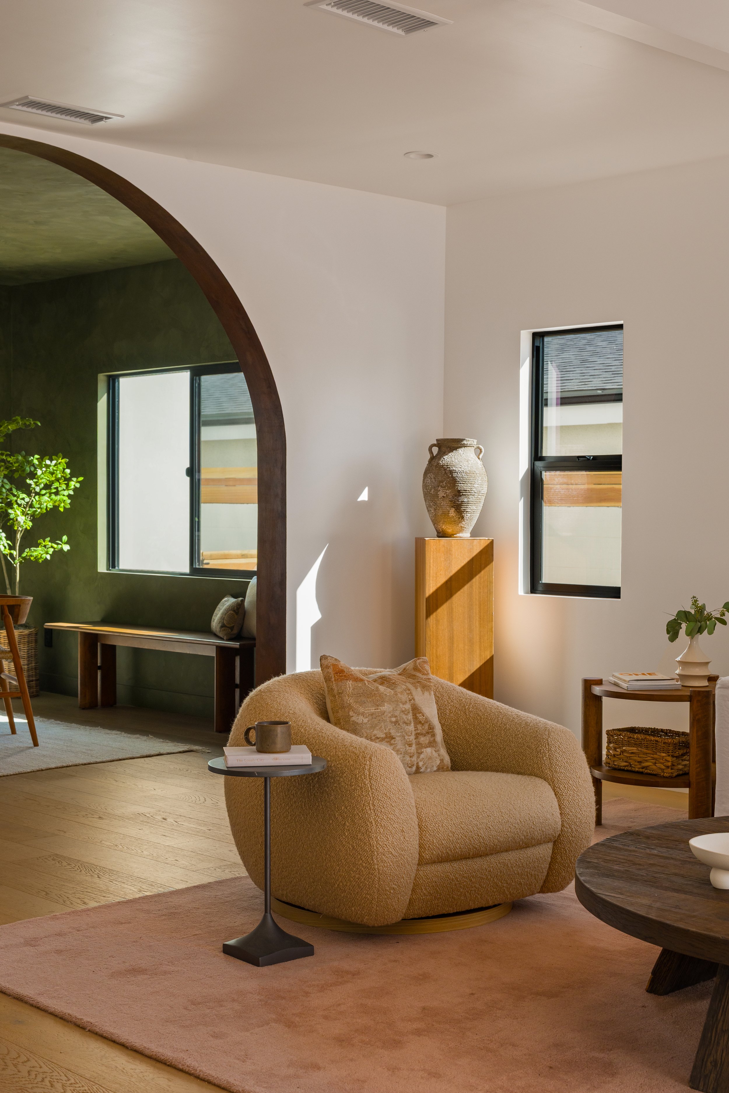
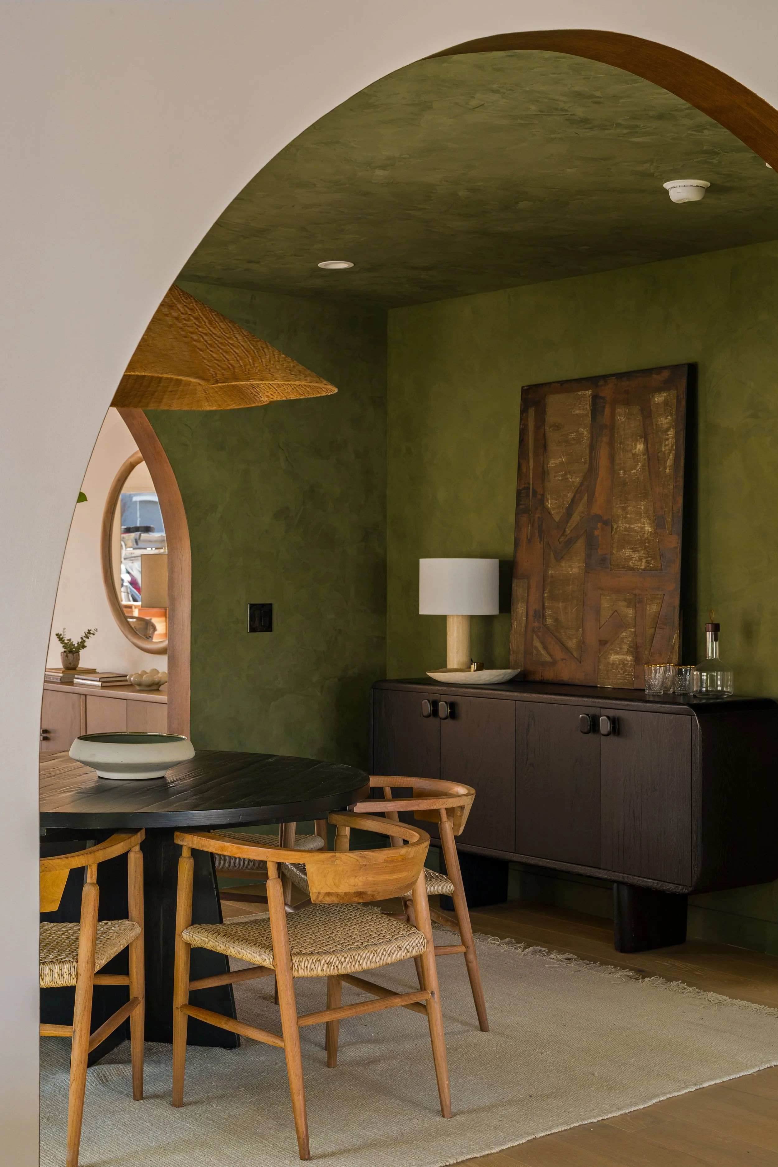
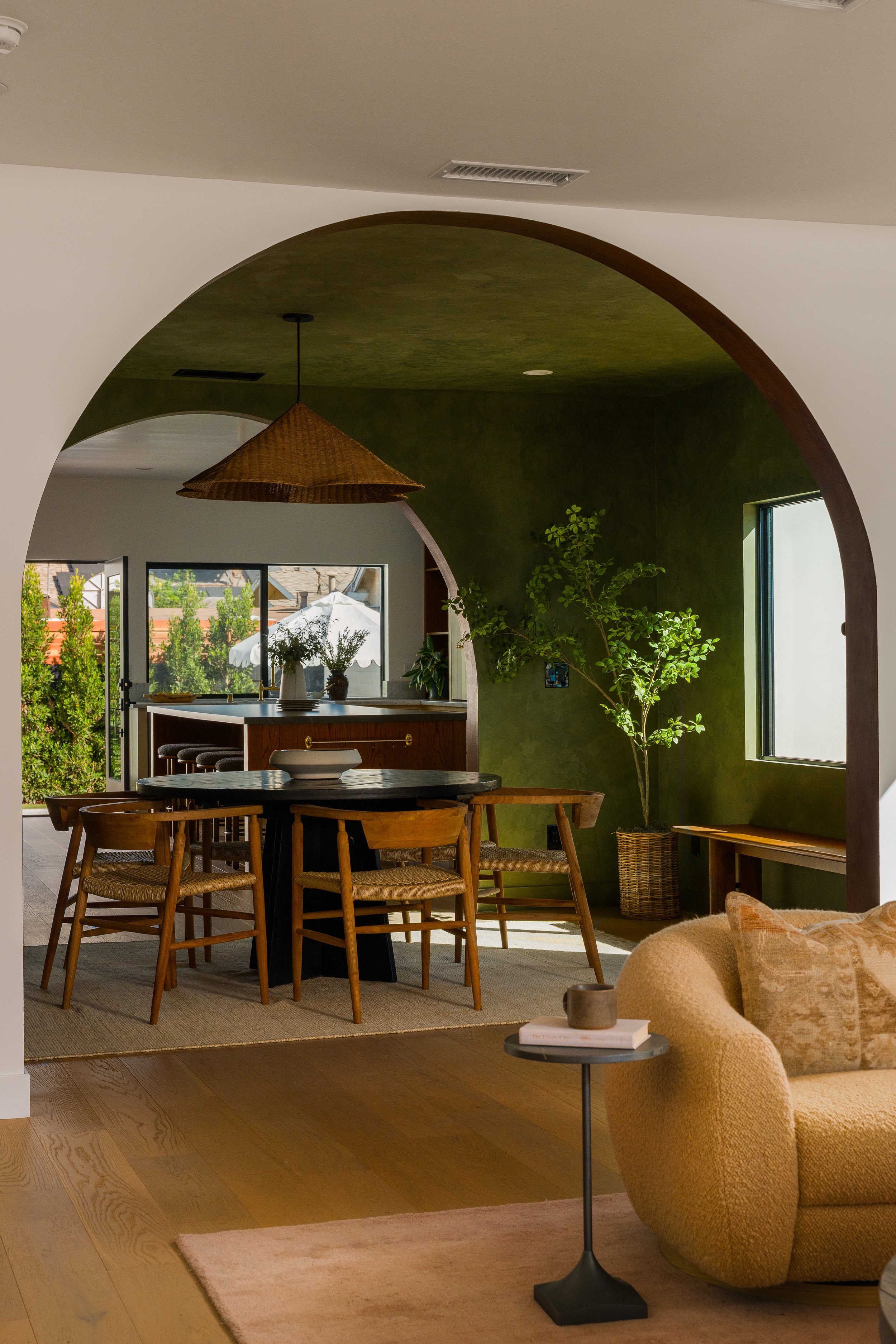
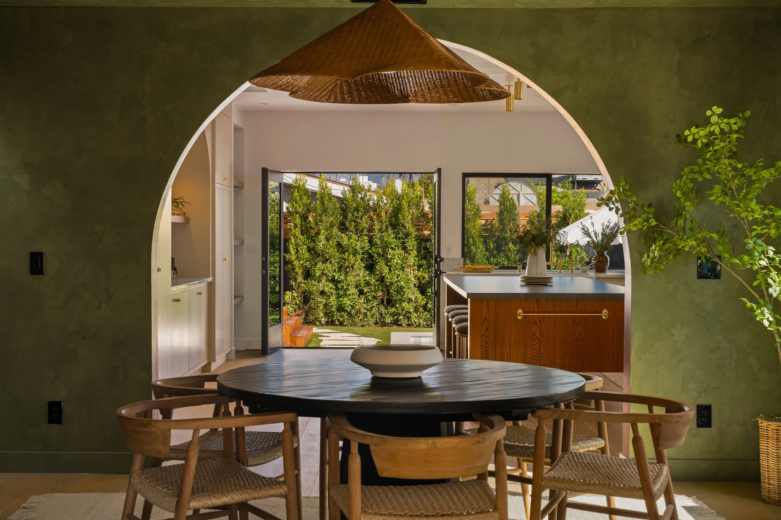
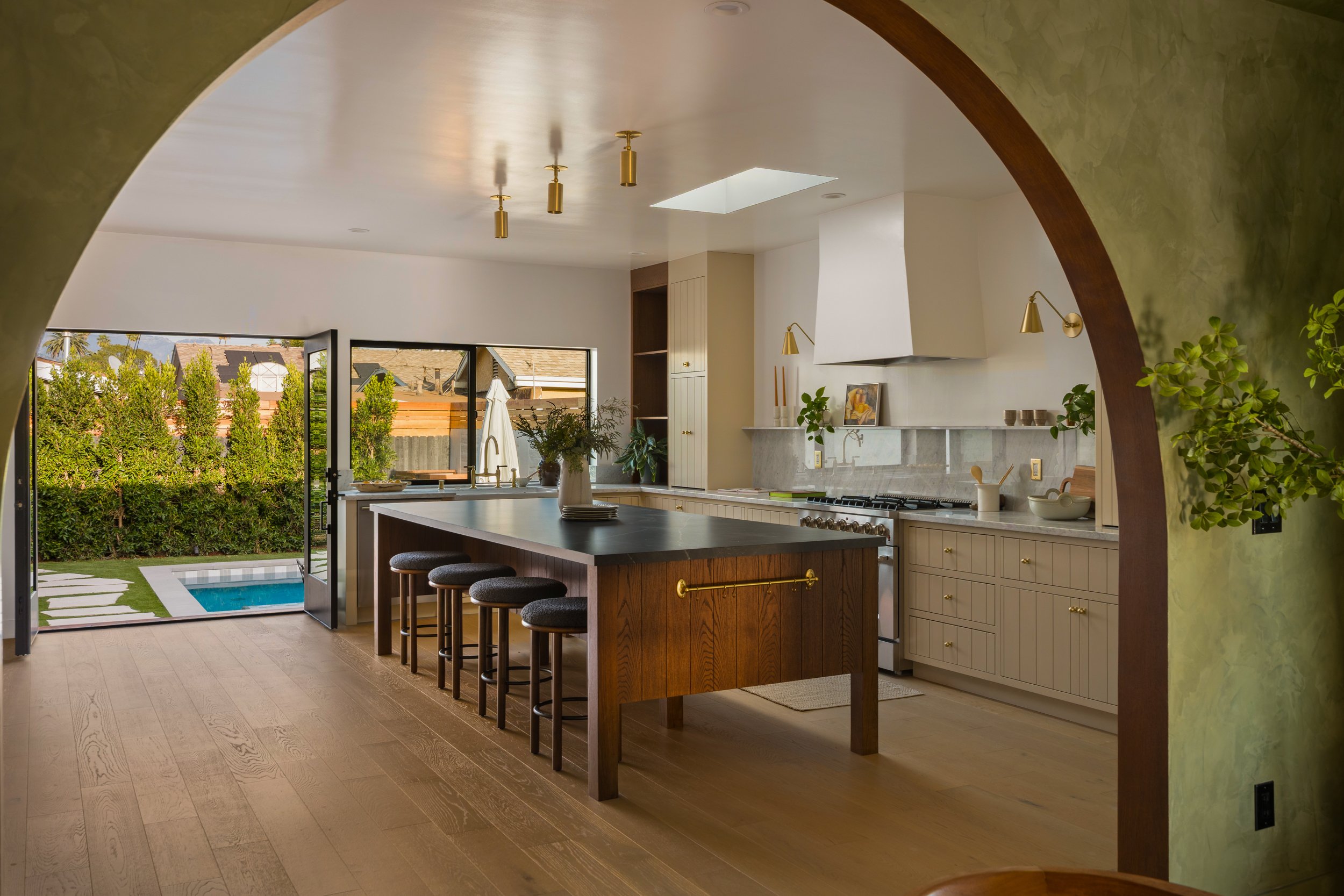
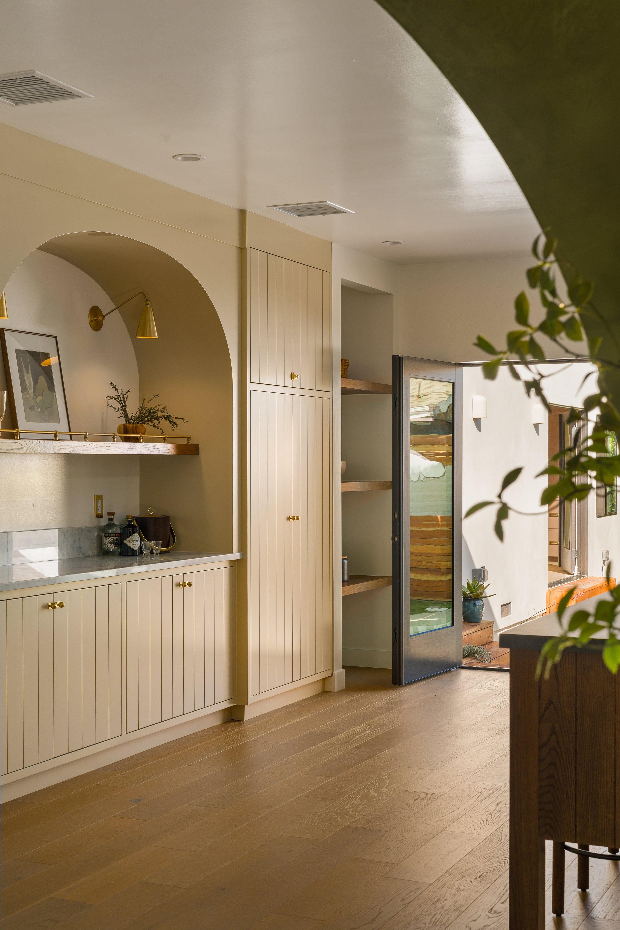
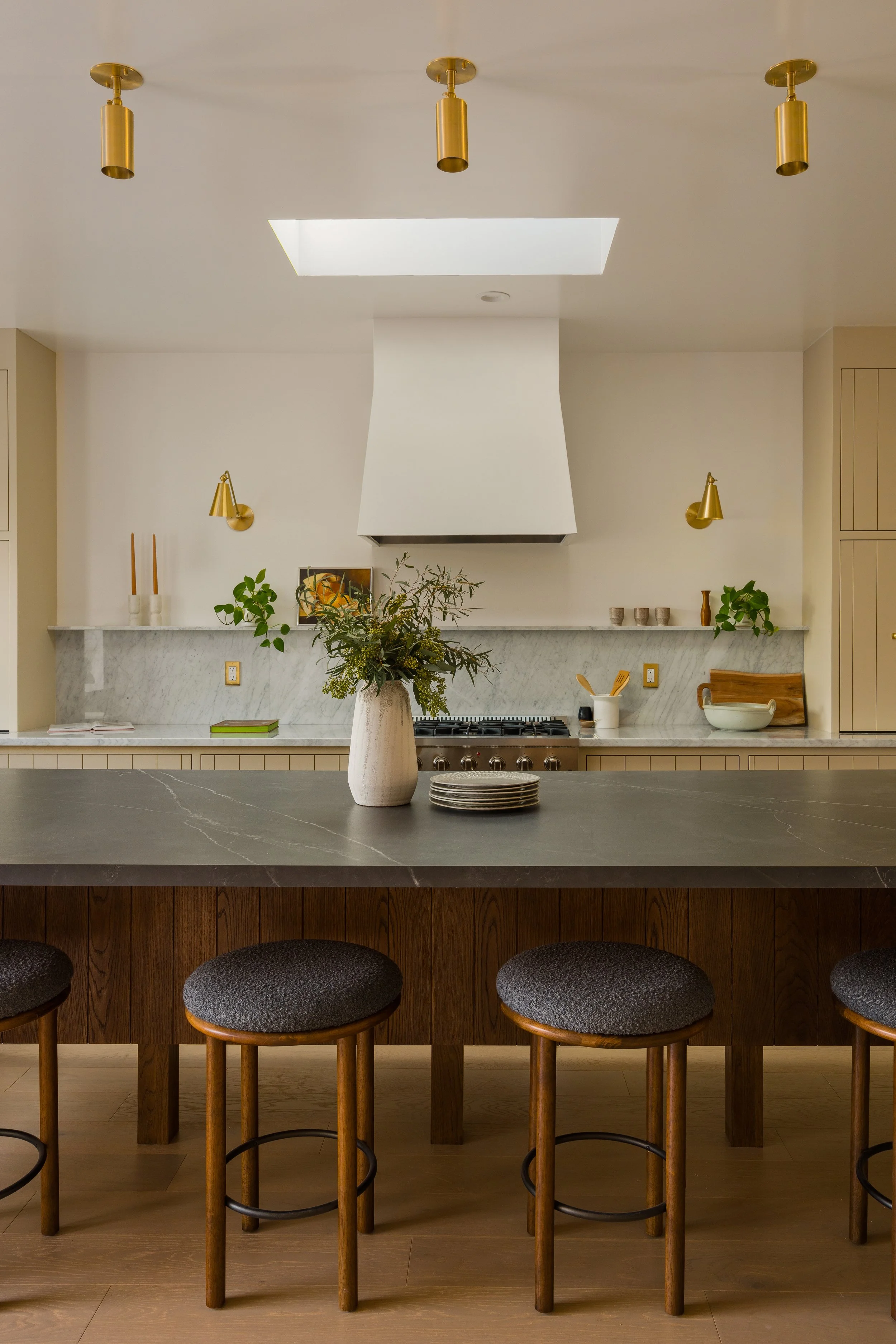
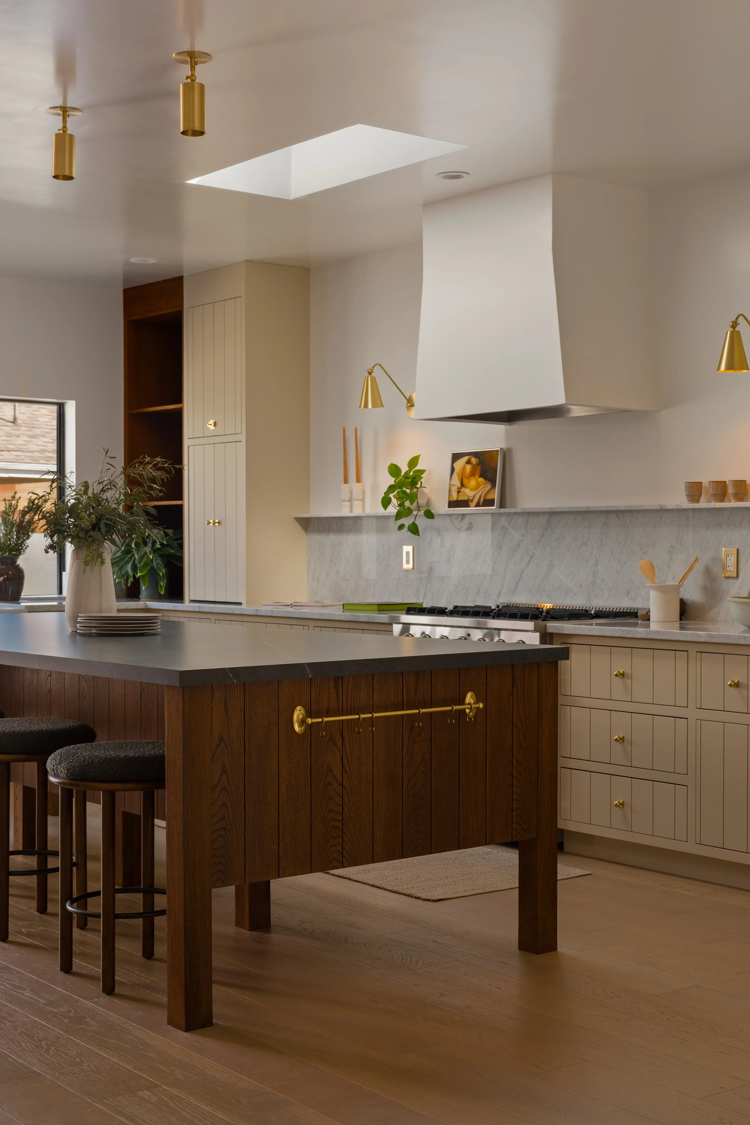
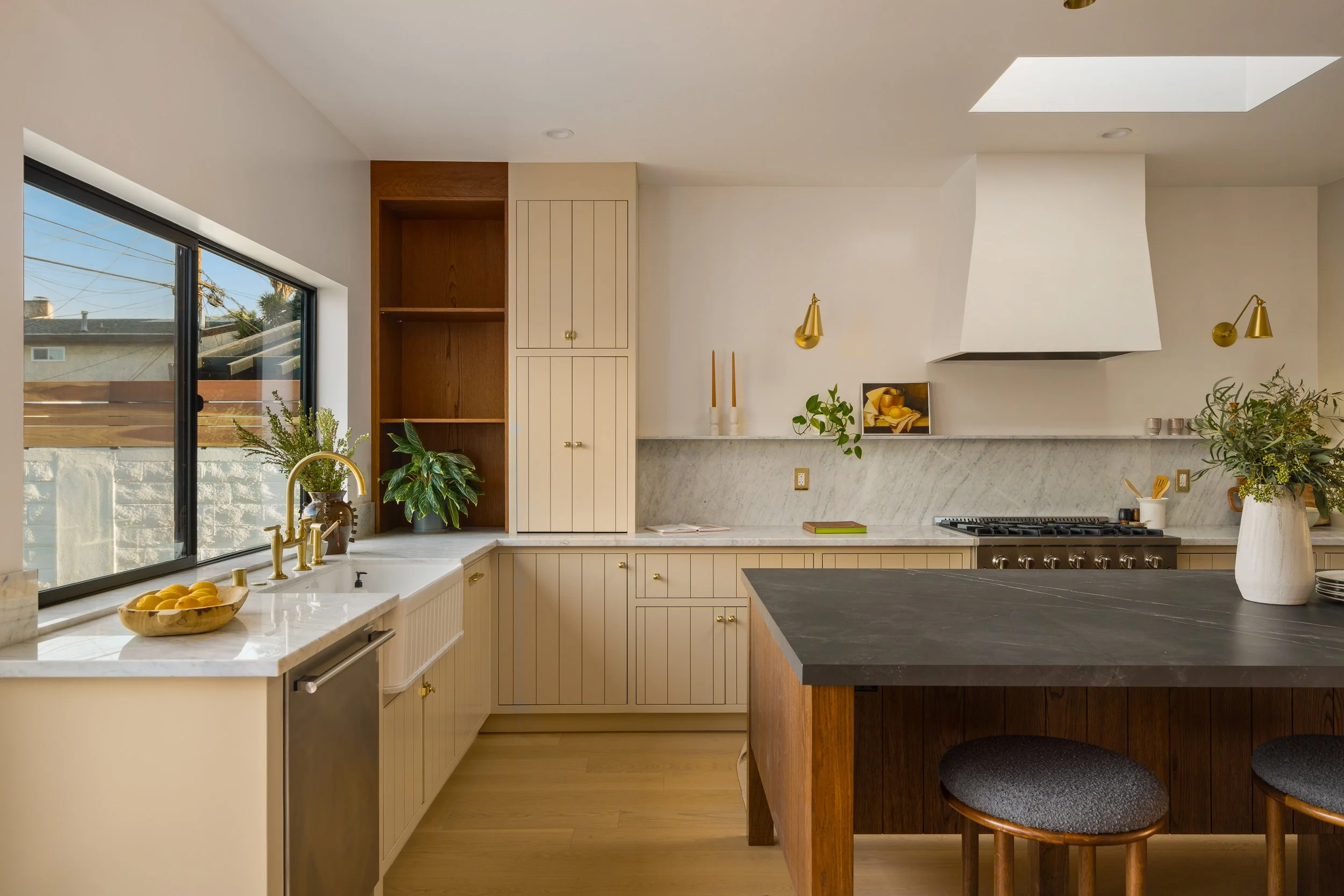
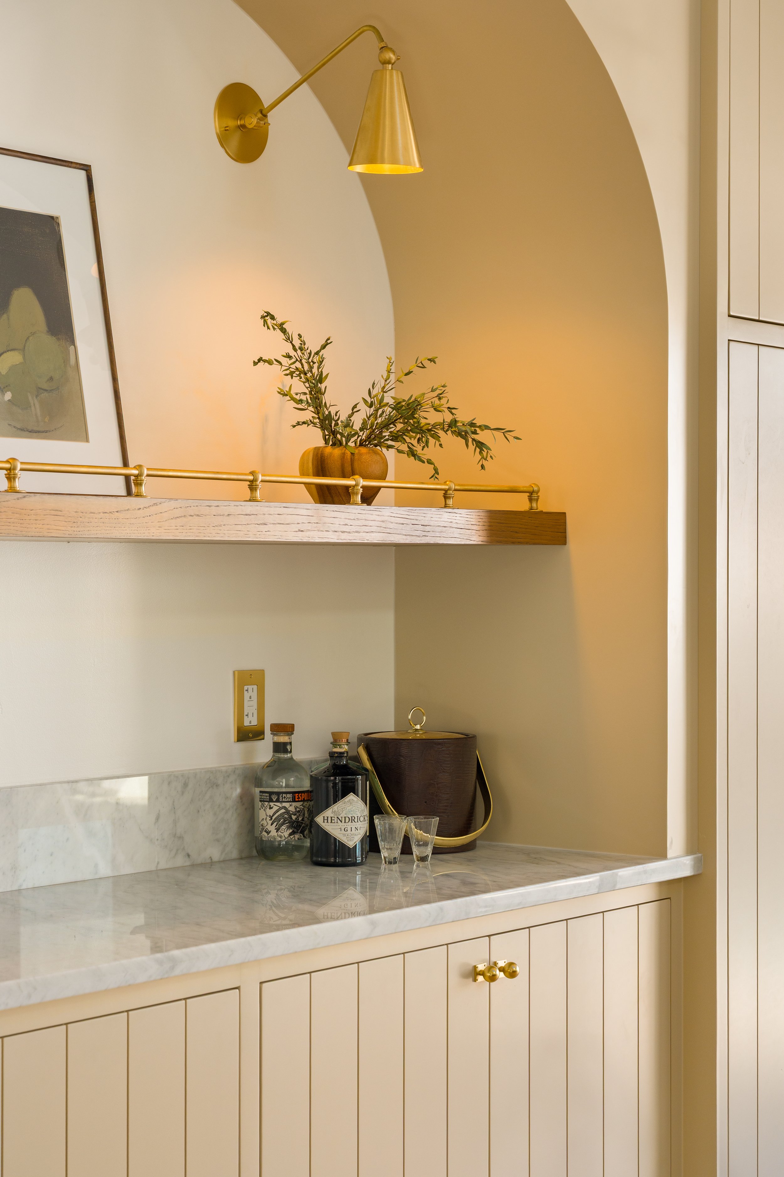
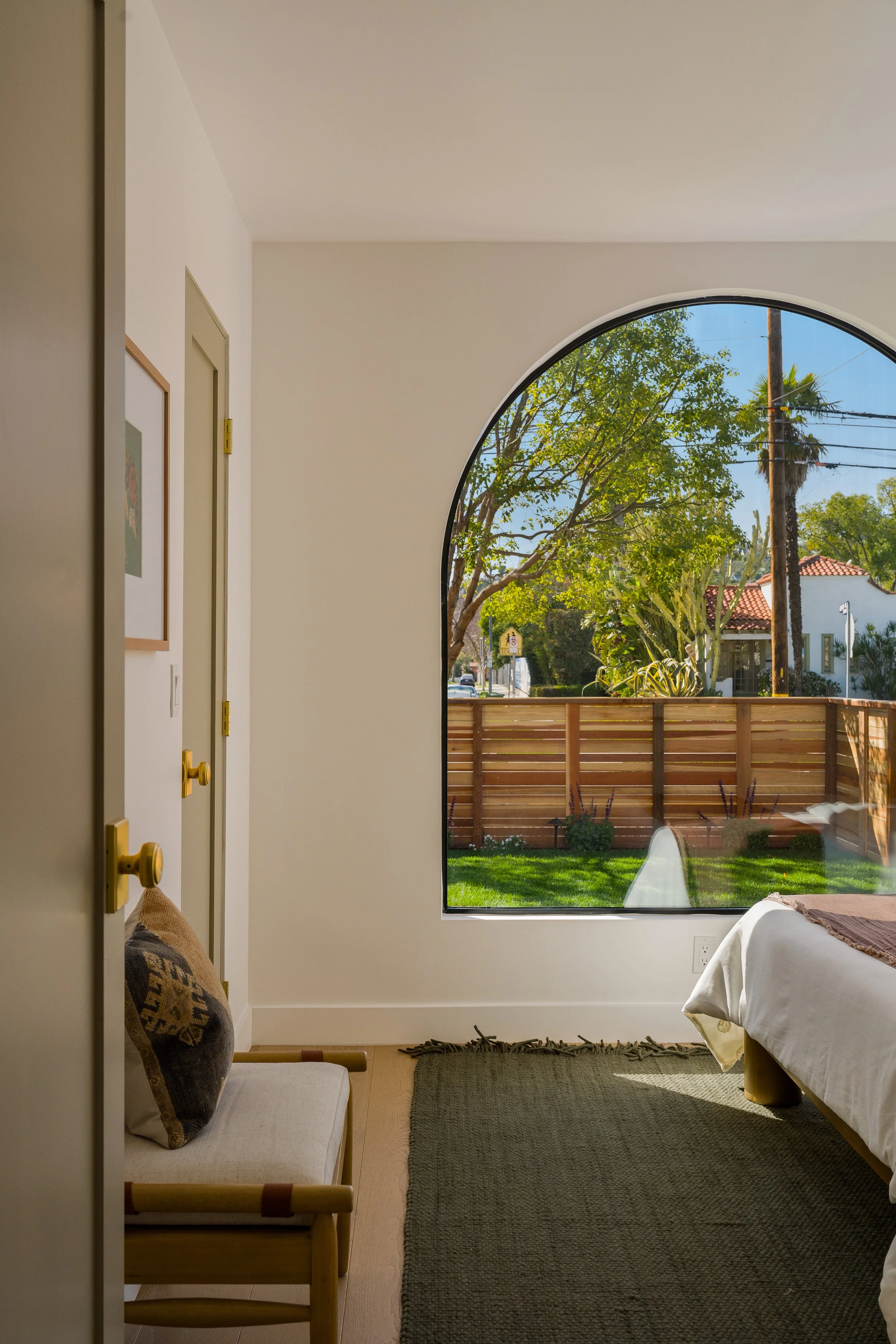
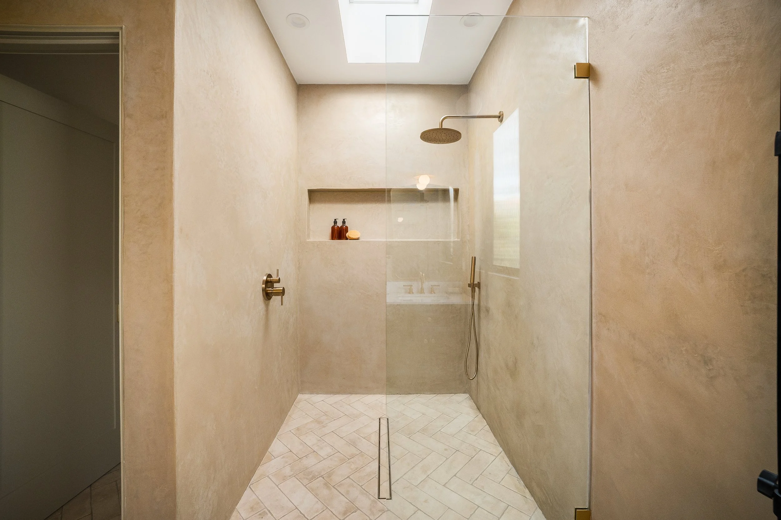
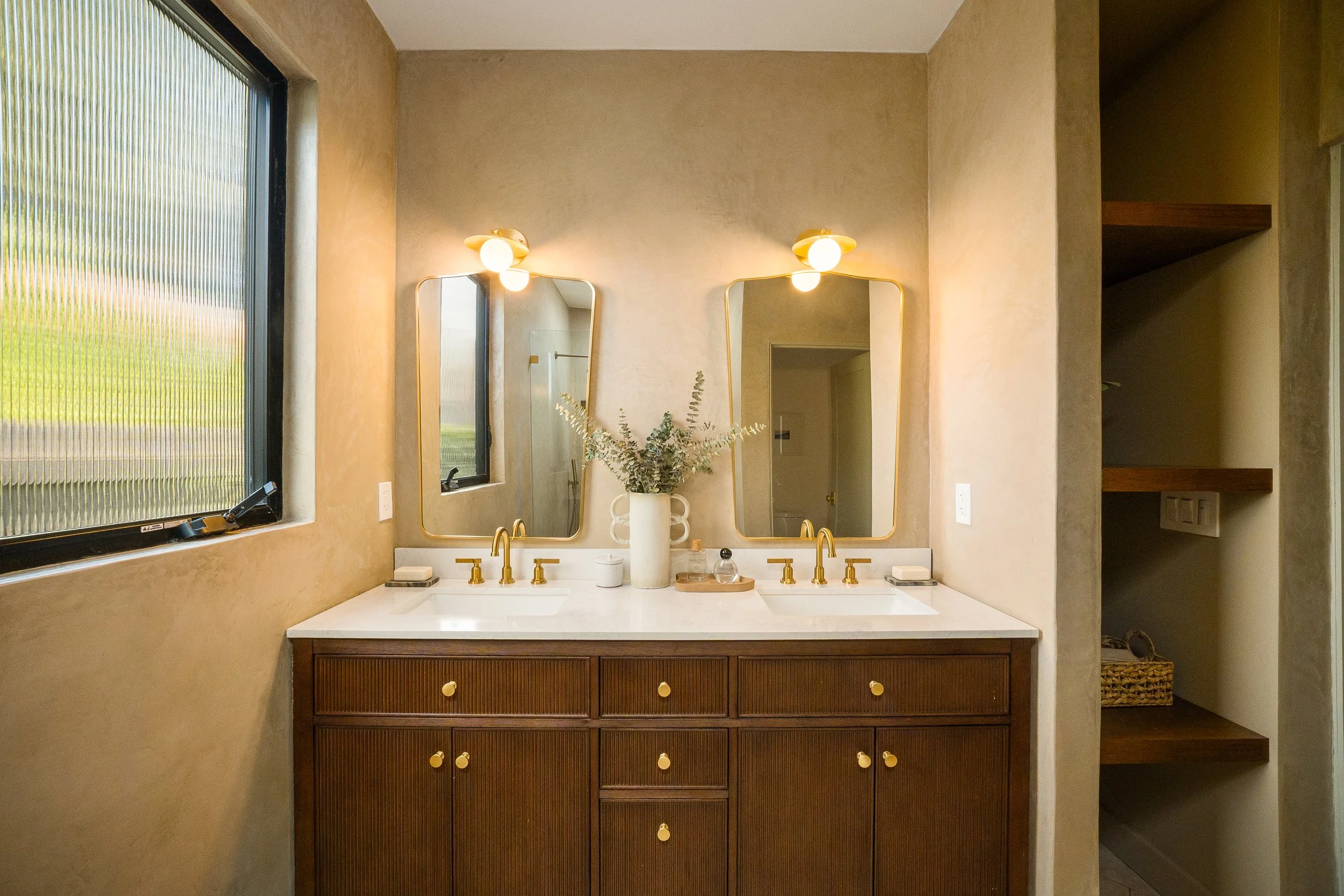
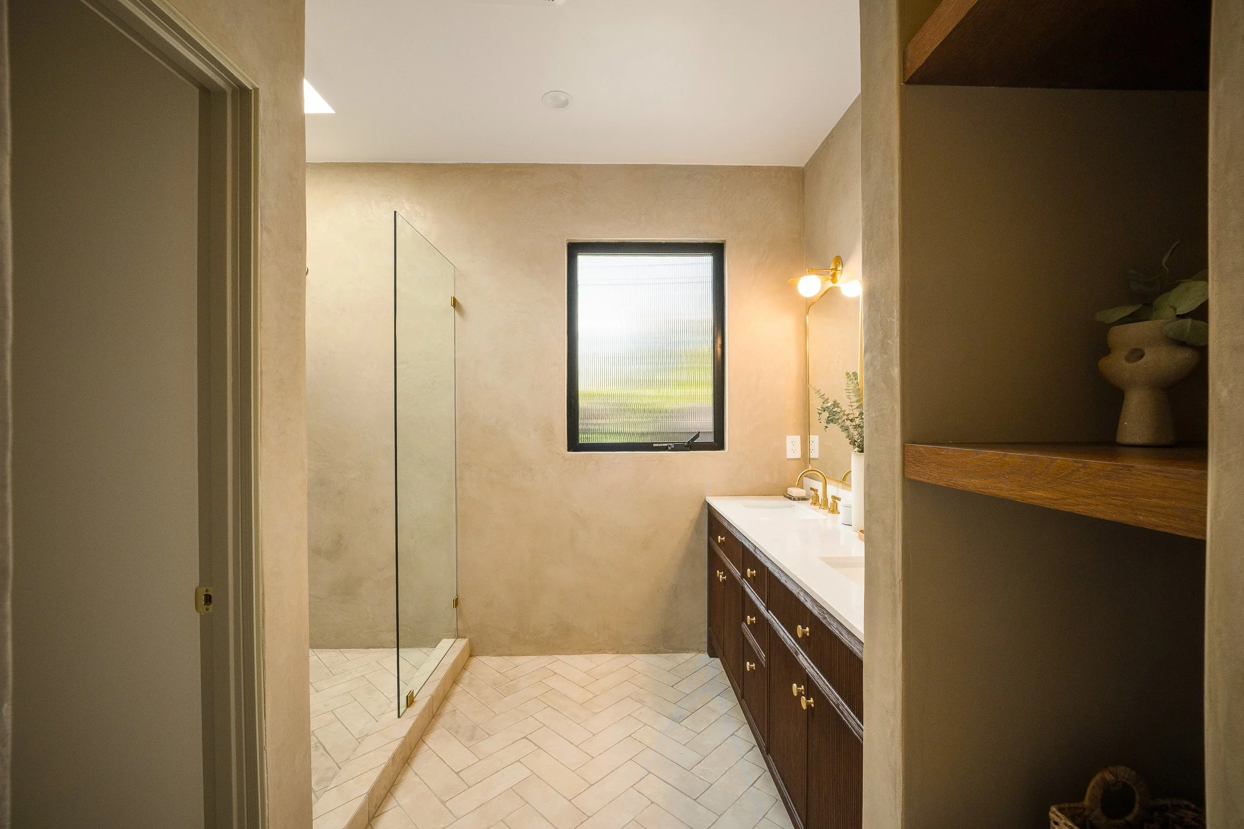
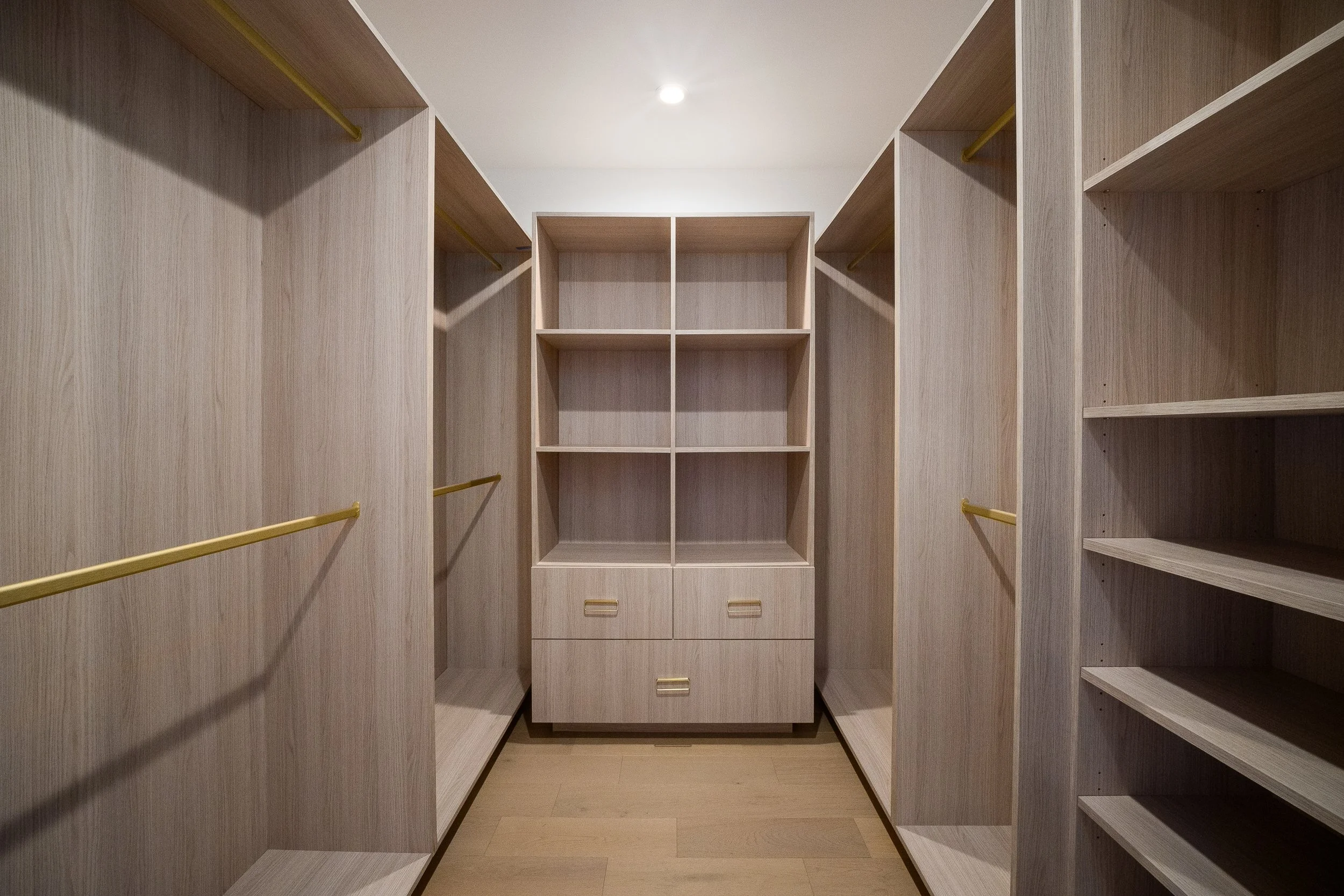
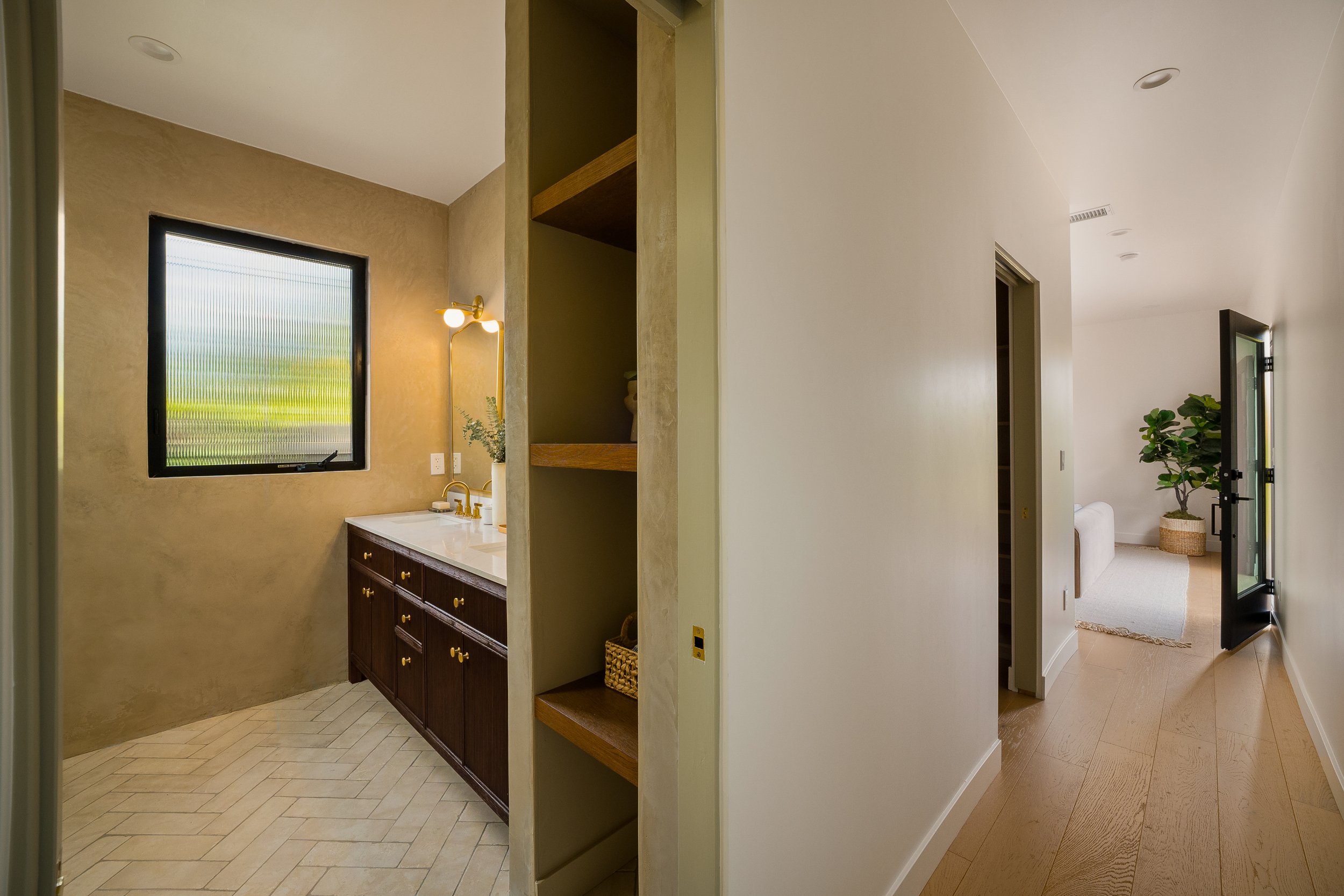
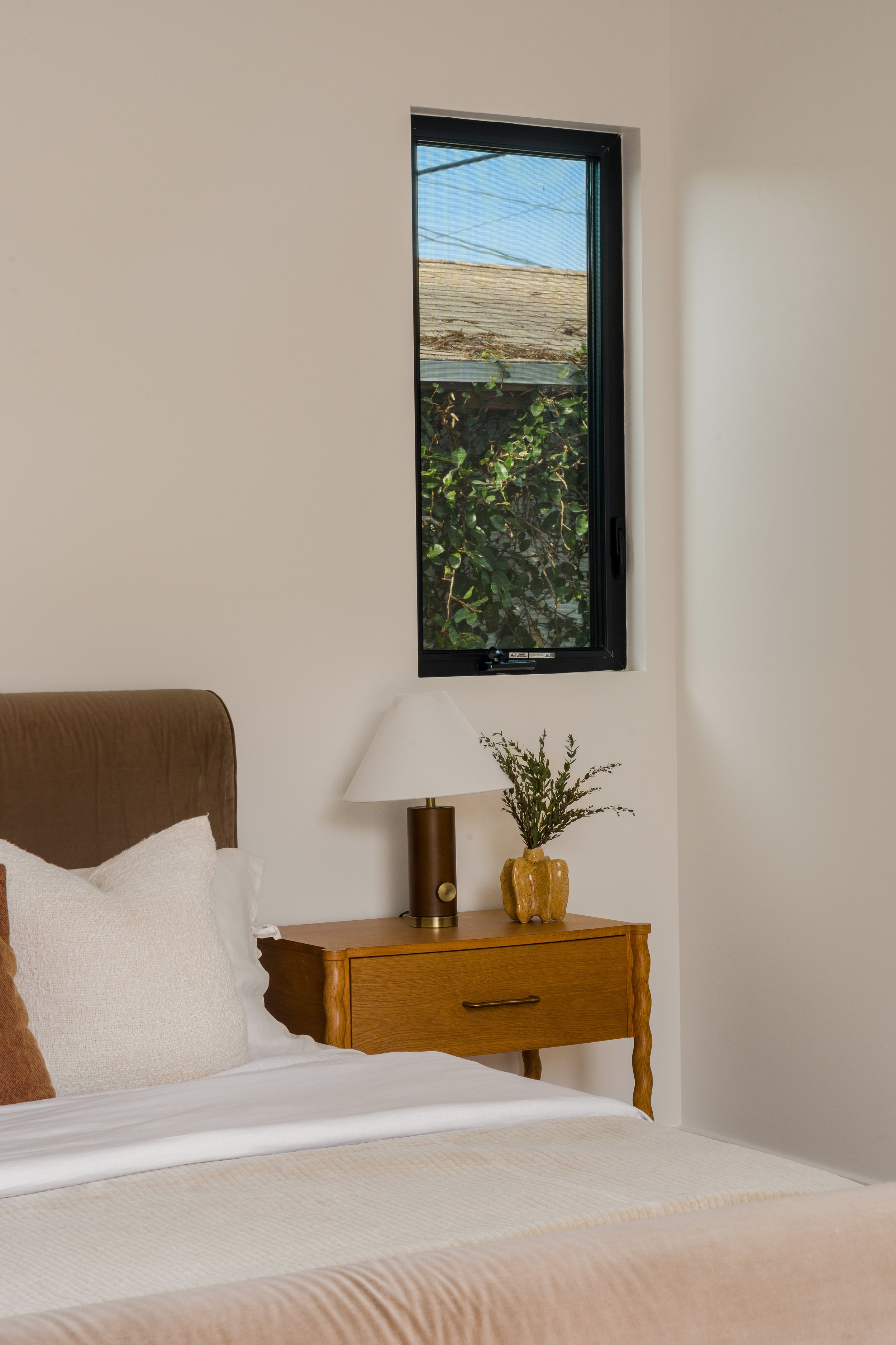
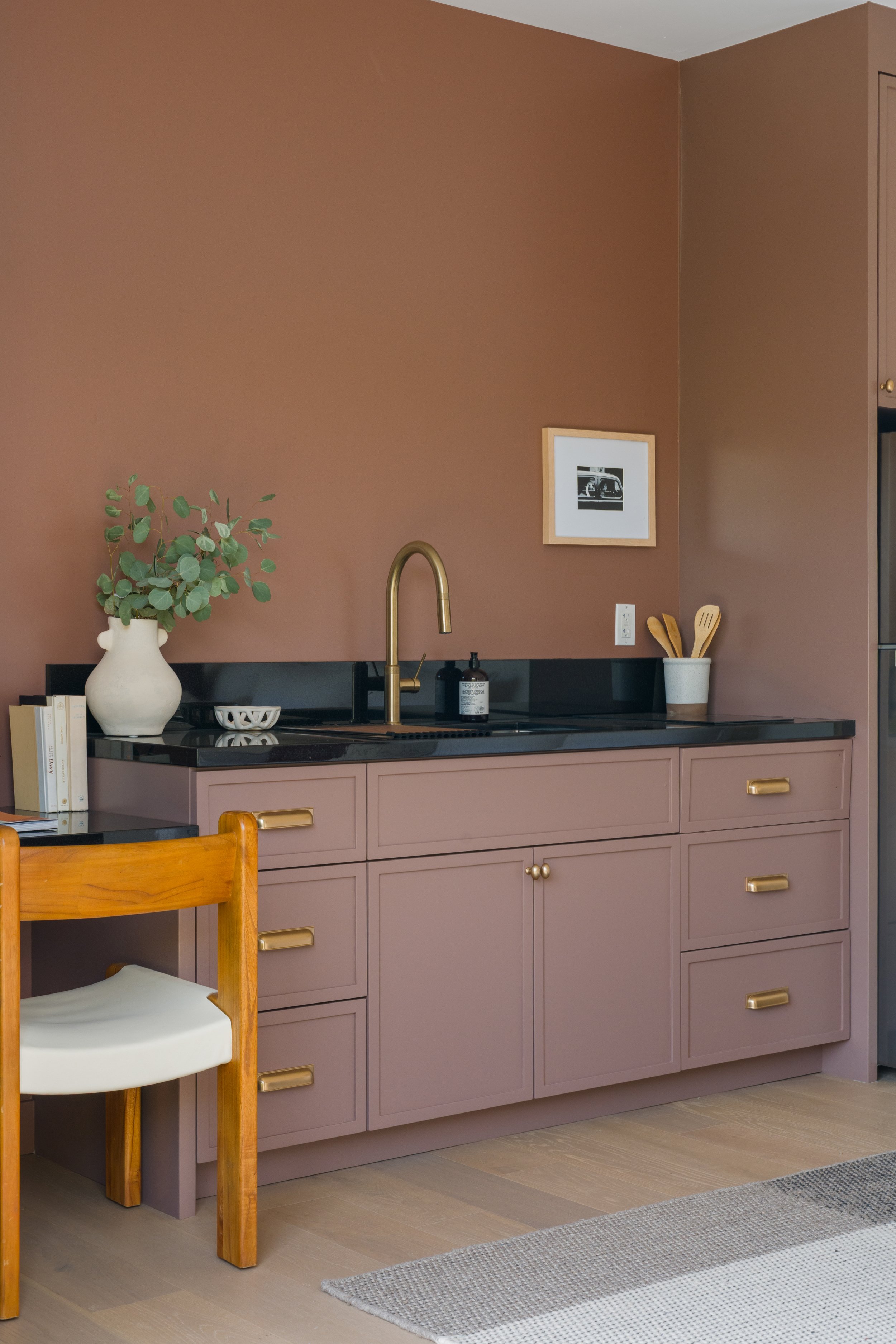
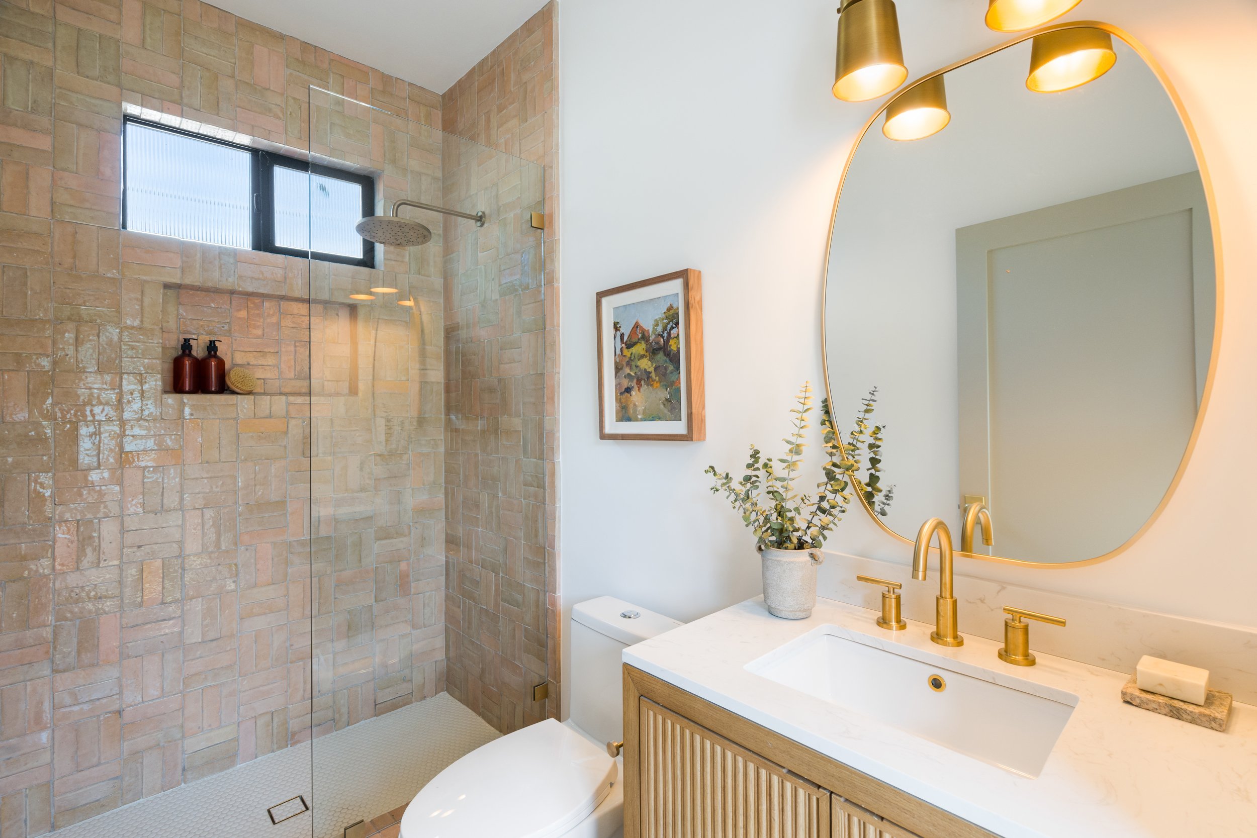
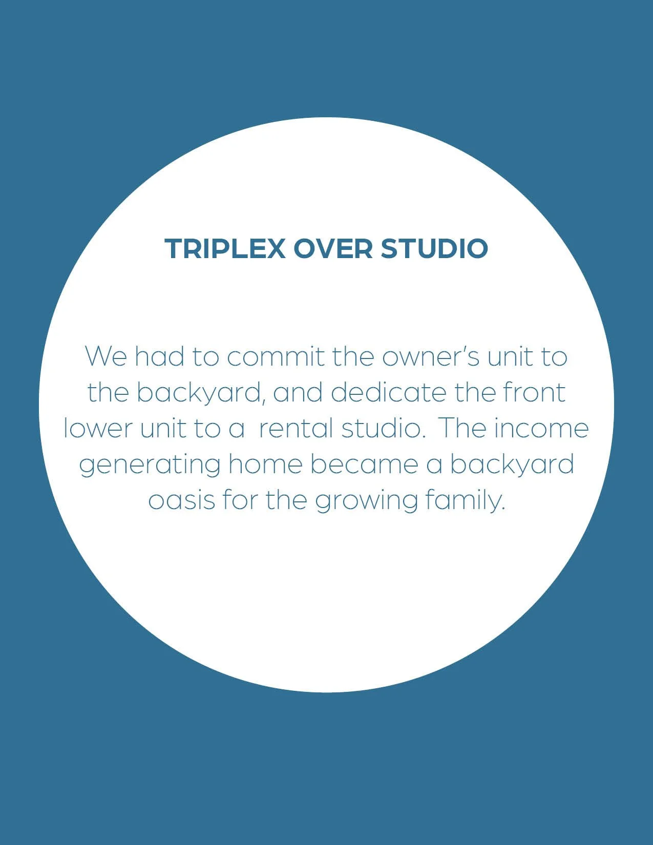
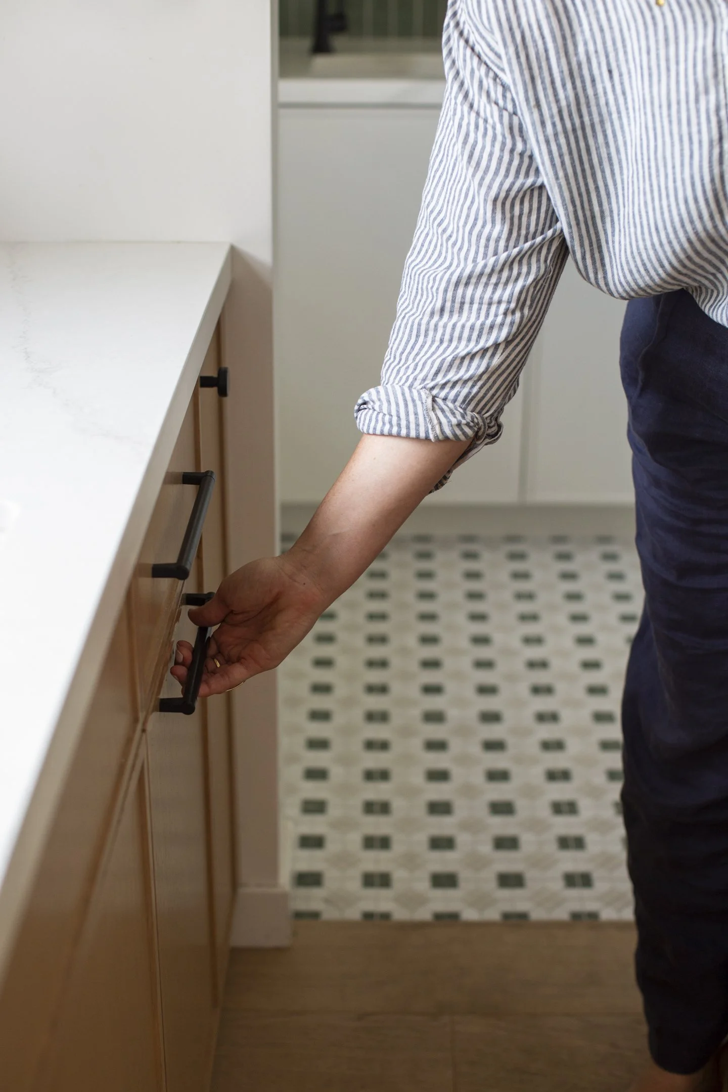
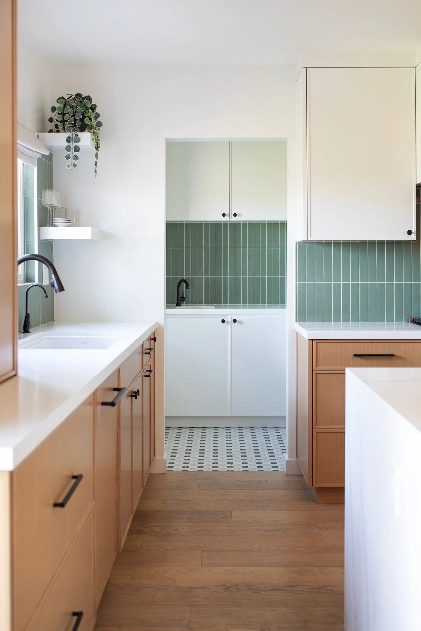
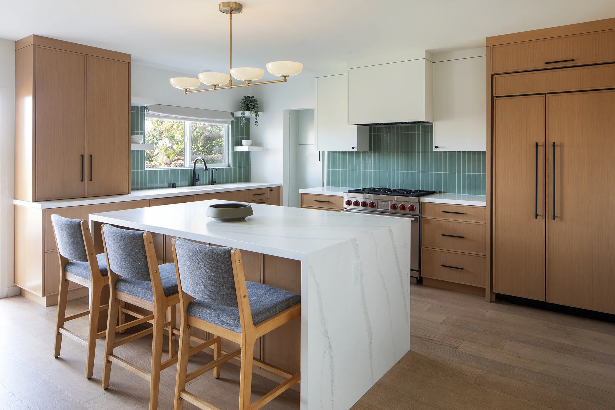
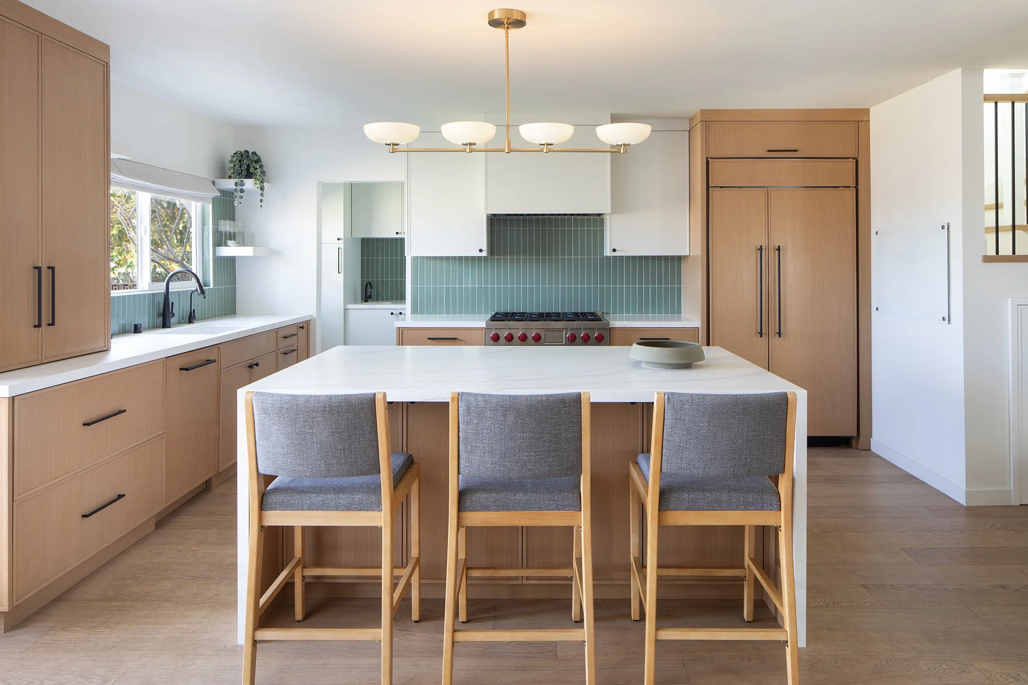
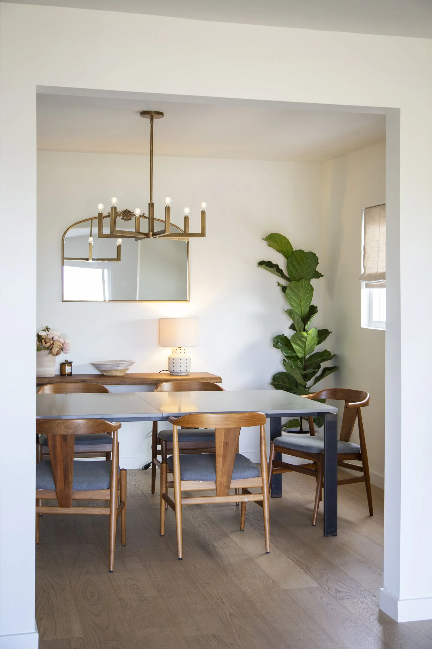
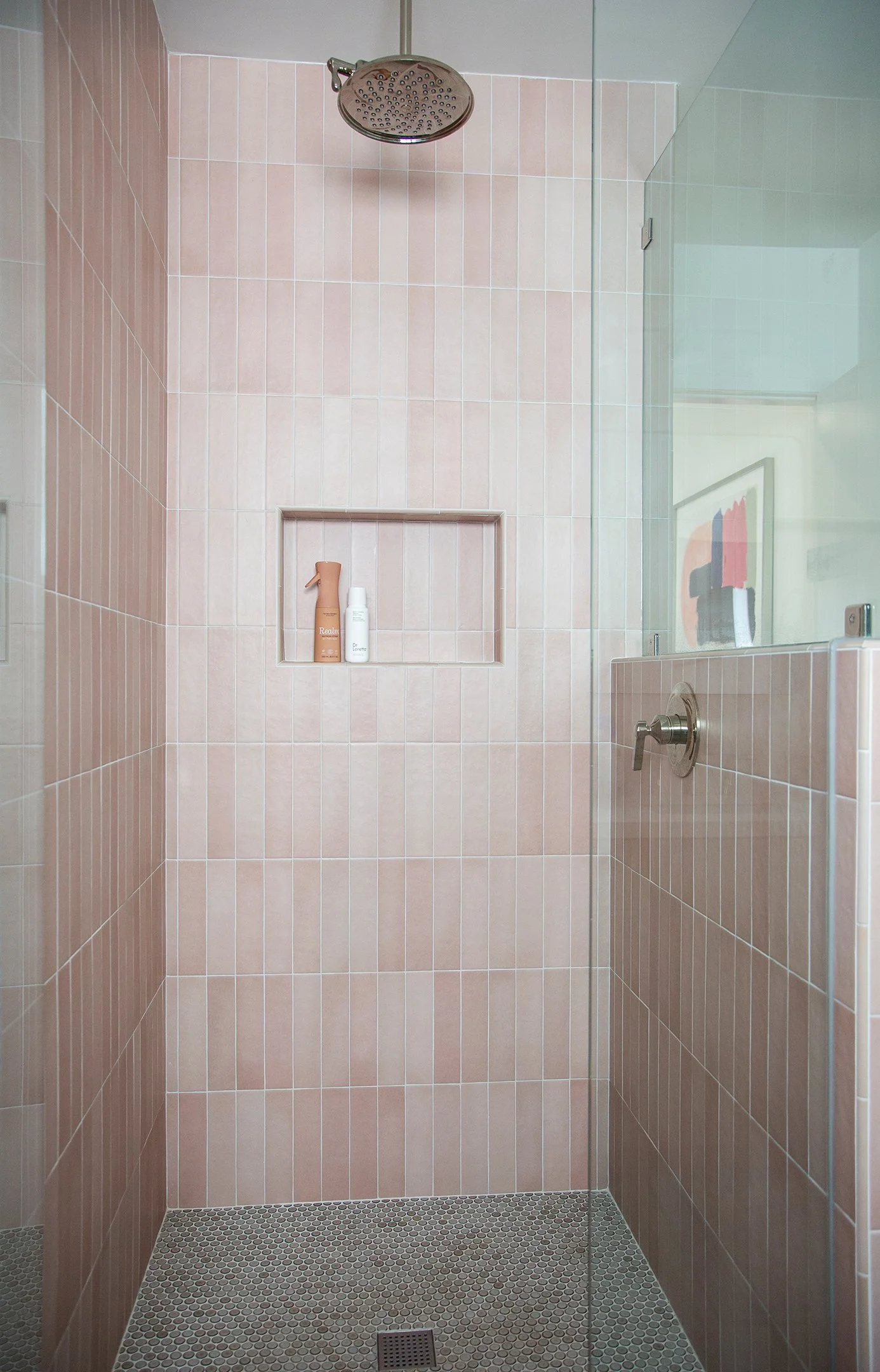
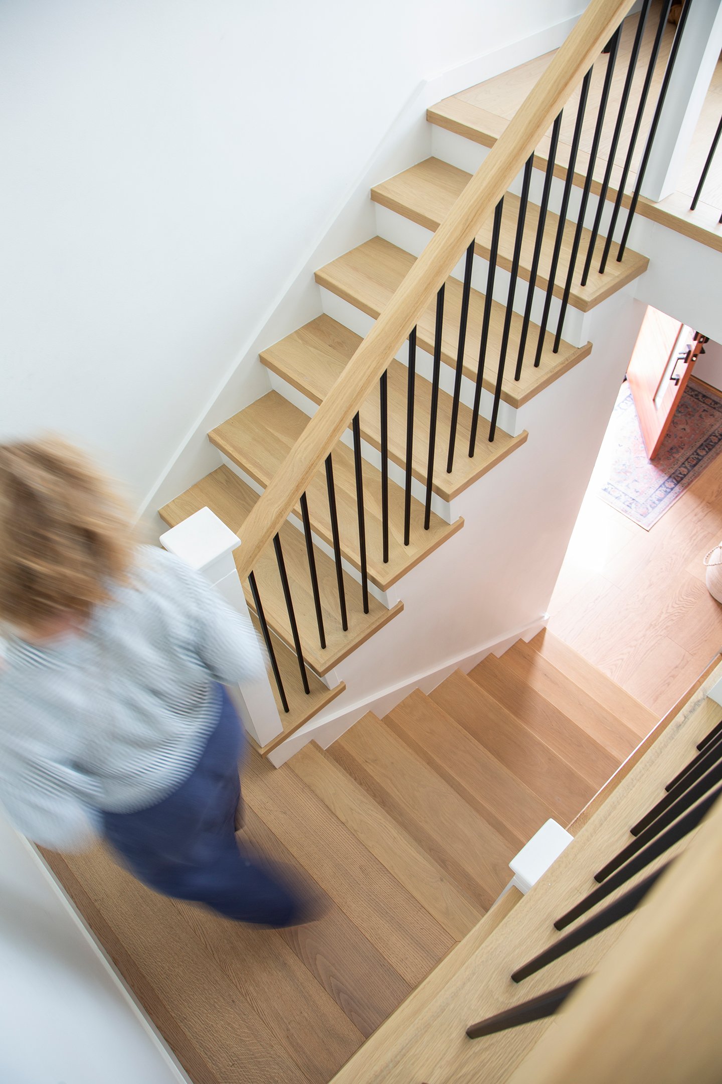
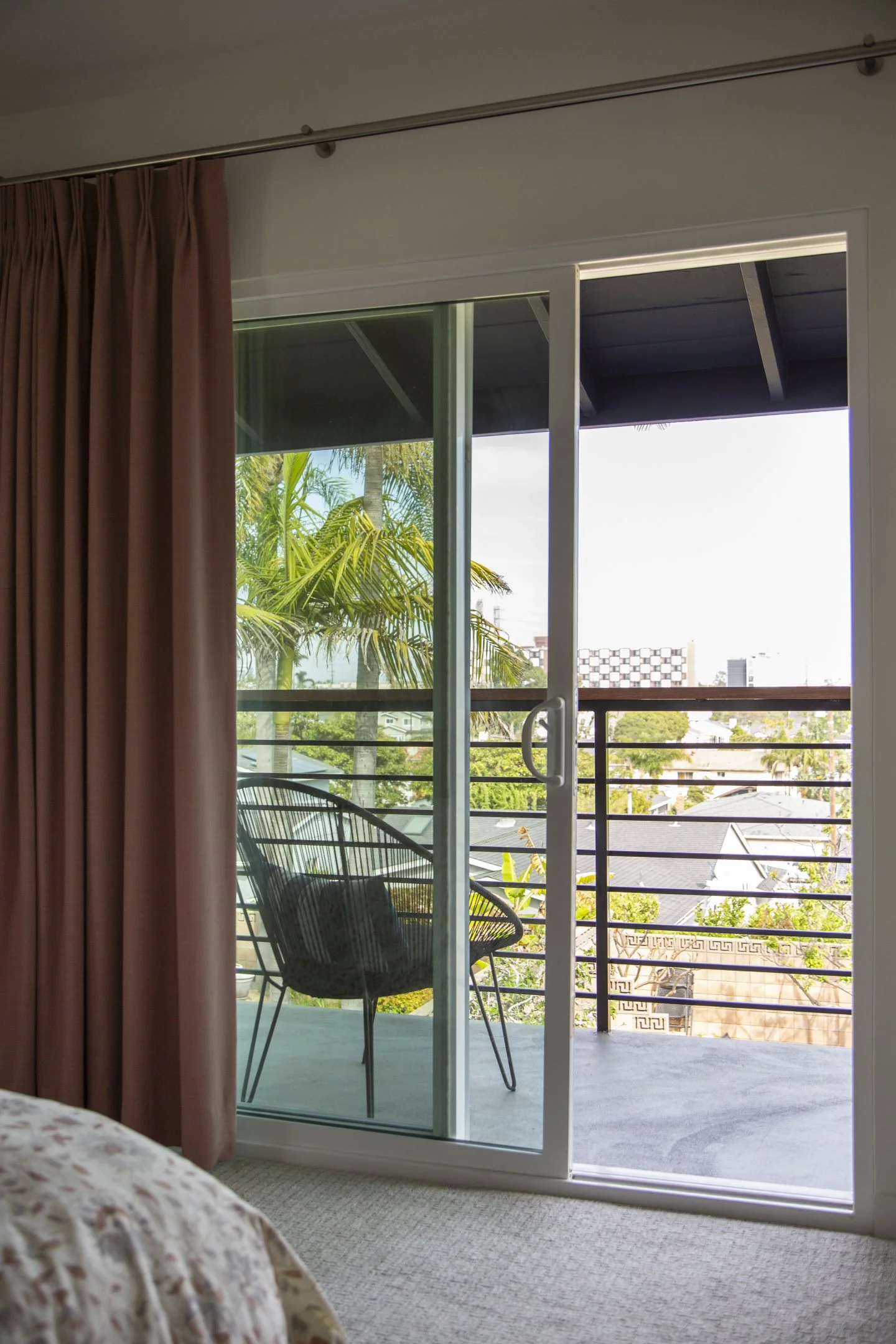
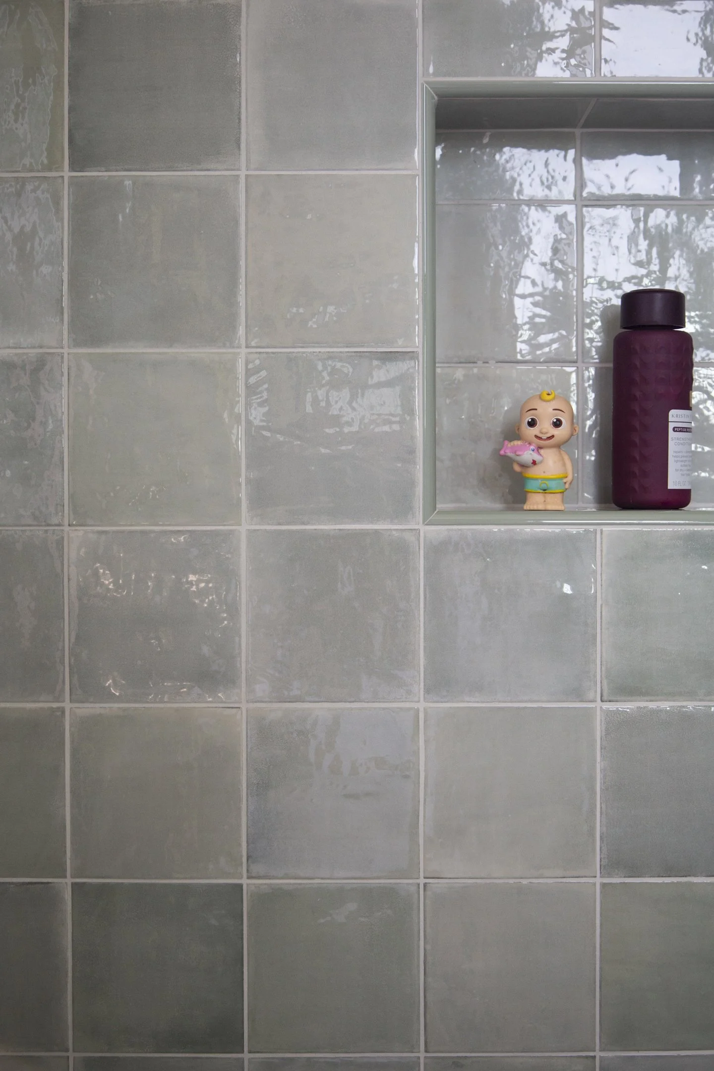
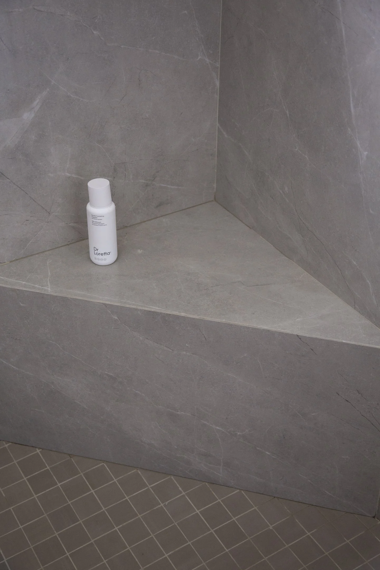
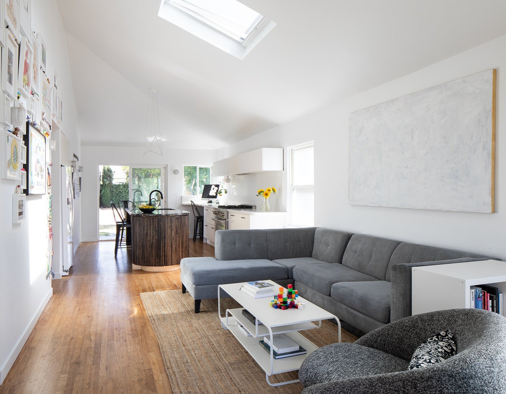
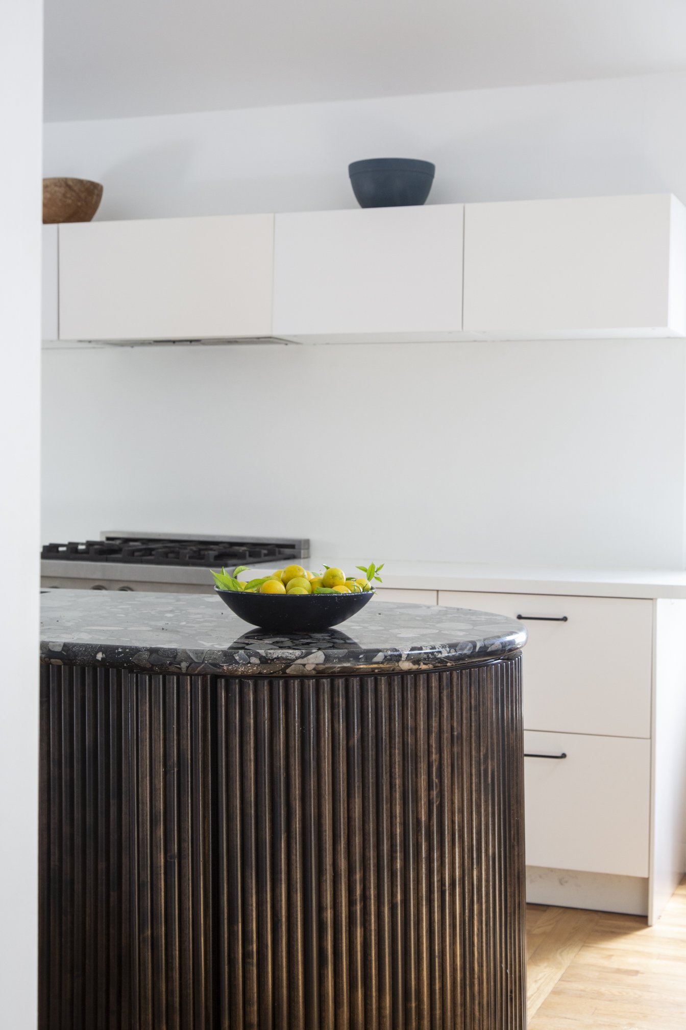
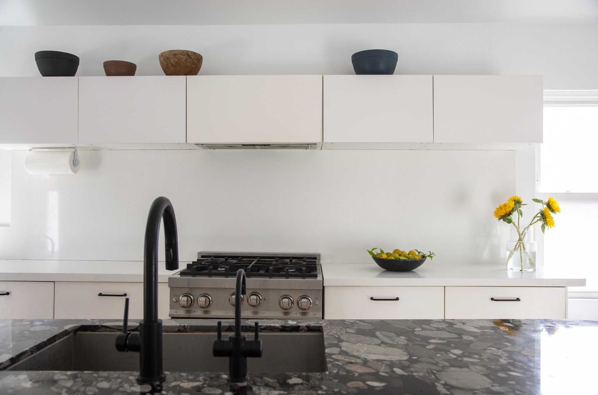
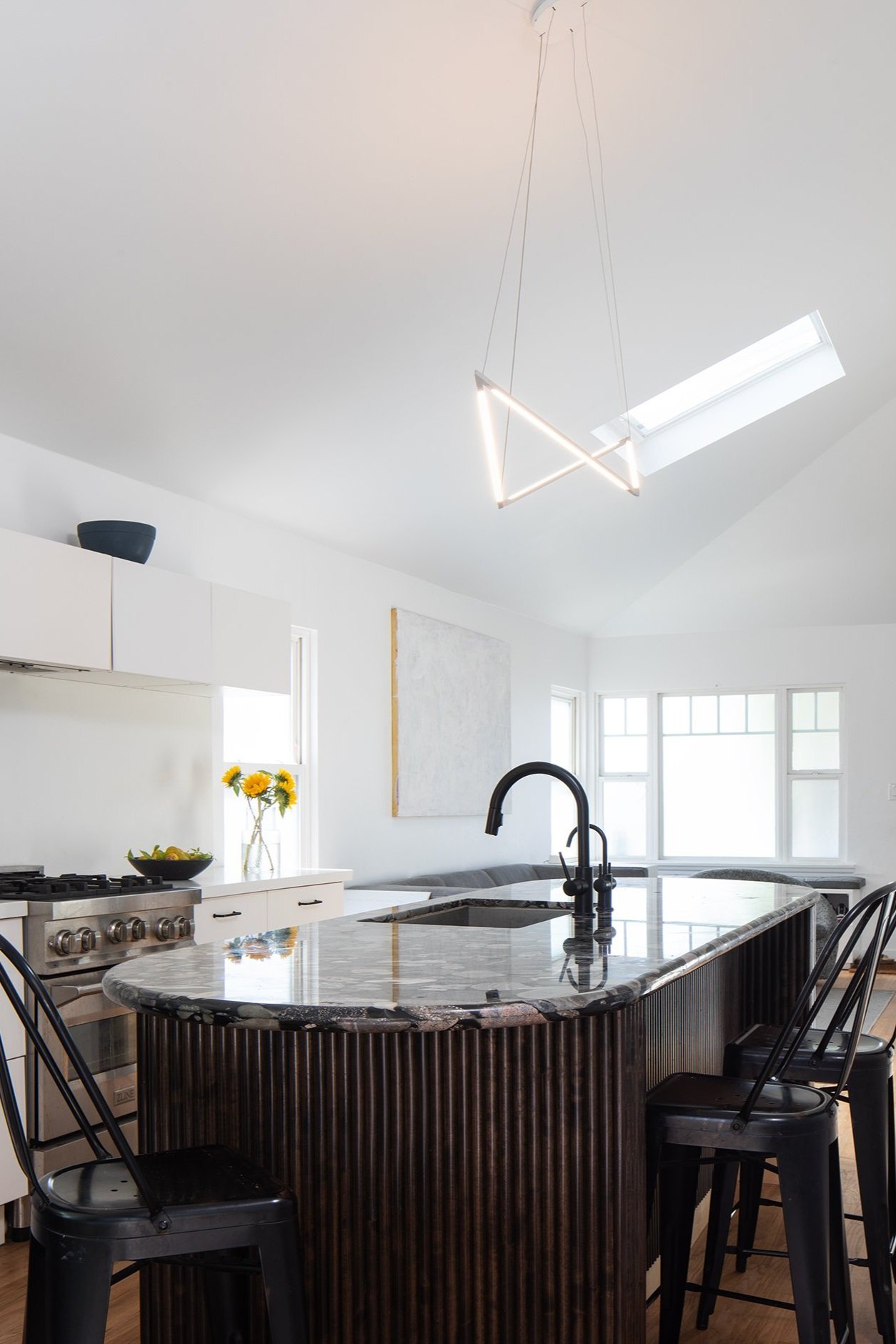
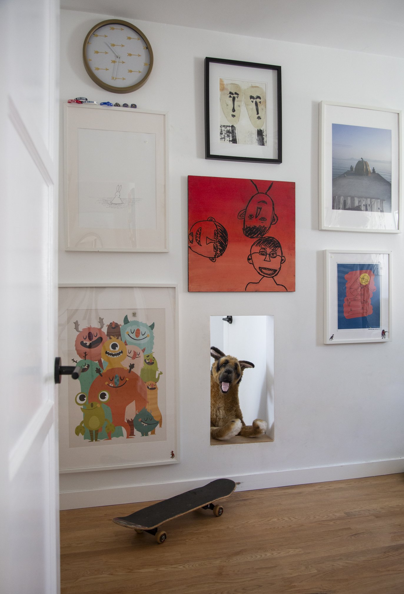
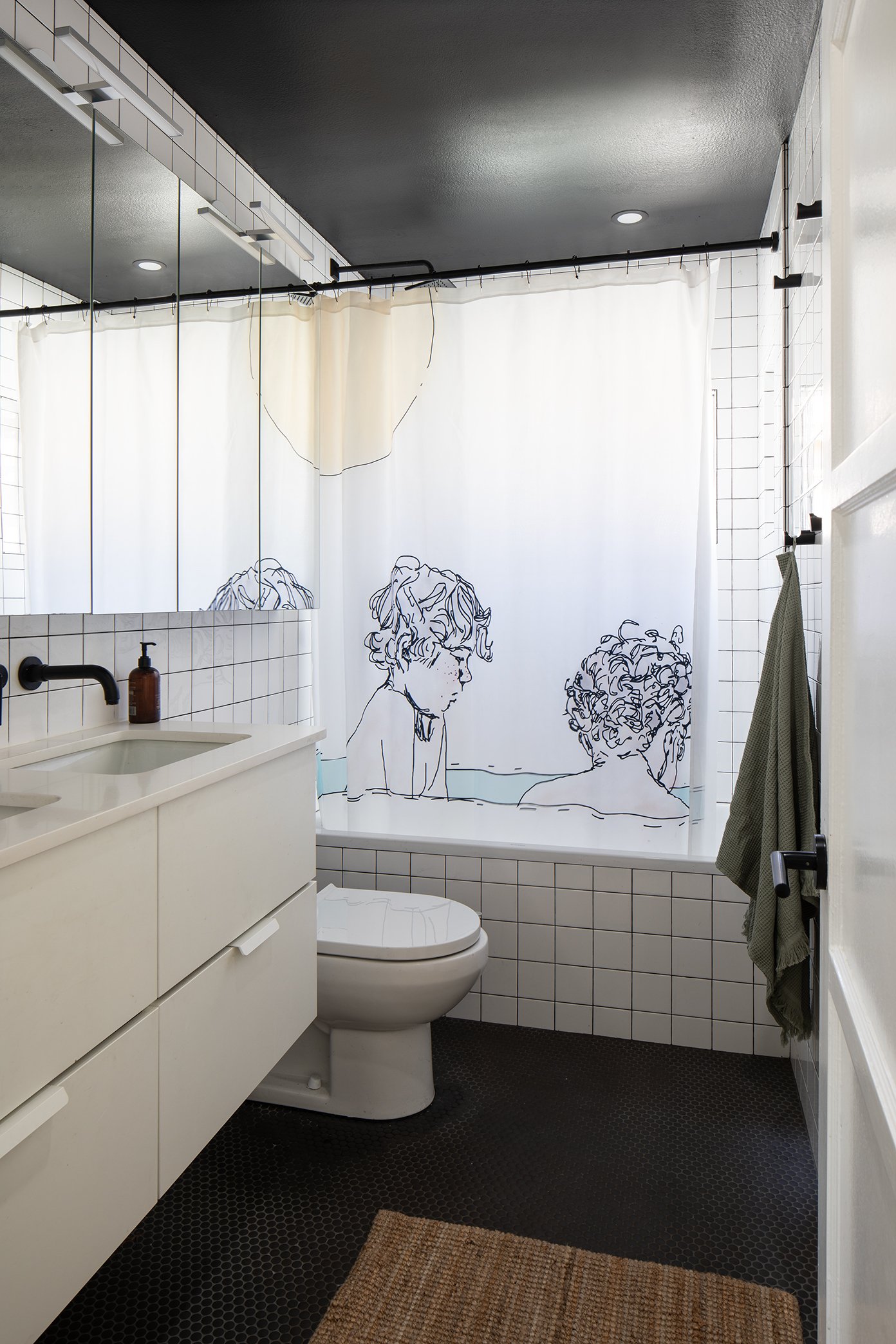
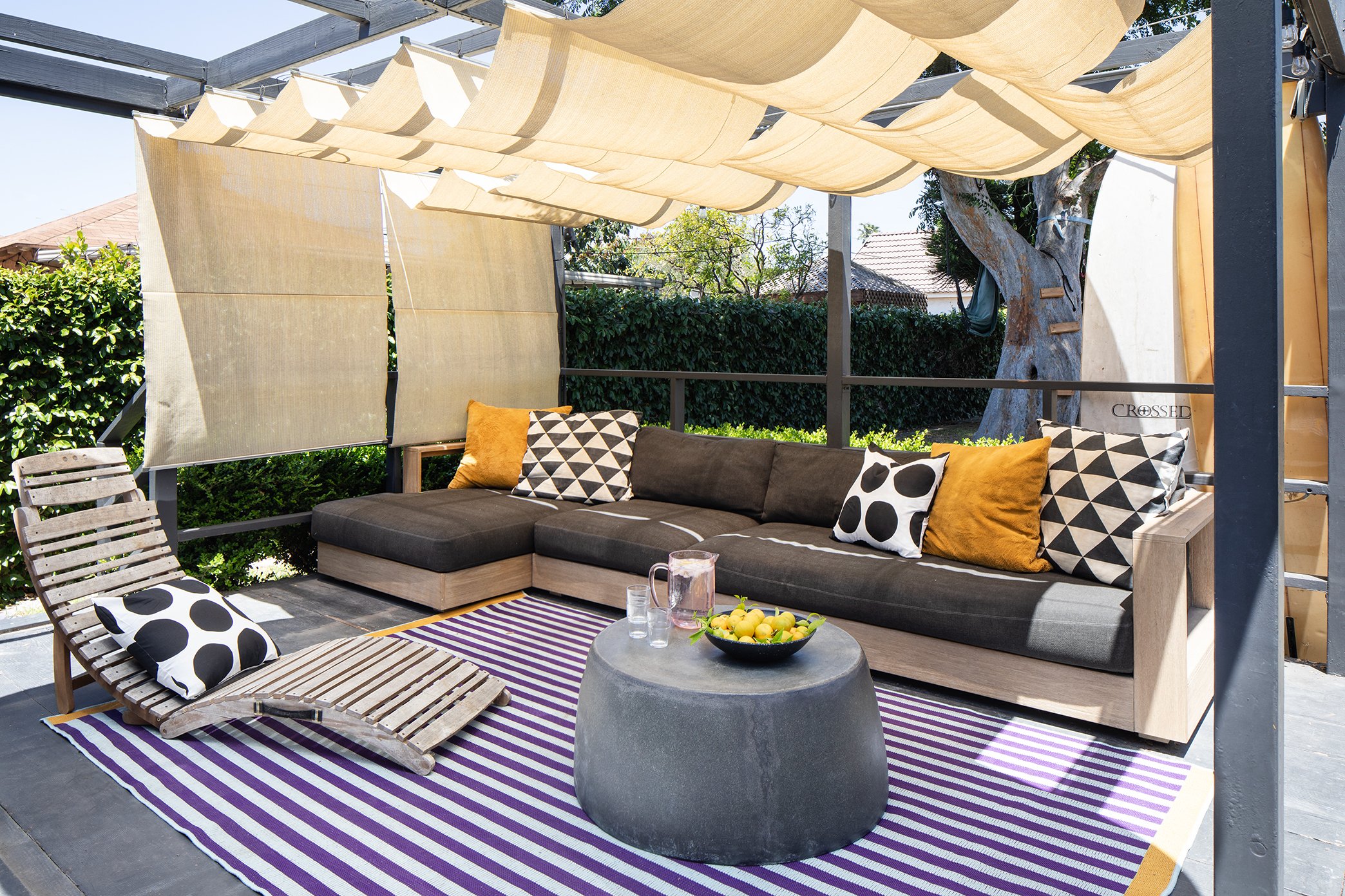
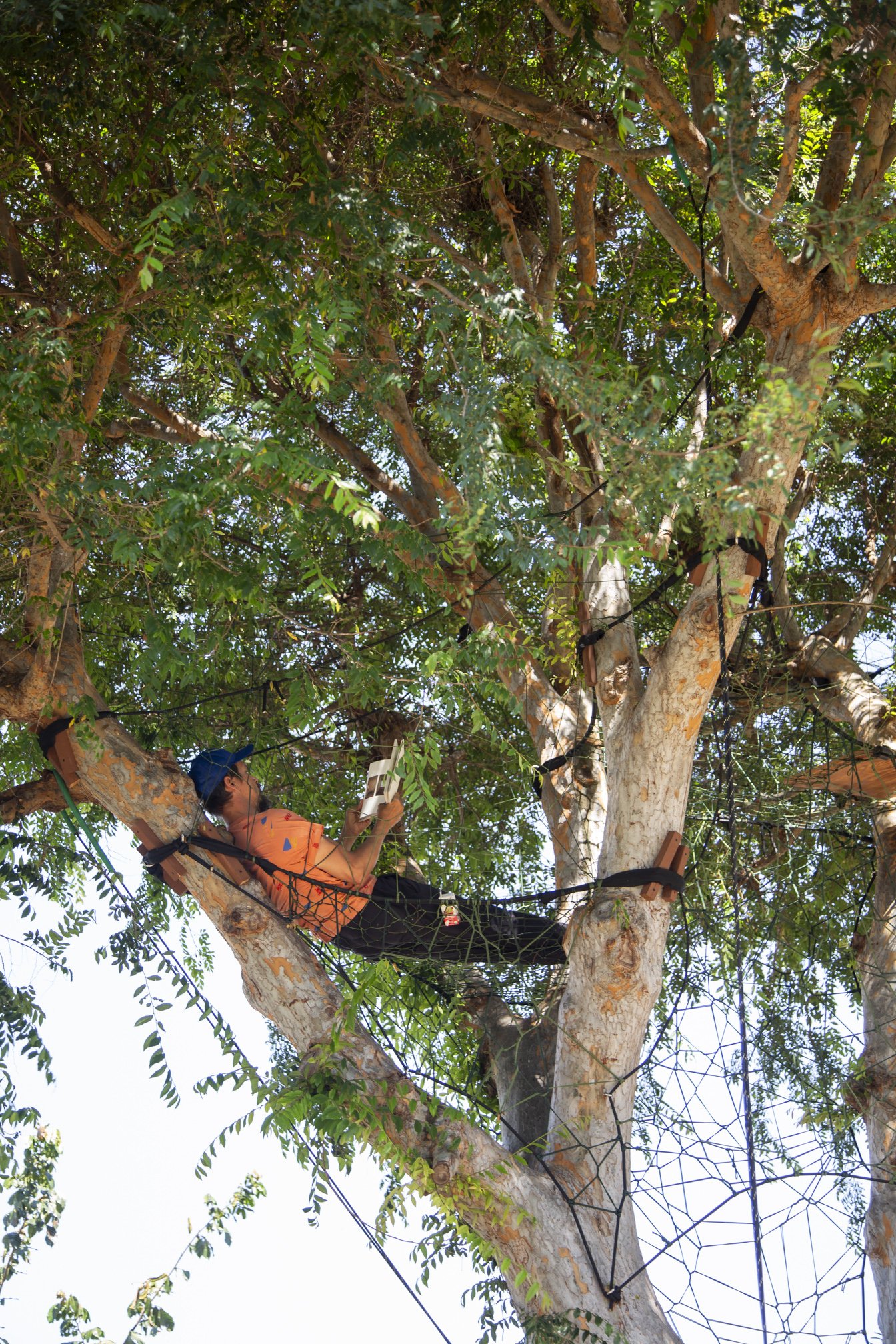
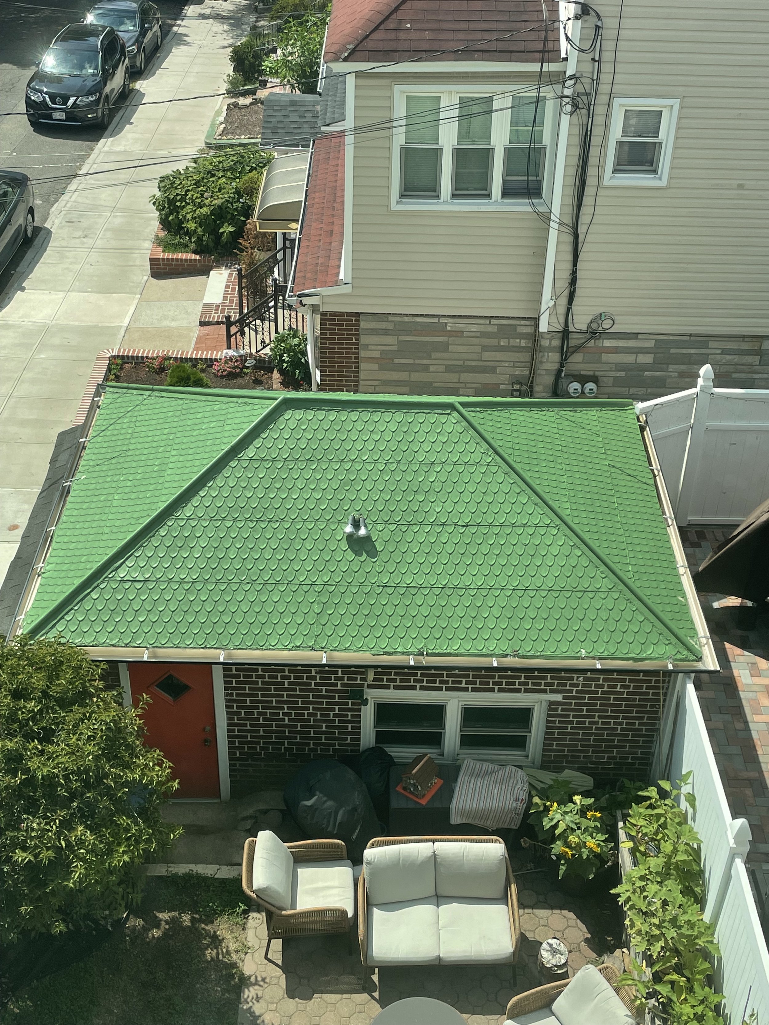
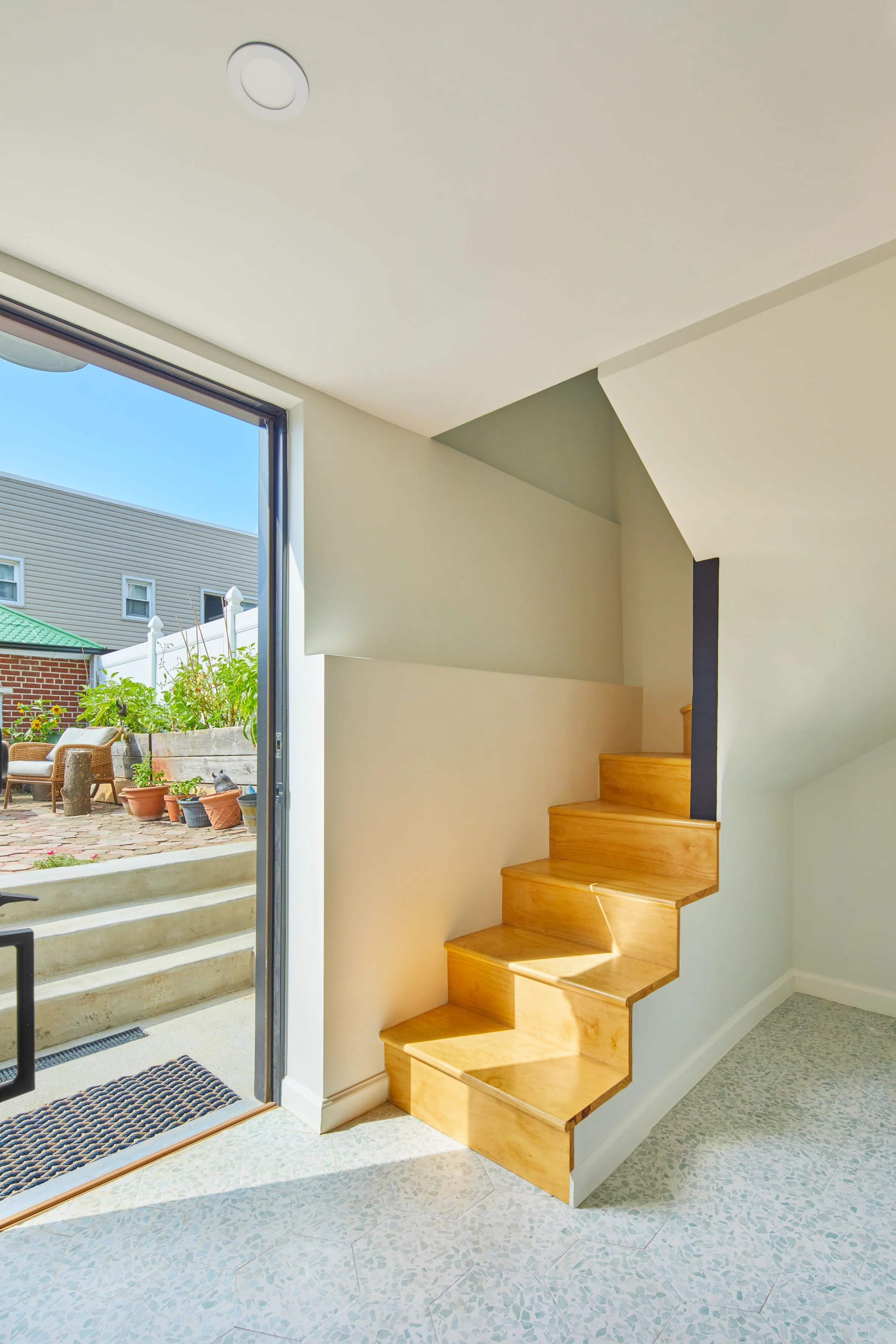
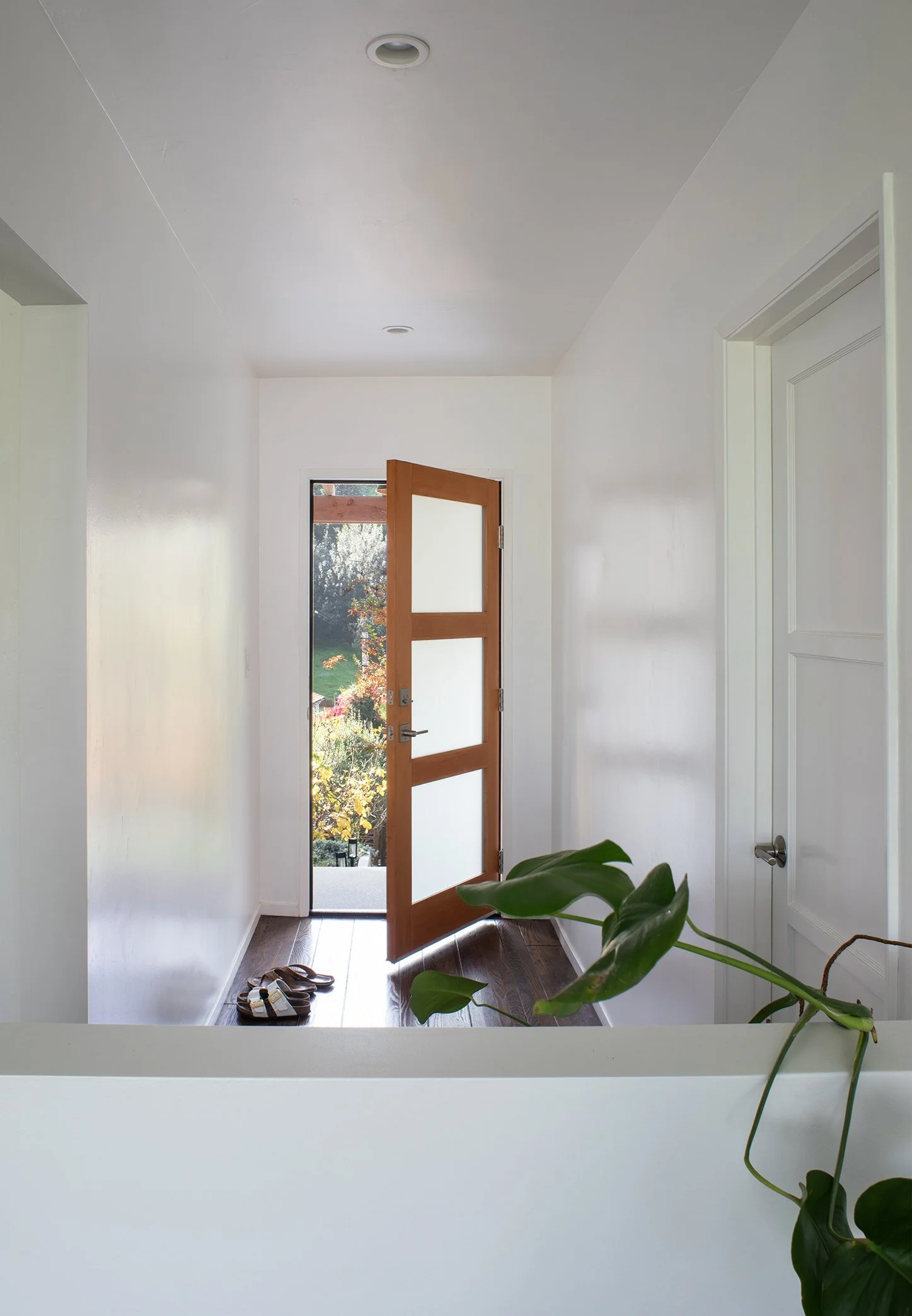
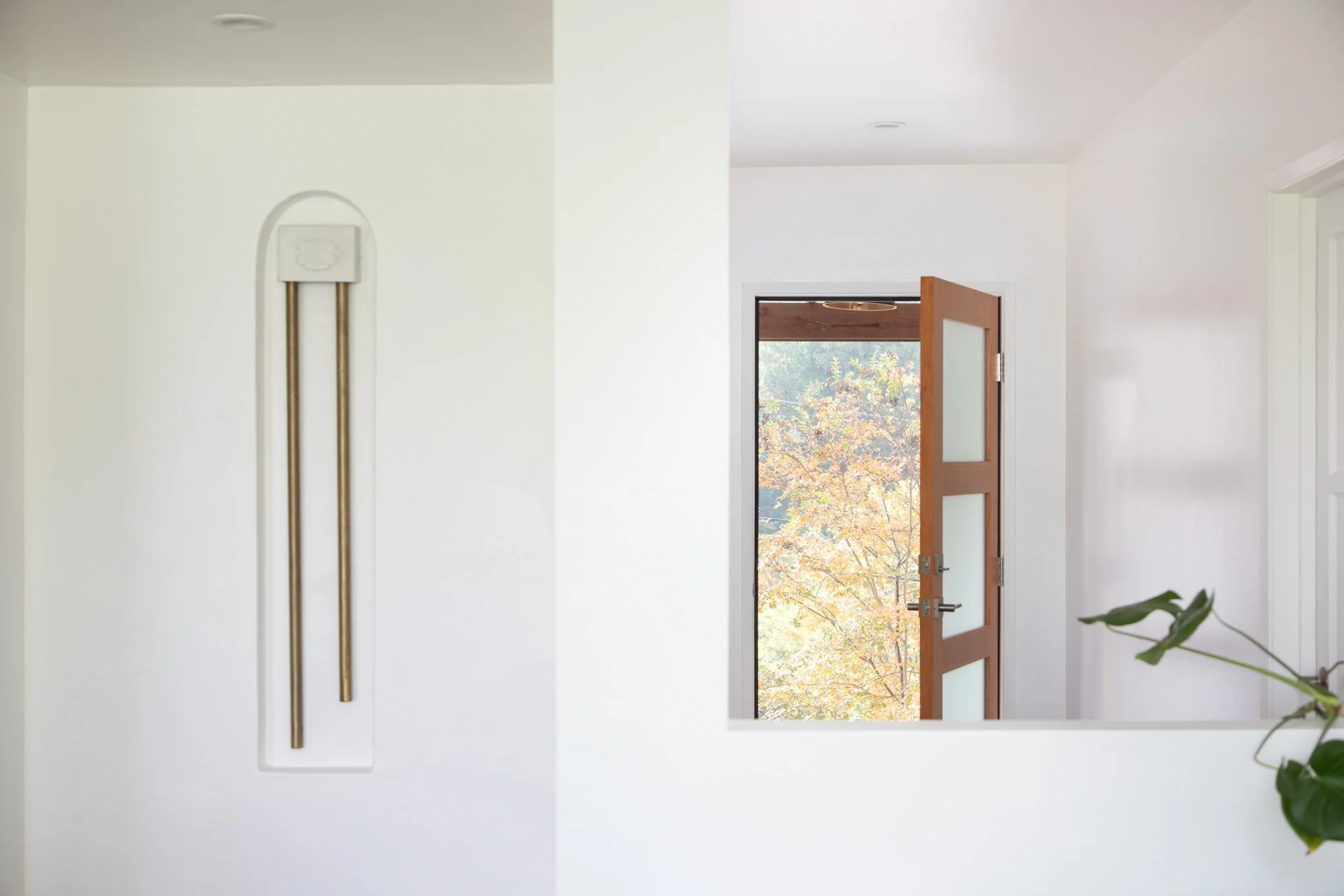
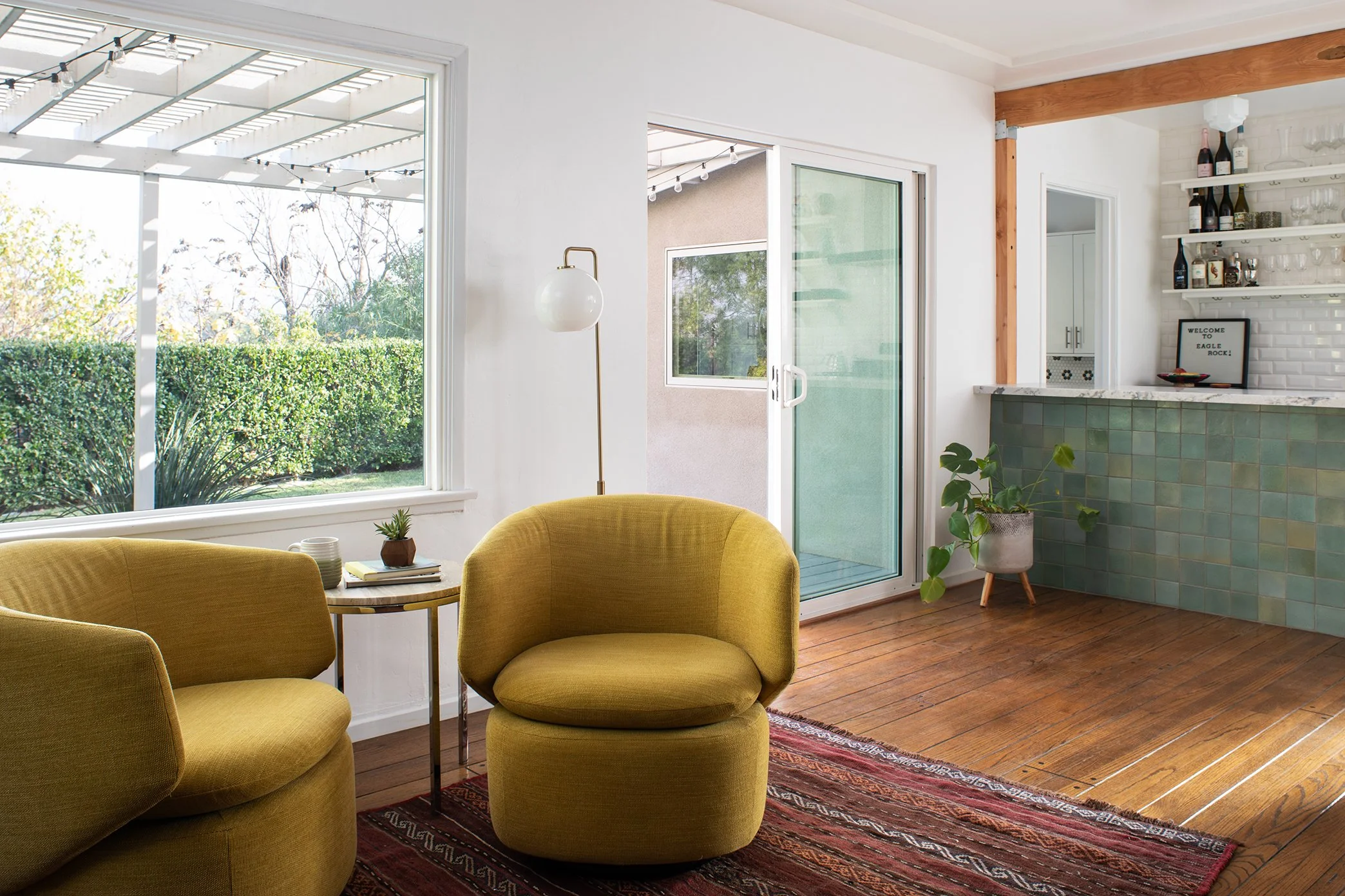
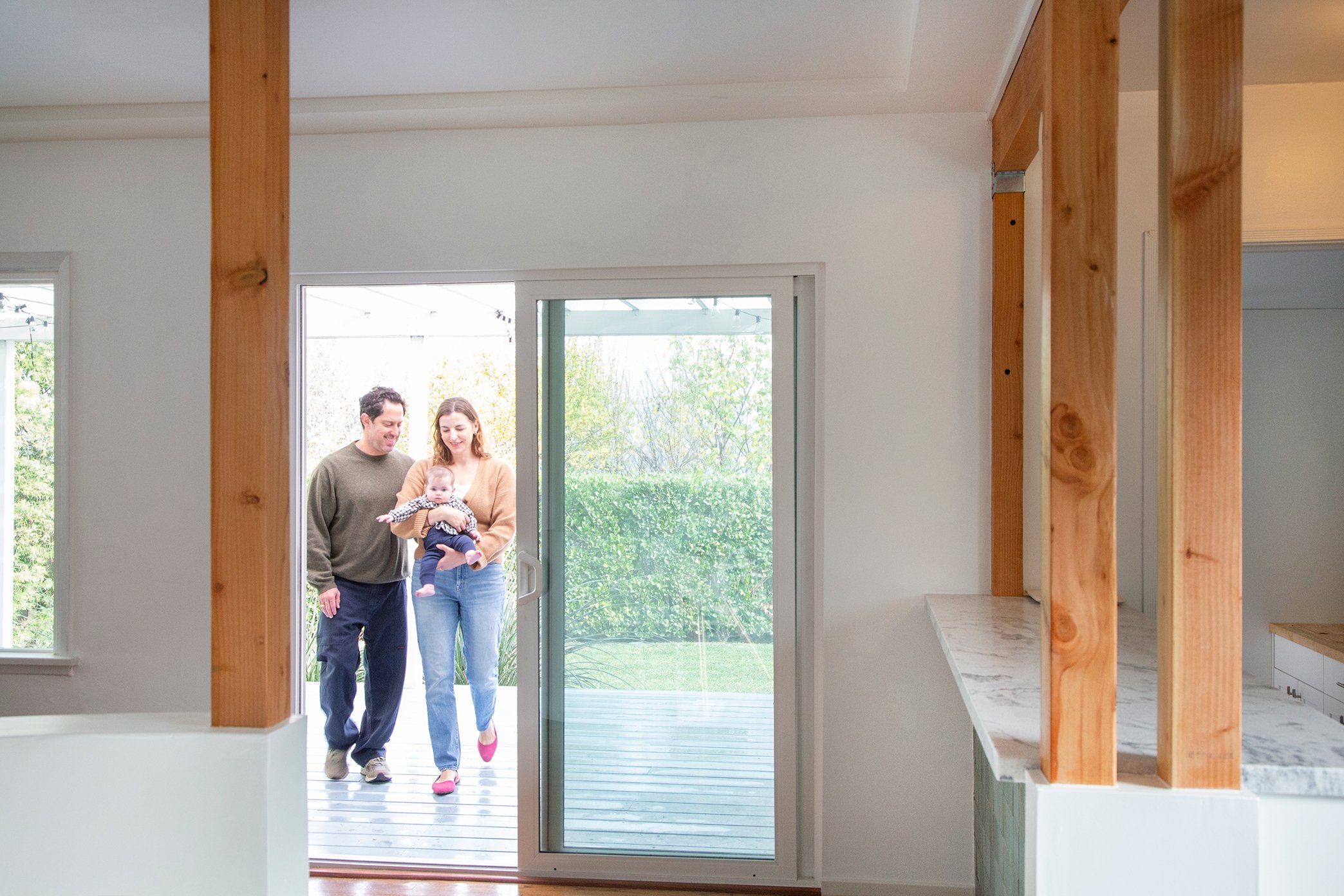
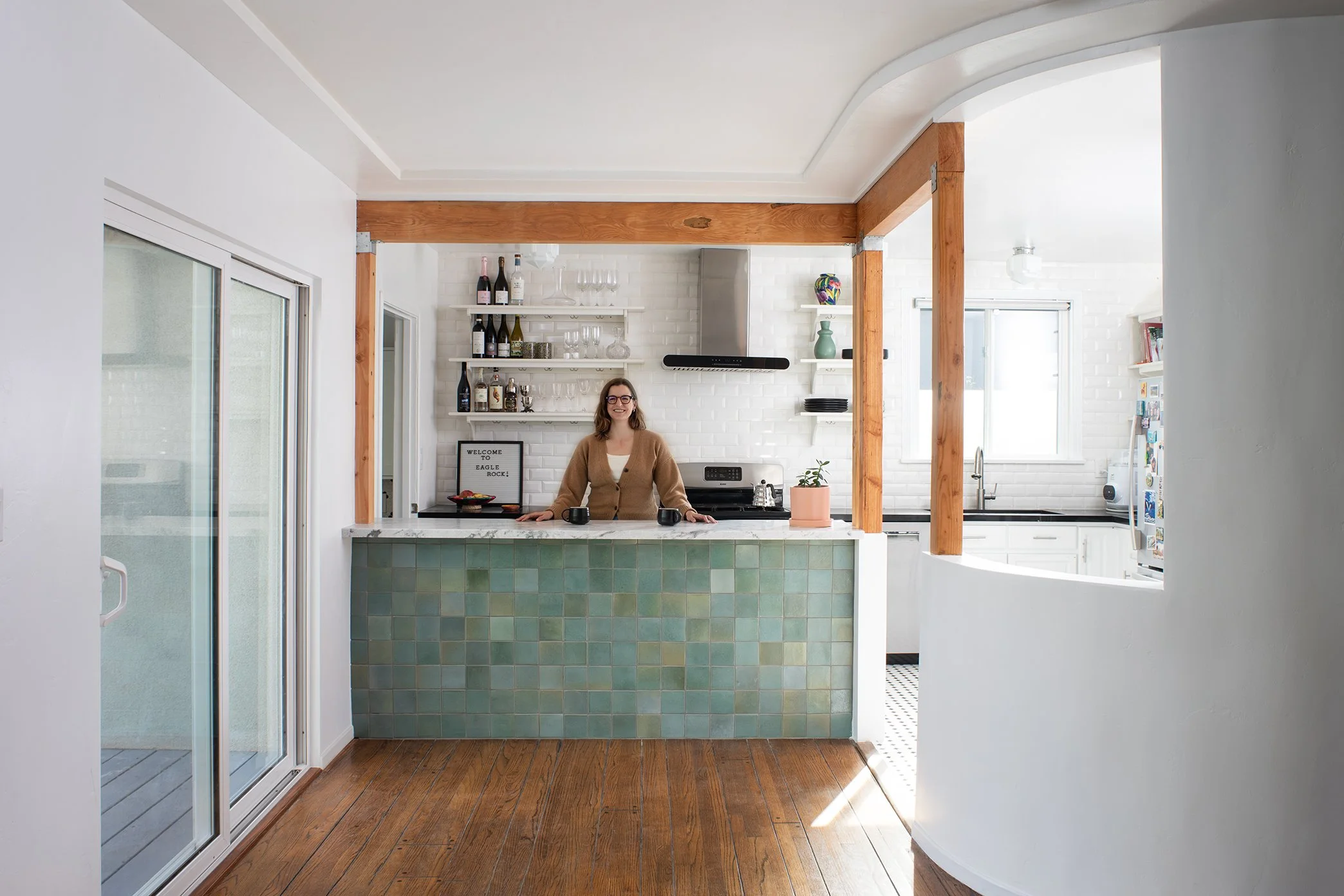
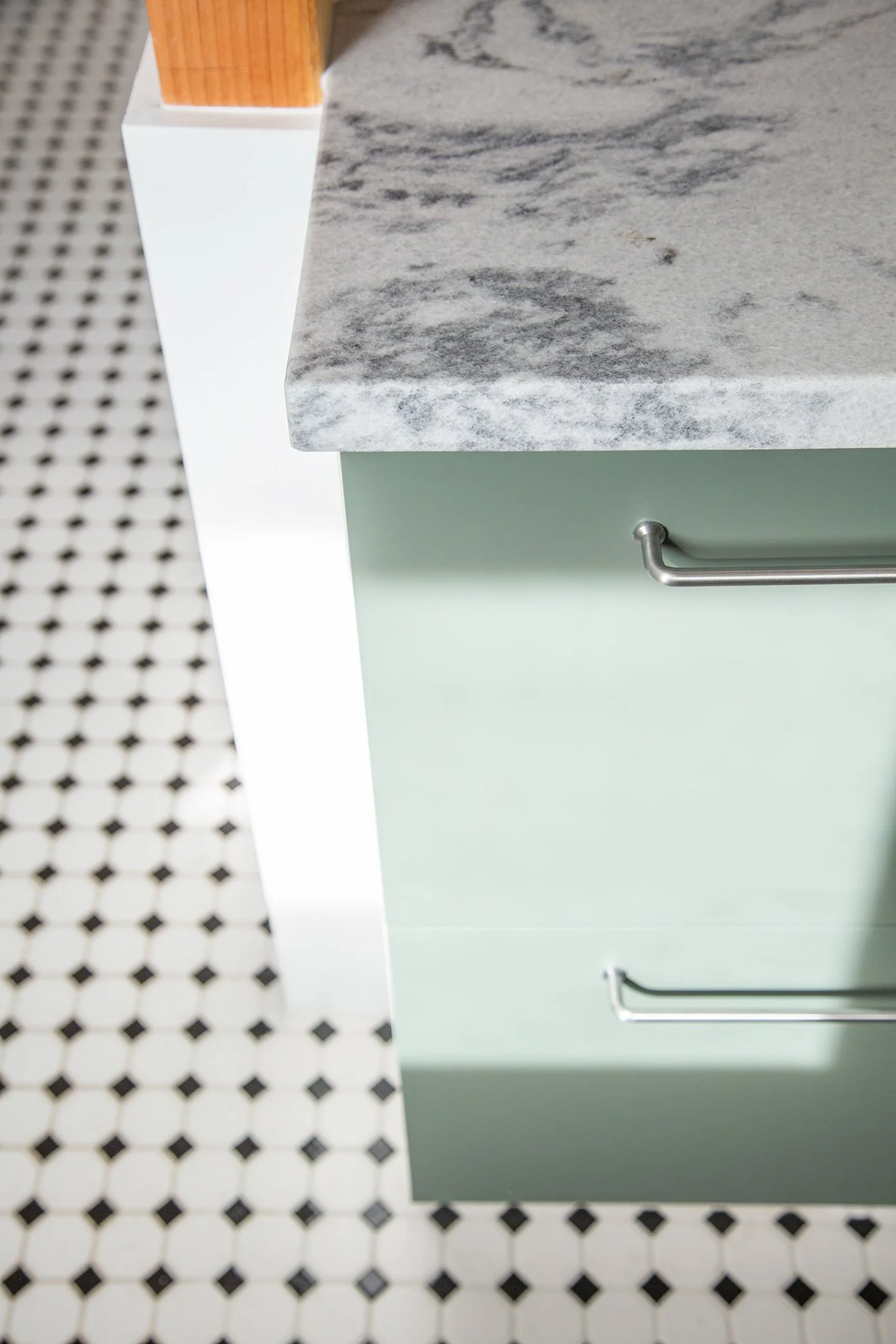
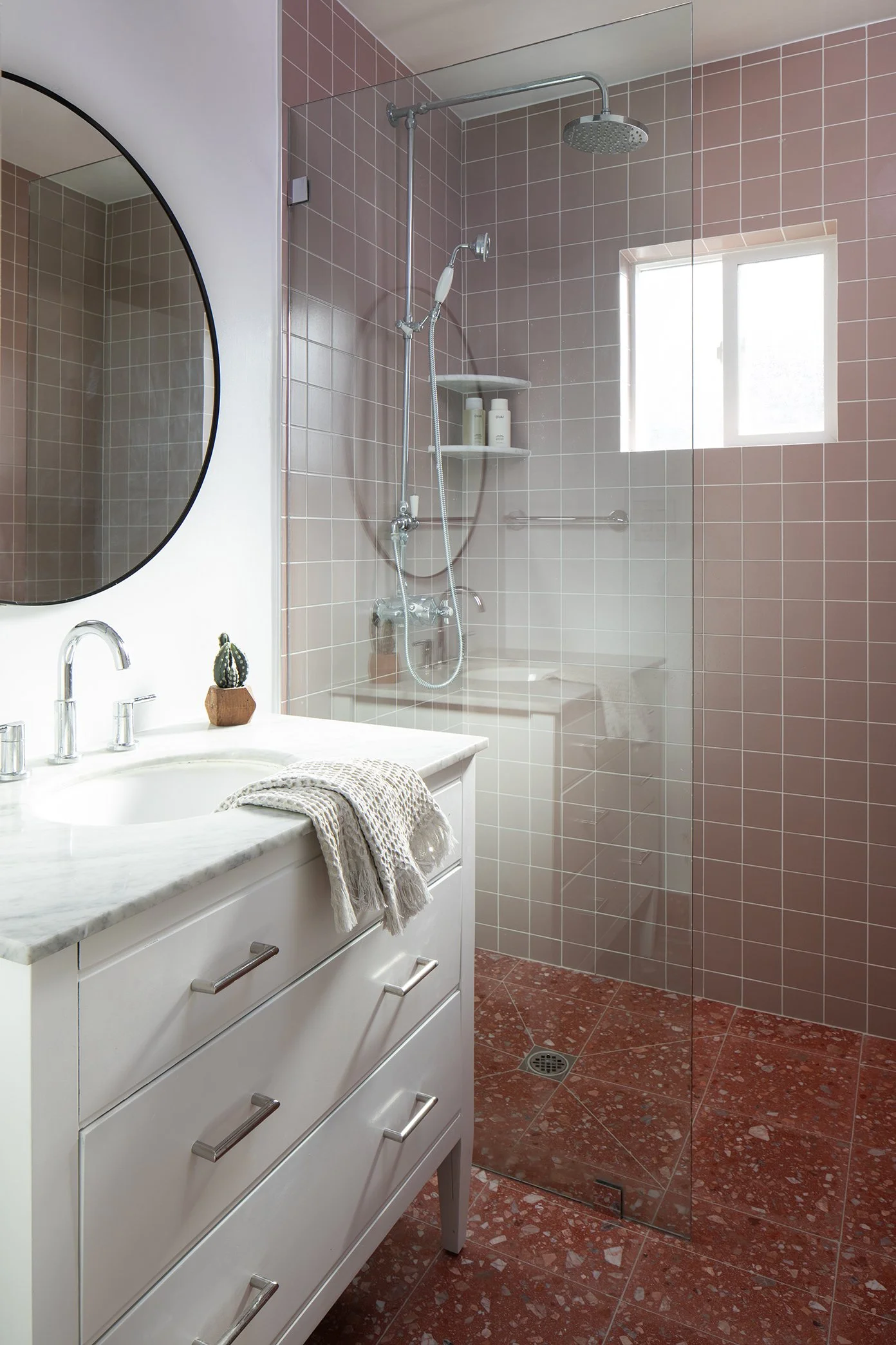
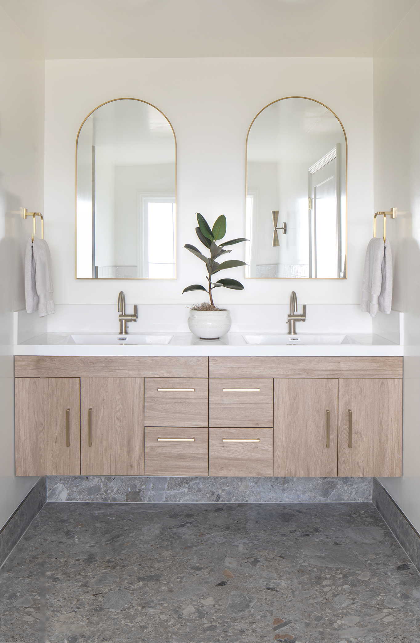
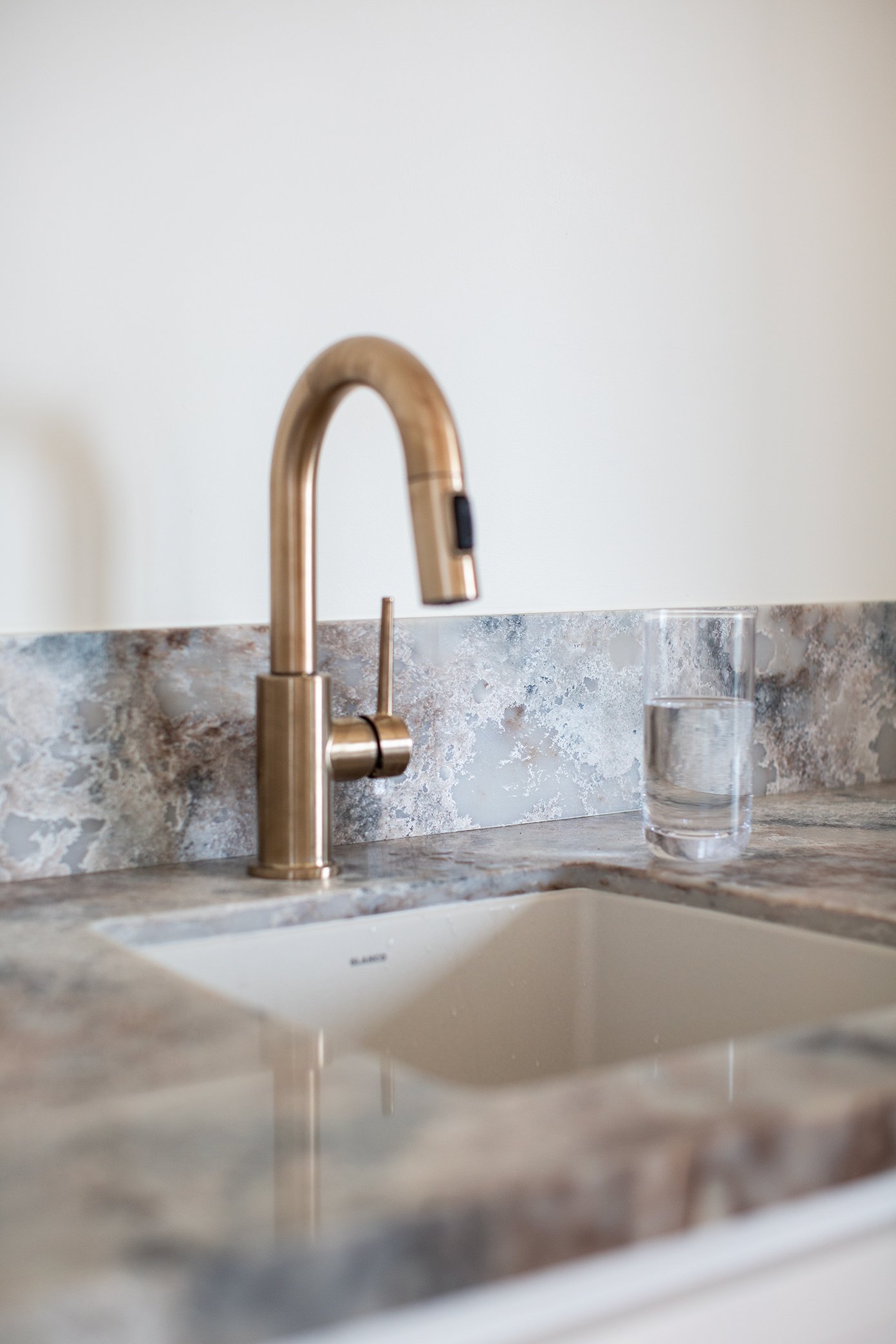
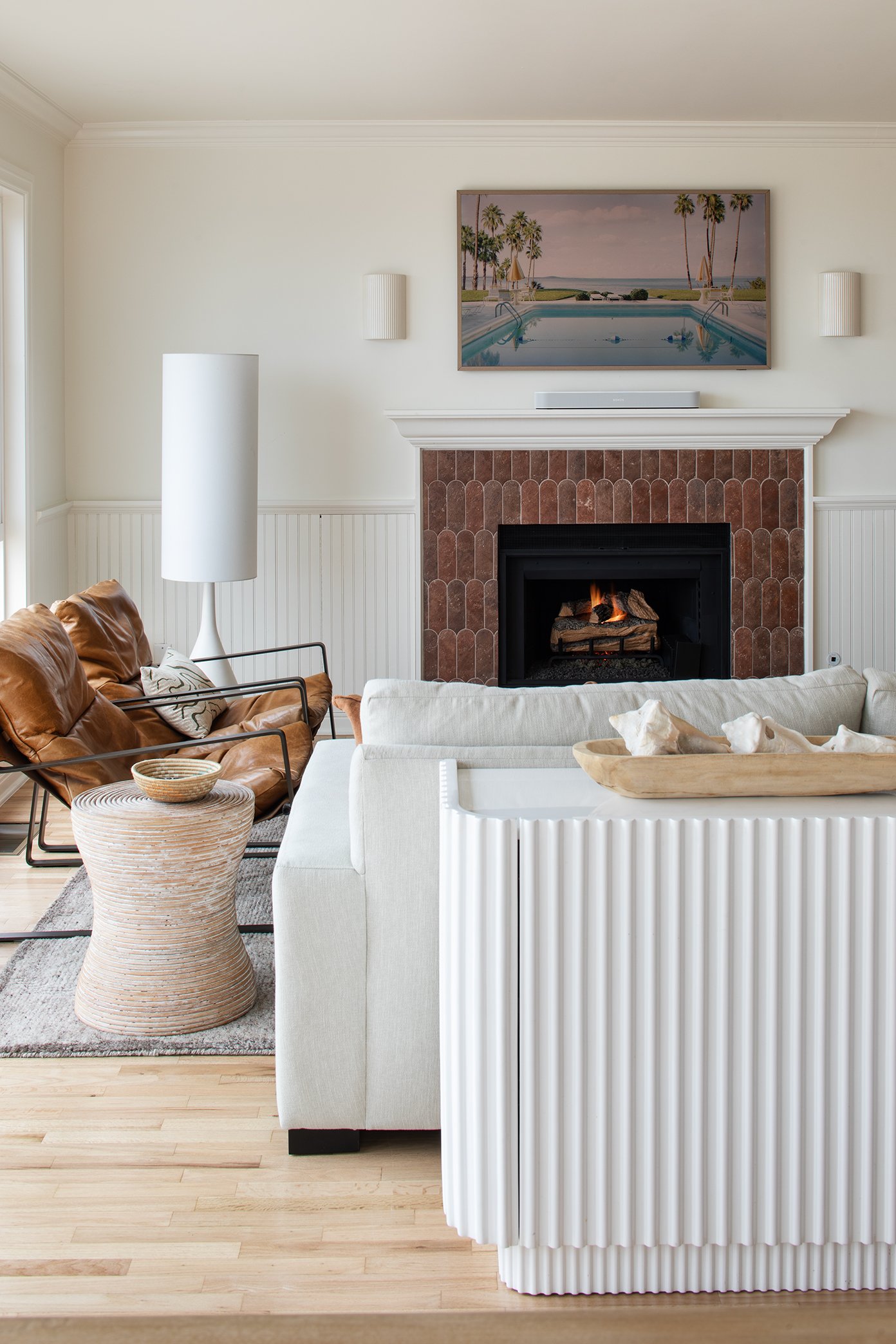
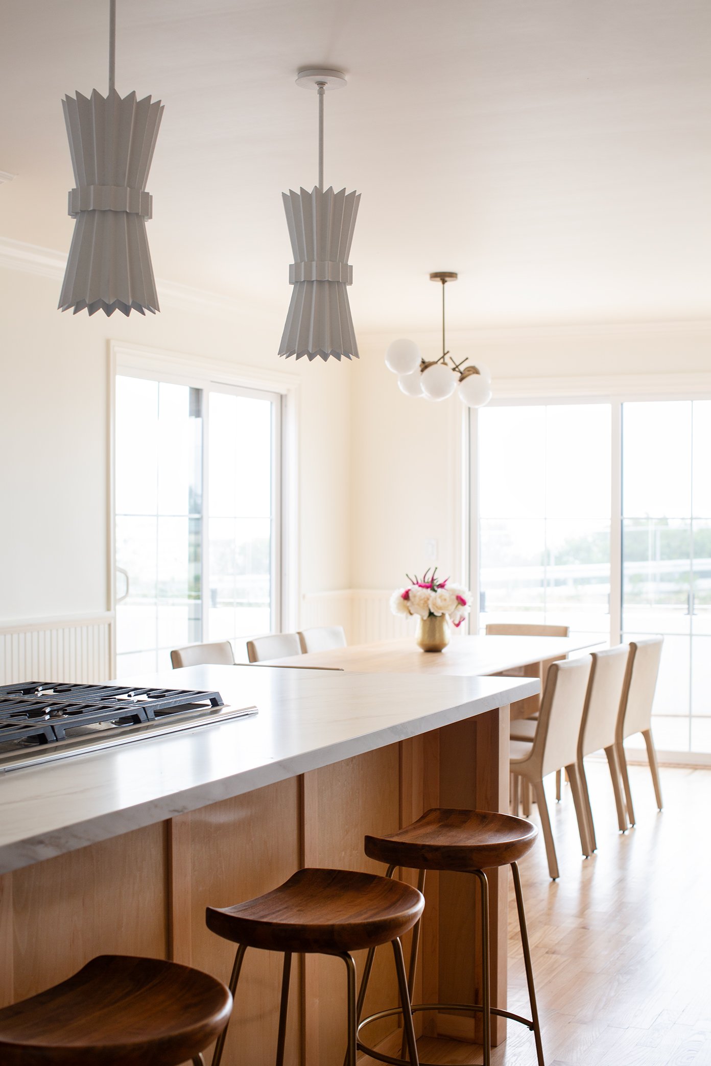
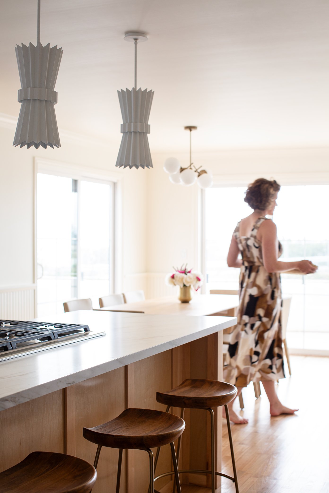
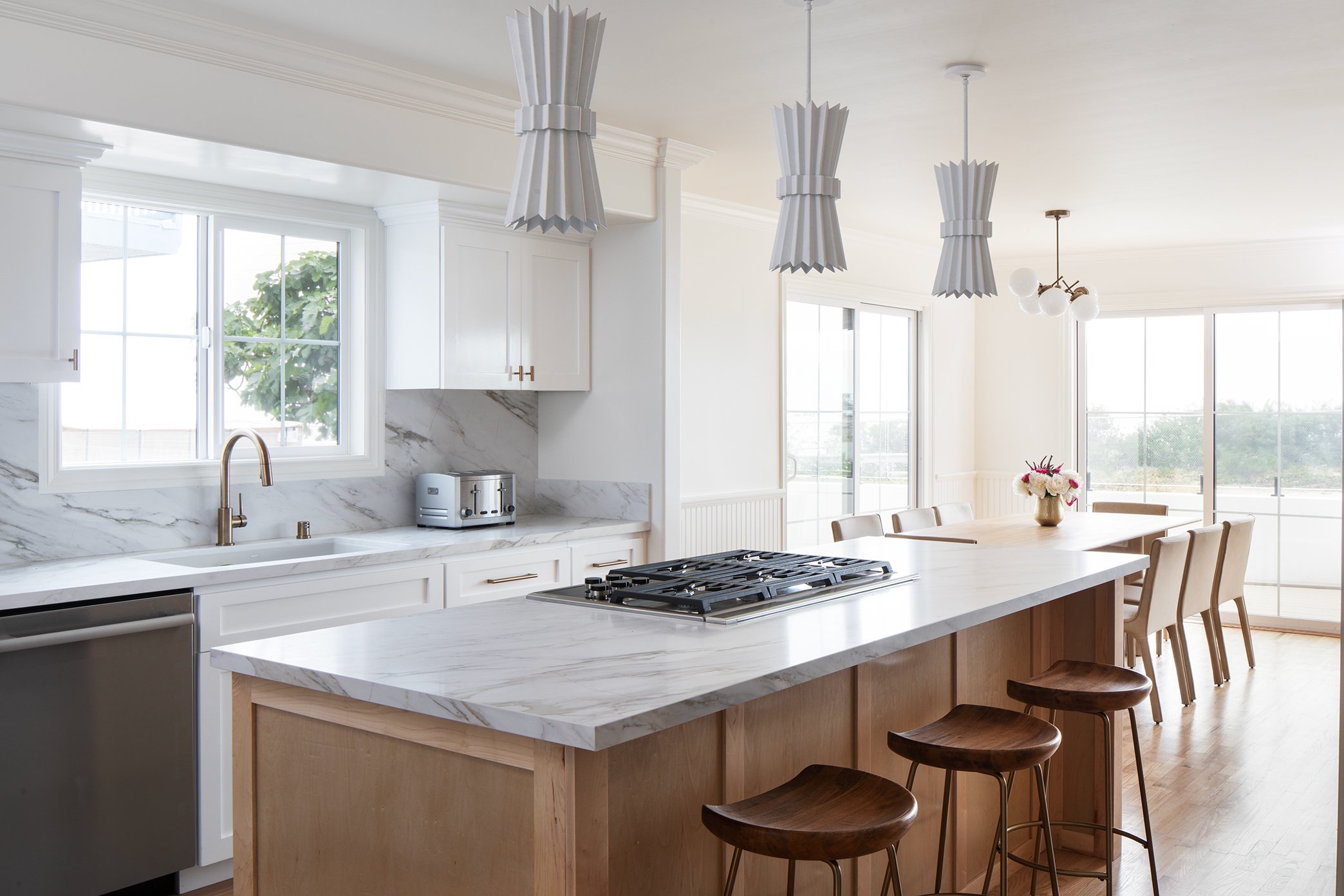
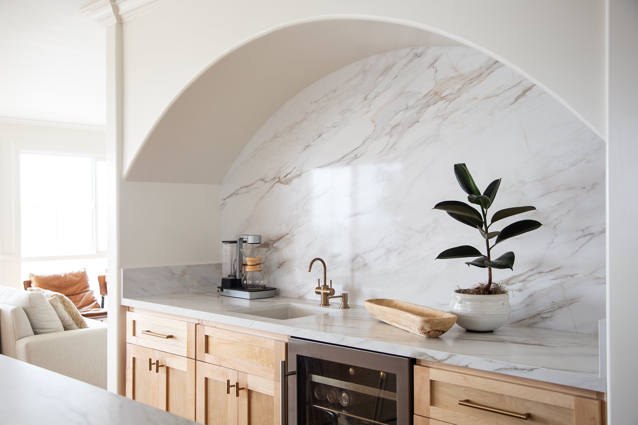
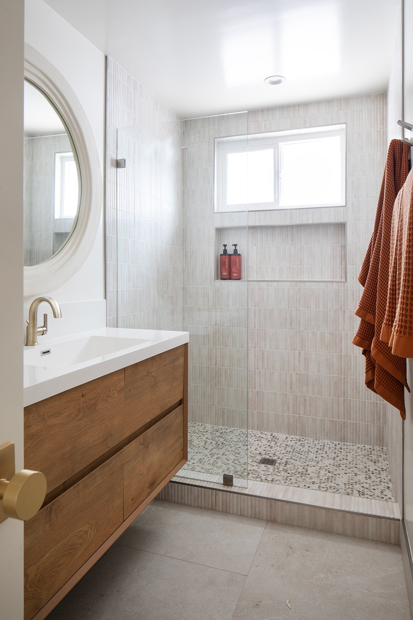
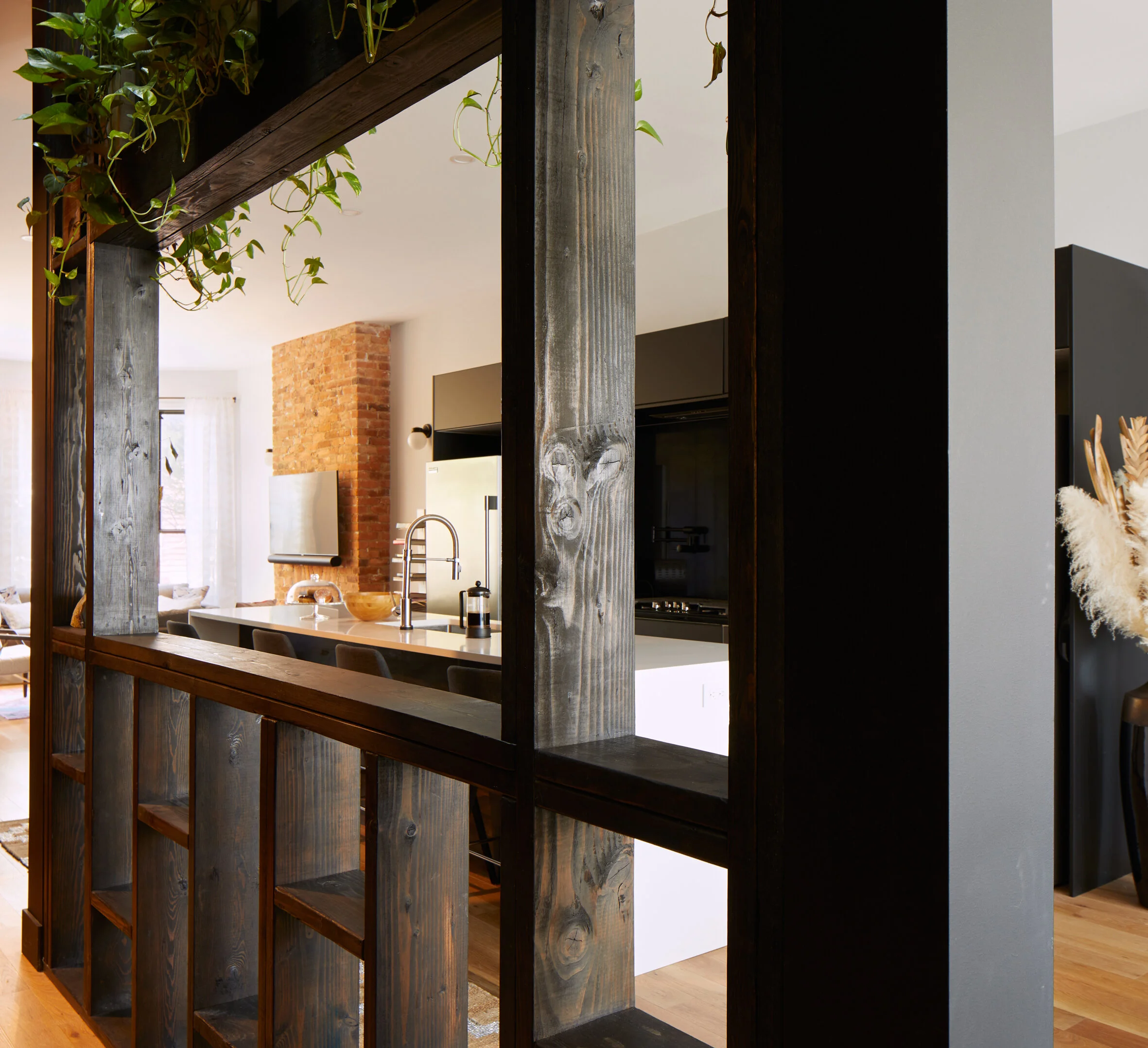
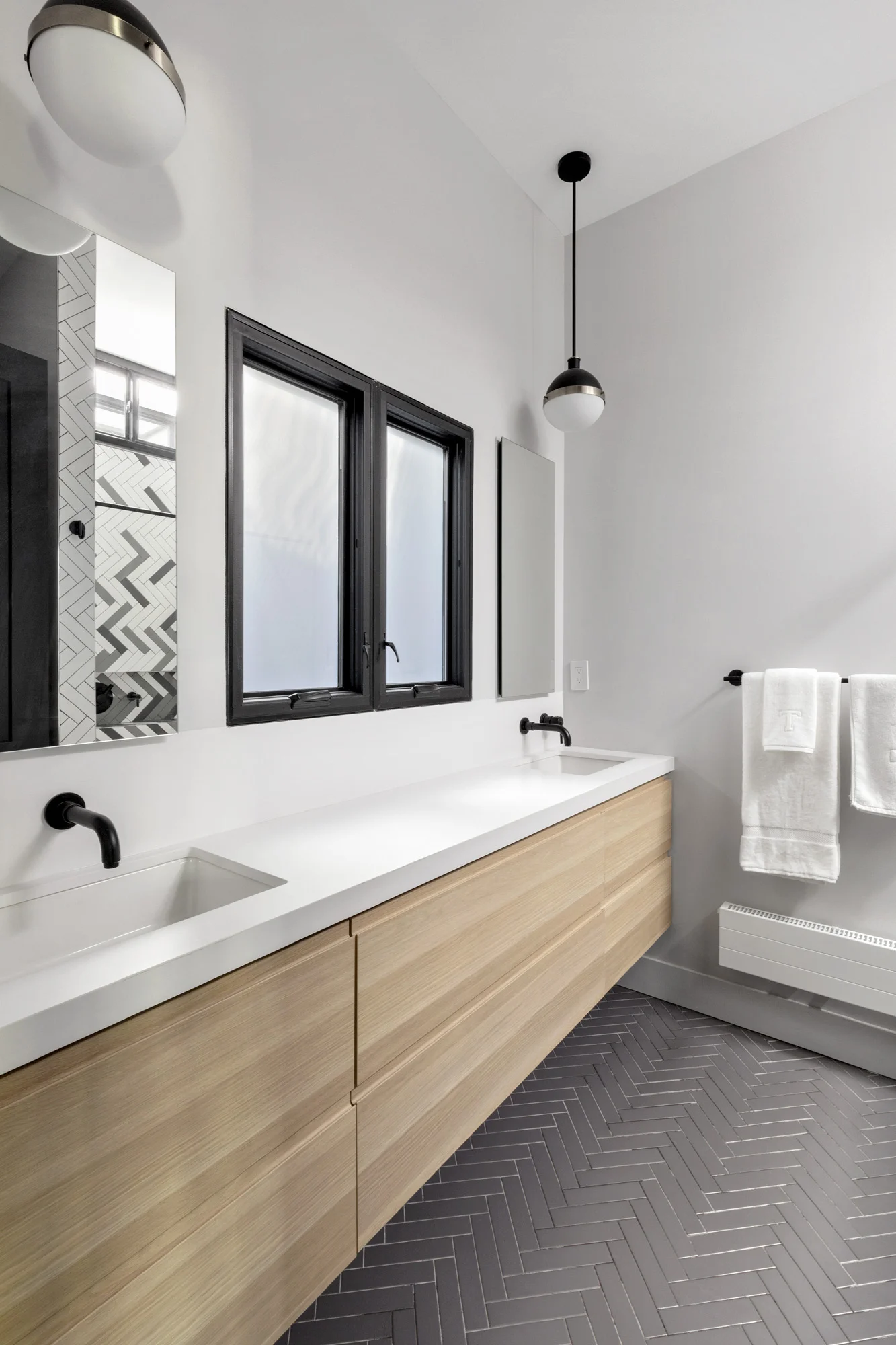
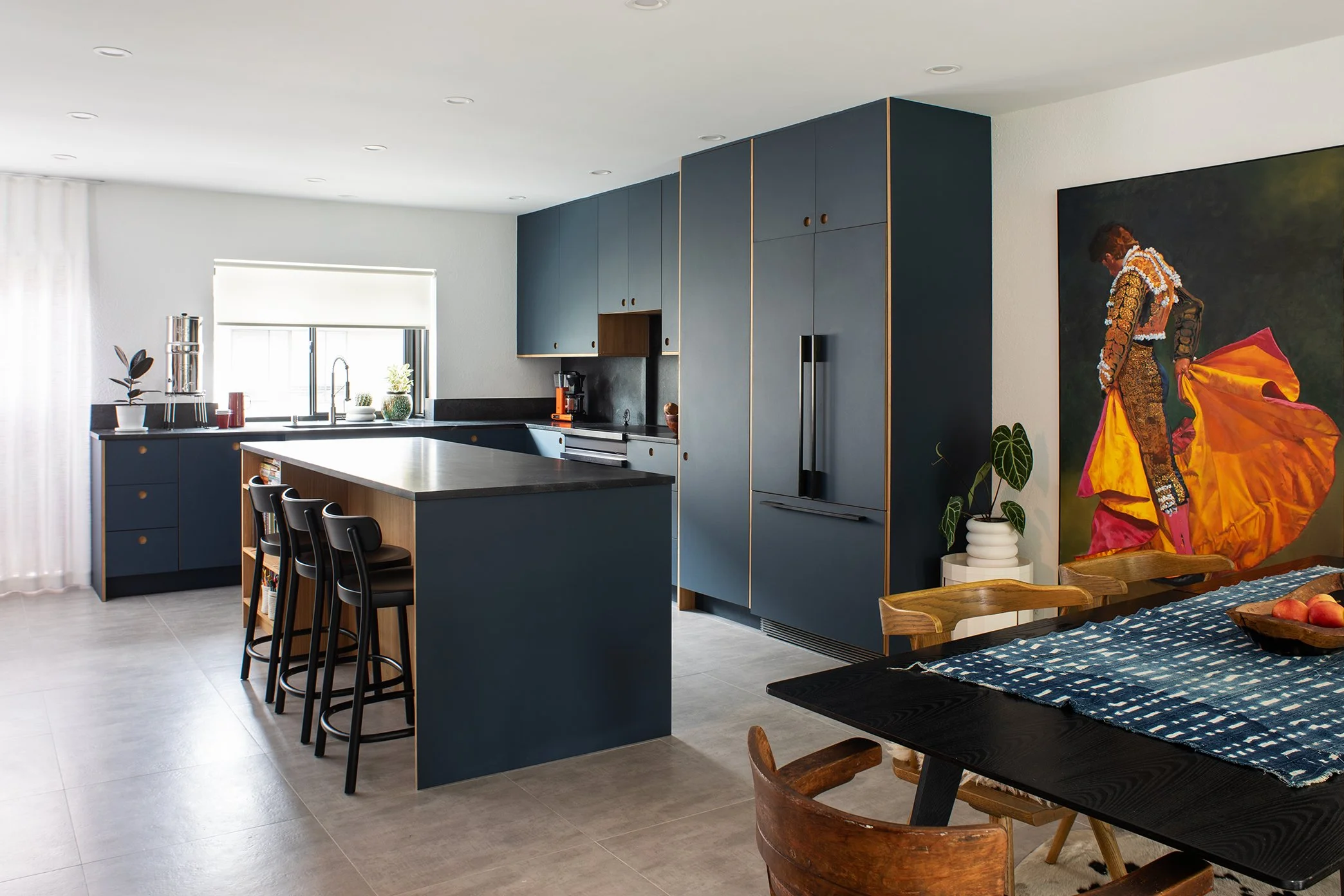
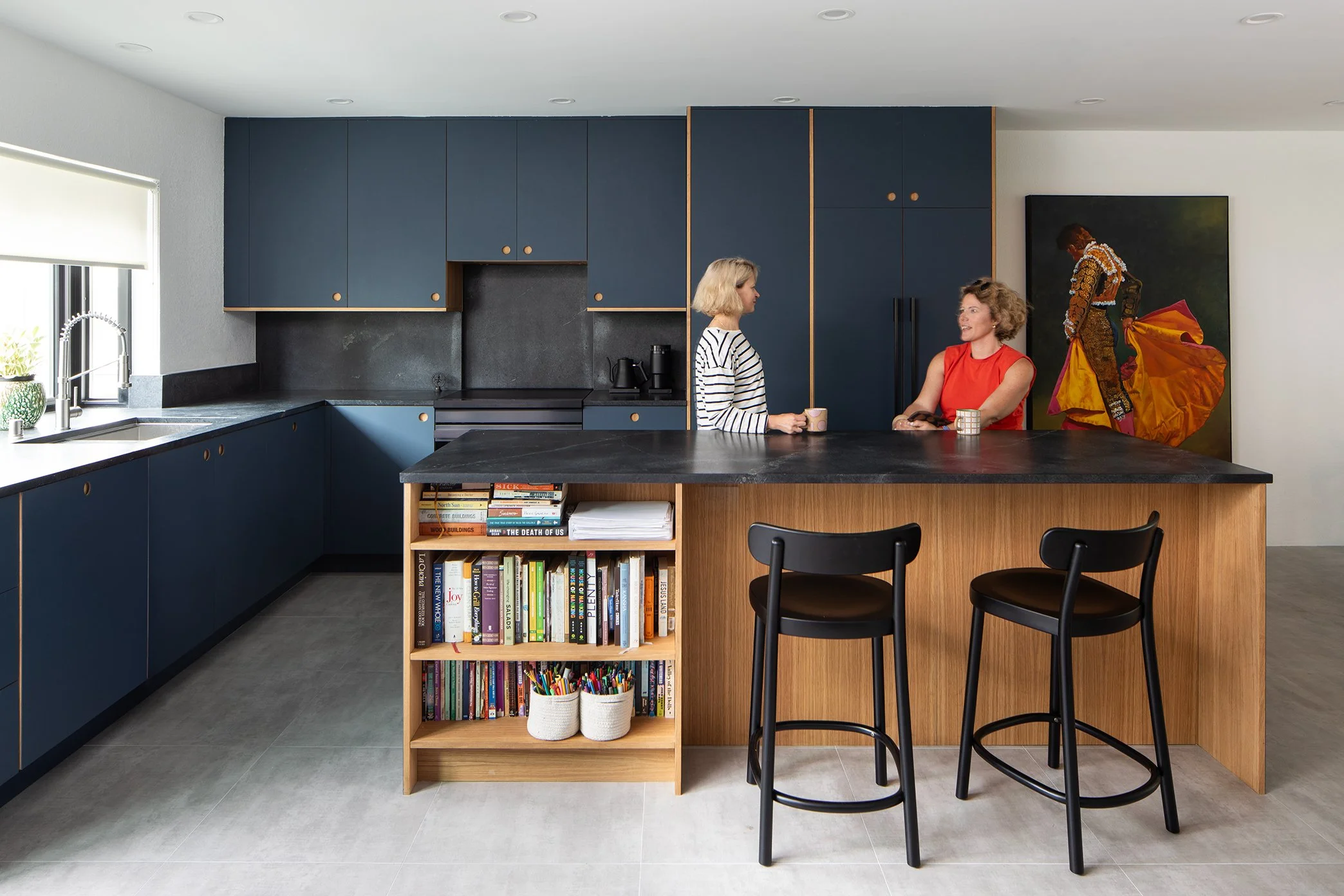
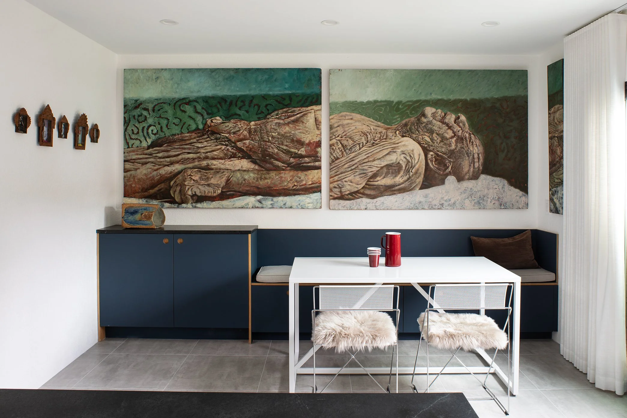
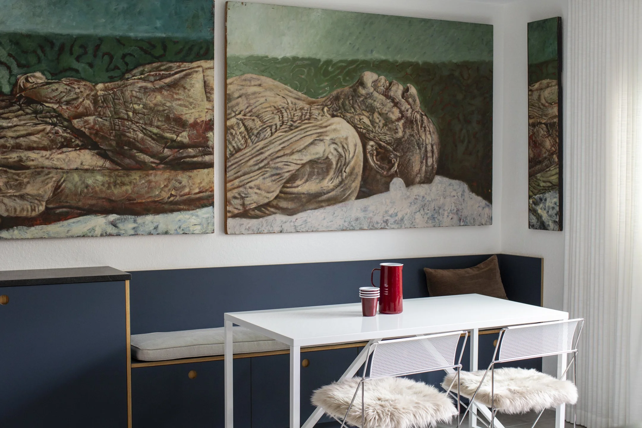
The design respected the original Spanish character while giving the home the scale and flow modern buyers crave. Arched moments and warm textures were layered into a larger, more open layout. The new square footage allowed for generous living spaces, better indoor-outdoor transitions, and thoughtful separation between the main residence and the ADU — perfect for guests or rental income.
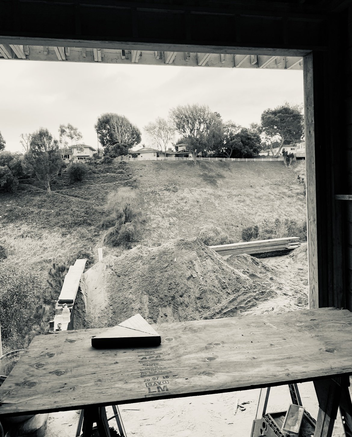
Timing was everything. The full plan moved through approval in just one month, with construction completed within six. From modest starter to standout property, the transformation was swift but strategic.
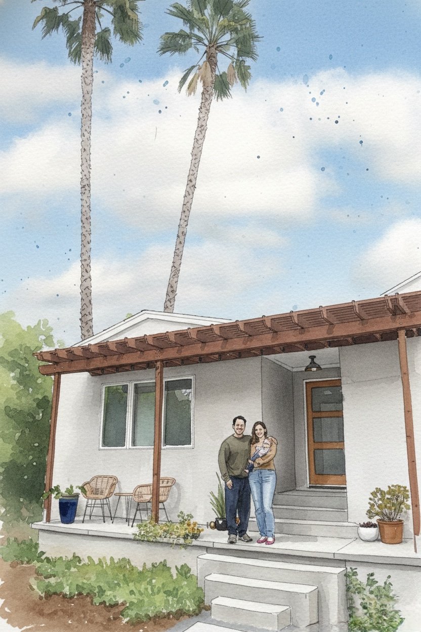
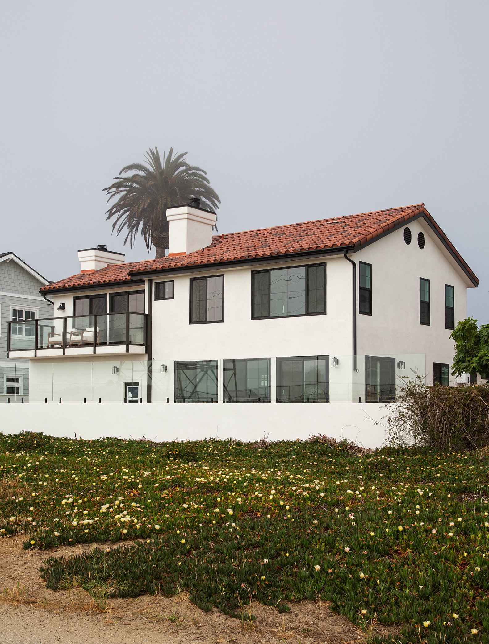
By completion, the home felt expansive yet rooted — classic yet newly confident. What began as a compact bungalow became a fully realized compound with flexibility, function, and undeniable curb appeal. And yes, it sold — proving that smart zoning, clear vision, and thoughtful design are the ultimate dream team.
Proudly completed in collaboration:
Architect: Julia Ann Gallagher Architect, PC
Interior Designer: Kaleb Khu
Structural Engineer: KTW Solutions
Builder: Den and Dwell Estates & Property Beast LLC
Real Estate Specialist: Sand and Stone LA
When this creative entrepreneur and chef family set out to renovate their home, their vision was bigger than just updated floors and fresh finishes — it was about living well and living sustainably. After transforming the top two floors of their townhouse, they found themselves in a tricky spot: great space, no backyard, and a temporary rental that wasn’t cutting it. The challenge? Reimagine the lower unit to both unlock outdoor access and expand how they live.
The genius of the Triplex Over Studio redesign is in how smartly it rebalances the whole property. By dedicating the back portion of the lower level to expand the family’s living space and connect directly to a new backyard, the home finally breathes outdoors. Suddenly, morning coffee flows into evening dinners under open sky, kids have room to play, and the city feels just a little friendlier.
Up front, the design introduces a thoughtful income-generating rental studio that feels separate yet harmonious with the rest of the home. It’s tailored, efficient, and full of personality — perfect for guests, long-term tenants, or anyone looking for an inspired rental in a great neighborhood.
Throughout, the palette and material choices feel warm and lived-in — a mix of functional surfaces and crafted touches that reflect the family’s creative sensibility. Clever storage, smart transitions, and thoughtful planning tie the whole home together.
Triplex Over Studio proves that with intention and design, a house can become more than a home: it can support your life, your work, and the way you truly want to live.
Proudly completed in collaboration:
Architect: Julia Ann Gallagher Architect
Structural Engineer: Spiro Anaxhara
When a tech professional and a commercial real estate expert bought this South Bay home for their young family, they saw more than a 1990s build — they saw possibility. Moving from West LA, they were ready for a lifestyle shift: more space, more light, and a stronger connection to the outdoors. They wanted a home that felt welcoming, relaxed, and built for both family life and easy entertaining.
While full permits have been submitted for a comprehensive renovation, they chose to begin where life happens most — the kitchen and living room. The existing layout had good bones but felt dated and compartmentalized. By refining the open plan and clarifying sight lines, the main living area now feels airy, connected, and ready for everything from weeknight homework sessions to casual dinner parties.
Updating the trim throughout the home made an immediate difference. Fresh paint brightened the interiors and gave the architecture a cleaner, more cohesive feel — a simple move with major impact. The new finishes elevate the space without overcomplicating it, striking that perfect balance between polished and livable.
Outside, the deck was thoughtfully refreshed to strengthen the indoor-outdoor flow that defines South Bay living. Now, the transition from kitchen to backyard feels seamless — ideal for kids playing nearby while adults gather around the grill.
This first phase sets the tone for what’s to come: a home evolving alongside a growing family, blending modern updates with a laid-back coastal sensibility that feels just right for their next chapter.
Proudly completed in collaboration:
Architect: Julia Ann Gallagher Architect, PC
Structural Engineer: HD Structural CO
Real Estate Specialist: Sand and Stone LA
Photography: Meghan Bob Photography
The 2025 fires left so many families reeling, so when a builder–interior designer client called asking for help rebuilding a longtime friend’s home — and doing it fast — the answer was immediate: yes. This wasn’t just another project. It was personal.
The property sat on a flat lot with a 1930s home and detached garage that had been lost completely — a true 110 percent rebuild. The goal wasn’t to reinvent the house, but to restore it with care and respect for what had been there. The garden, especially, mattered. Handmade, hand-laid brick and stone pathways had shaped years of memories, so we committed to preserving as much of that original character as possible.
When we first visited the site, something hopeful had already begun: plants were quietly regrowing. It felt symbolic — a reminder that rebuilding is both physical and emotional. The design honored the scale and spirit of the original 1930s architecture while subtly upgrading structure and systems for modern resilience.
Plan check moved swiftly, with approvals secured in just a month and a half. Construction began that summer, though like many rebuilds, inspections revealed unexpected hurdles. Progress slowed at times as we navigated new requirements and unforeseen site conditions — a reminder that rebuilding after disaster is rarely linear.
Still, the framing is rising, details are taking shape, and the house is steadily becoming a home again. Soon, its resident will return — not to what was lost, but to something restored with intention, strength, and heart.
Before moving into their first detached home in California, this artist-architect couple and their two boys were dreaming big — despite starting with a modest 853-square-foot house that felt more like a starter cottage than a family home. Their goal was clear: transform this compact space into a bright, open, and joyful place to live — one that didn’t just accommodate their family but celebrated daily life, connection, and future possibility.
The original layout was tight — small rooms, low ceilings, and limited connection to the backyard. We reimagined the plan with intention, reorganizing the floorplate to create two bedrooms and two bathrooms where there had only been one of each. But the real magic came with the ceiling: by vaulting the living room and kitchen spaces, the home now feels expansive and light, with a sense of volume that completely changes how the interior reads.
The design opens toward the big backyard they love — anticipating a future ADU, a garden oasis, or even a tree-house-inspired play space for the kids. Big glass, strategic openings, and thoughtful material choices make every room feel connected to outside life, even on ordinary mornings.
Throughout, finishes are warm, tactile, and quietly expressive — just enough to support creativity without competing with it. The result is a home that feels both humble and lovingly elevated: functional for family routines, generous in daylight and spatial flow, and ready for what comes next.
This isn’t just a renovation — it’s a home that inspires — one vaulted beam at a time.
Photography: Meghan Bob Photography
When this beachside gem came onto the market, it hadn’t seen a meaningful update in 30 years. But the moment our clients — a family drawn to sun, surf, and timeless style — stepped inside, they knew its potential: this was always meant to be a seaside Spanish haven.
They asked for a home that felt more Spanish, more connected to its coastal surroundings, and filled with light, texture, and joy. And that’s exactly what we set out to do.
From the outside in, the transformation feels like a breath of salty ocean air. Fresh finishes and architectural details were introduced to echo classic Mediterranean influences — think warm stucco tones, graceful arches, and a palette that sings of sand, sea, and sun-bleached days. The exterior now feels iconic against its dune-scaped backdrop, a joyful and intentional embrace of seaside living.
Inside, the updates bring brightness and ease without losing character. Finishes were chosen to be relaxed yet refined: plaster walls that glow in golden light, tiles with subtle pattern that add soul without shout, and fixtures that feel both modern and gently rooted in Spanish tradition. Every corner feels considered but effortless — like a modern take on classic craftsmanship.
Most importantly, the home now feels lived-in beautifully: spaces that flow for family gatherings, casual meals with the ocean breeze, and quiet mornings with coffee in hand. This isn’t just a renovation — it’s a celebration of place, culture, and coastal life, finally fulfilled.
Photography: Meghan Bob Photography
On the Palos Verdes Peninsula, where sweeping views are everything, this family’s home had long been oriented toward the vista — but not into the life they truly wanted to live. Their original balconies hinted at potential, but they didn’t deliver the indoor-outdoor experience this family dreamed of. That all changed with Peninsula Fresh renovation — a project that didn’t just update a house, but expanded how it feels to live in it.
The most striking move? Stripping the old back balconies and transforming that façade into a fluid, family-centric living space that embraces indoor-outdoor living at its fullest. What was once underutilized crawlspace at the third-floor level became the heart of the home: a dynamic suite of spaces where daily life and entertaining flow together seamlessly.
Here, the interiors don’t just open to the outside — they merge with it. A living room with panoramic views and light steps directly into a generous entertainment kitchen and outdoor kitchen. An outdoor kitchen keeps pool days carefree, while thoughtful architectural detailing and material continuity between inside and out make transitions feel effortless.
The result is a space that invites connection — family dinners that spill out into sunset air, morning coffee with an ocean breeze, laughter floating between interior and exterior rooms. The Hill isn’t just about capturing the view anymore — it’s about living in it.
This renovation turned a passive overlook into an active home scene, where every direction feels like an address and everyday life feels so very good.
JAGA Studio worked with the owners on the interiors and finishes of this project as a designer.
Proudly completed in collaboration:
Architect: Buchmann Design
Interiors: JAGA Studio
INTERIOR DESIGN ASSIST WITH MALLORY ROBERTS MORGAN
Landing in Los Angeles from New York City in the midst of a pandemic meant learning on the fly — especially when it came to understanding residential design in Southern California. Early on, Julia Ann Gallagher reached out to local firms to connect, listen, and observe. One of the most formative collaborations that followed was with designer Mallery Roberts Morgan, alongside the teams at Terremoto Landscape and Johnston Marklee & Associates, on a renovation inside a quintessential Craig Ellwood–era home in the Malibu Hills.
The house itself is an ode to modernist restraint — pure lines, deep overhangs, and breathtaking connections to the hillside site. Working with the young socialite client, the team honored that clarity while refreshing the home’s material palette and spatial flow for contemporary life. What stands out in this project is the seamless dialogue between inside and out: expansive glass frames views of canyon and sky, while terraces and landscape gestures extend living spaces into nature.
The interiors strike a thoughtful balance between tradition and ease. Warm wood tones and tactile surfaces give the open floor plan a grounded, soulful feel, while minimalist details and refined finishes let the architecture take center stage. Even small moments — the way the light hits a corner, or how a path guides you through outdoor space — feel intentional and crafted.
For a team newly immersed in the LA design scene, Malibu Case Study became more than a project — it was an immersive masterclass in scale, light, landscape, and sophistication. It taught how high-end residential work in Los Angeles doesn’t just look good — it lives beautifully in its terrain.
When this PR executive and lawyer duo relocated from Brooklyn with their two kids, they landed in a mid-century home with great bones — but it didn’t yet feel like theirs. The architecture had that classic low-slung charm and clean lines, but the interiors needed personality, warmth, and a bit of edge to reflect a family used to New York energy.
Rather than erase the mid-century character, we leaned into it — and then layered in something unexpected. The design centers around a bold yet thoughtful mix of German tile, printed wallpaper, and rich wooden cabinetry finished with brass fittings. It’s a combination that feels worldly and collected, not overly polished. The tile brings graphic punch and craftsmanship; the wallpaper introduces pattern and movement; and the warm wood cabinetry grounds everything with depth and texture.
In the kitchen and main living spaces, brass hardware and fixtures catch the light just enough to elevate the palette without overpowering it. The result is a home that feels curated but approachable — stylish, but still very much designed for family life. Sight lines were clarified to make gathering easier, and functional updates ensure the layout supports busy mornings and lively evenings alike.
What makes this renovation special is the balance: mid-century simplicity meets European influence, Brooklyn sensibility meets West Coast ease. It’s layered without being cluttered, refined without feeling formal.
Now, this once-standard mid-century house feels like a true reflection of its owners — thoughtful, design-forward, and full of character in every corner.
When choreographer and creative force Luam Keflezgy set out to renovate her Brooklyn brownstone, she wasn’t just updating a home — she was creating a layered backdrop for family, movement, and community. Known for shaping conversations in the dance industry as much as shaping performances, Luam wanted her space to reflect that same forward-thinking energy.
The biggest transformation? Opening the rear façade to an expansive wall of glass, flooding the home with natural light and framing views of the backyard and the city skyline beyond. The gesture feels bold but effortless, dissolving the boundary between indoors and out and giving the historic structure a distinctly contemporary edge.
Rather than gutting everything, Luam chose to keep the existing kitchen, grounding the renovation in practicality. Around it, new flooring, reworked ceilings, and a refined stair design create cohesion while supporting her eclectic, modern aesthetic. The palette balances warmth and edge — clean architectural lines softened by expressive color and playful pattern.
Wallpapers from Backdrop introduce moments of personality throughout, adding texture and visual rhythm without overwhelming the space. It’s curated but never precious.
Functionally, the brownstone operates almost like a vertical campus: dance studios anchor the lower and upper levels, while the middle floors serve as an inviting hub for family life and gatherings. The result is a home that moves — fluid, light-filled, and deeply personal — just like its owner.
Architect: Julia Ann Gallagher
Structural Engineer: Spiro Anaxhara
Photography: Miyuku LLC
When a teacher and musician partnered with us to reimagine their home, they came armed with a clear vision: honor the old, invite the new, and create a space that felt both grounded and inspired. What emerged is a home that feels calm, cohesive, and quietly transformative.
From the outside in, the update makes a statement. The façade was wrapped in a deep, rich dark vinyl that sets up a striking contrast with the neighboring homes and becomes a lush backdrop for the verdant greenery of the street. It’s bold without being loud — a contemporary twist that feels true to the couple’s aesthetic.
Step inside and the story continues. What was once a cluttered kitchen is now simplified and refined. Clean lines, thoughtful storage solutions, and intentional material choices give the space room to breathe and make daily life feel easier. The palette is warm but restrained, letting personal pieces and the home’s architecture take center stage.
The real game changer? Bringing the exterior stair inside. This elegant move dissolves the barrier between basement and backyard, introducing a seamless flow that redefines how the family moves through the home. Sunlight pours in, and the previously under-utilized lower level feels connected, purposeful, and inviting.b
Every decision — from the modernized façade to the thoughtfully reconfigured interior — was made with livability and quiet beauty front of mind. The result is a home that feels intentional, refined, and full of heart.
Before kids arrived and life got a little more lived in, the architect and actor who call this 120-year-old townhouse home had one clear idea: open it up and let the spirit of the space breathe. What they imagined — and what came to life — is a home where circulation and places of rest aren’t separated by walls, but by a living tapestry of books, plants, and artifacts collected from travels around the world.
Walking in feels like stepping into someone’s personal museum, but with all the comfort of everyday life. Raw exposed plywood surfaces add a warm, tactile simplicity, while the brass backsplash in the kitchen becomes an unexpected jewel — subtle, reflective, and impossibly elegant against the rougher textures.
The IKEA kitchen centerpieces are honest and unfussy, perfectly suited to the home’s relaxed ethos, while exposed beams overhead remind you of the building’s storied history. The railing — a striking feature of epoxy-coated chain-link — feels like poetry in motion: industrial yet poetic, rugged yet refined. It captures the urban beauty of this renovation and ties it back to the life of the city outside the windows.
Instead of hiding what’s raw or worn, the design celebrates it, letting each material — from metal to wood to greenery — tell its own story. The result is a home that feels authentic and layered, at once elegant and approachable, and deeply personal to the couple who lives here. It’s a quiet reminder that beauty doesn’t need polish — just intention.
Photos by Amy Barkow @ Barkow Photography
When a filmmaker and a music DJ finally landed their first Manhattan co-op — after years in Brooklyn — they knew they needed a home that could keep up with their creative lives. They were ready for a space that felt open, intentional, and truly theirs, a place where everyday routines and inspired moments could live side by side.
The heart of the transformation was the kitchen. What had been a closed-off galley didn’t reflect how they cook, entertain, or gather. Opening up that wall changed everything. The new layout invites connection between kitchen and living areas, making the space feel larger, brighter, and way more functional — especially when friends drop by or dinner turns into a late-night hang.
Custom cabinetry and millwork bring everything together with a clean, tailored look. Thoughtful storage solutions make everyday life feel effortless, while material choices — warm woods and sleek surfaces — balance urban polish with a welcoming vibe. Every detail feels purposeful, from the way the new kitchen flows into the rest of the apartment to the custom closets that give their wardrobe room to breathe.
The result is more than just a renovation — it’s a home that reflects who they are and how they live. It’s smart without being precious, stylish without feeling staged, and comfortable without losing its edge.
In this Manhattan co-op, every corner feels considered, and every day feels a little more inspired — exactly what you’d want when you’re creating your life in the city.
What began as a desire to loosen up the layout of this Brooklyn brownstone turned into a thoughtful renovation that now feels as natural as morning light streaming through its windows. The homeowners — a mobile entrepreneur and veterinarian alongside a filmmaker — were juggling the beautiful chaos of two young kids and a home that wasn’t keeping up. They wanted space that worked for everyday life: an open kitchen where the whole family could gather, and a living room that flowed easily out to the backyard. He wanted something modern and she wanted a farmhouse. JAGA Studio was there to negotiate and support them in their renovation together.
The original floorplan felt closed off and compartmentalized, so we knocked down interior walls to create a more expansive, connected layout. The result is a kitchen that doesn’t just function well — it feels like the center of the home. Now, the living room and kitchen live in harmony, welcoming family dinners, homework sessions, playtime, and quiet evenings without interruption.
Out back, the yard has finally become part of the daily rhythm rather than a distant backdrop. Large openings and clean transitions invite light and air in, blurring the line between indoor and outdoor living in a way that feels effortless and natural.
Upstairs, we added a new bathroom to the primary suite, creating a calm retreat for the parents while preserving the character of the landmark property. Carefully reopened interior windows and thoughtful material selections brighten every room and honor the home’s historic structure.
Quirky Mashup isn’t just a renovation — it’s a reboot of how this family lives, plays, and grows together. It’s warm, open, and unmistakably connected to life as it actually happens.
When longtime friends — a housing developer and a globe-trotting ER doctor and professor — welcomed their baby, the next text we received said it all: “We need a house. And we want you to work on it.” It was their first home purchase, and for us, it felt especially meaningful — his dad had been my very first boss. This wasn’t just a renovation; it was a full-circle moment.
The house had potential, but it needed light, warmth, and a layout that could grow with a young family. Before move-in, we focused on the spaces that matter most. The kitchen was completely reimagined — opened up with new interior openings to improve flow and sightlines, making it easier to cook, gather, and enjoy community. Natural light was amplified wherever possible, creating a brighter, more welcoming atmosphere from the start.
Material choices carried the emotional tone of the project. Zellige tile in a warm green palette anchors the kitchen, echoing the lush exterior gardens and views beyond the windows. The subtle variation in the tile gives the space texture and life without overwhelming it. In the bathroom, warm rosso tones introduce a rich, earthy contrast — a bold but cozy choice that feels grounded and timeless.
The result is a home that feels layered, personal, and ready for the long haul. It’s fresh but not fussy, modern but deeply rooted in connection — the kind of place designed not just to live in, but to grow into.
Photography: Meghan Bob Photography
This project is special to our heart, because it the the project at made us a business. The client liked our house so much, (see Common Place) that she engaged us to help her find a home in the neighborhood, plan out her renovation for her new family, design her architecture, help her curate her home for her unique needs and lifestyle, find a construction team, who we are proud to still work with today, and complete her house just in time, so her mom and her baby boy could move in and create home.
This gracious woodframe townhouse in Bushwick, Brooklyn first caught the client’s eye with it’s central skylight. In our gut renovation we kept the original location and revised catwalk above to maximize the light pouring down into the main living floor.
In contrast to the white framed skylight we chose to paint the central stair well, corridors, and double height display wall in black as a dramatic contrast to the light grey living spaces and bedrooms throughout.
Just outside of the central skylight we found a window shaft to the old bathroom. We decided to mirror two bathrooms, the shared with a deep soaking tub and the master with a roll-in shower, around a skylight to provide natural light to the bathing areas. For the vanities, the shared bath received a window to look over the central stair and the master bath vanity looks over the garden.
We opened up the ground floor of the duplex for cooking, dining, and socializing. A black monolith kitchen and white island is inserted in the middle of the grand room with a dining area and bar on the garden side, and a living room on the street side.
The black quiet block on the stair side contains a large pantry, mechanical room, and power room aligning with the existing load bearing wall. The open display wall takes up an extra load while letting light fall into the kitchen from the central skylight above.
It was the special spaces that made room for her personality and personal taste to shine. Children’s rooms, custom closets, curated bedrooms, spacious pantries, and unique powder rooms all have the power to make a house that’s big enough, into a home that works.
When we first met this global travel and automotive executive couple, they were clear about one thing: the pool was staying. It held too many memories for them and their daughters to even consider starting over somewhere else. But everything around it? That was fair game. They wanted the house to feel brand new — lighter, larger, and effortlessly modern — without losing the joy of backyard life.
The solution was both architectural and emotional. Instead of treating the pool as an afterthought, we designed an attached ADU that wraps around it, turning the water into the true heart of the property. What once felt like a separate backyard feature now feels integrated, intentional, and almost resort-like. The footprint effectively doubles how the home lives and breathes.
Inside, ceilings were lifted to create volume and airiness, instantly transforming the atmosphere. A clean, straightforward architectural motif anchors the renovation — strong lines, open sightlines, and a restrained material palette that allows light and landscape to take center stage. The simplicity is deliberate: pale finishes, subtle textures, and thoughtful detailing give the interiors a quiet confidence.
Large openings frame pool views from nearly every main living space, blurring the boundary between indoors and out. Whether it’s morning coffee overlooking still water or evenings filled with laughter and splashing, the design keeps family connection front and center.
The result is a home that feels expansive yet serene — luxurious without excess, modern without coldness. It’s glorious simplicity done right, with the pool finally elevated to the starring role it always deserved.
When two filmmakers invite you to see their hillside home — mid–stop work order, no less — you don’t exactly walk in with a neat checklist. You walk in with curiosity. The structure had promise, but the path forward wasn’t clear. What followed wasn’t a quick fix — it was a strategy.
Instead of chasing an oversized addition or overcomplicating the footprint, we focused on the most efficient move: converting the existing garage into a junior ADU paired with a luxe bathroom and parlor space. It was a shift that respected the hillside constraints while maximizing usable square footage. Suddenly, what had been underutilized became essential.
The new layout feels intentional and grounded. The junior ADU functions flexibly — guest suite, creative workspace, or future rental — while the parlor brings warmth and sophistication to daily living. Every finish was chosen with longevity in mind: rich materials, durable surfaces, and details that can handle real life without losing their edge.
There’s a cinematic quality to the interiors now — layered textures, moody tones, and a palette that feels both refined and relaxed. It’s not flashy; it’s confident. The kind of space that ages well and tells a story over time.
What began as uncertainty turned into clarity. By working within the existing shell and making smart, disciplined moves, the home feels complete — grounded in its hillside setting and ready for its next chapter.
And yes, once the dust settled, it wasn’t just finished — it was hot